


There’s been a lot of information thrown at us in the first week of the Data School: Sorting, filtering, table calculations, a whole bunch of different types of charts and more. But it’s been fun to explore and hopefully, some of it has stuck! So here’s a taste of some of the things that stick out in my mind from the past week.
1. Don’t pick the yellow crayon
We started the week low tech – redesigning data visualisations with crayons and paper. We worked in groups to pick out what we liked and didn’t like about an existing visualisation and drew how we would redesign it. This was our makeover of a highly elitist viz on what makes people “successful.” 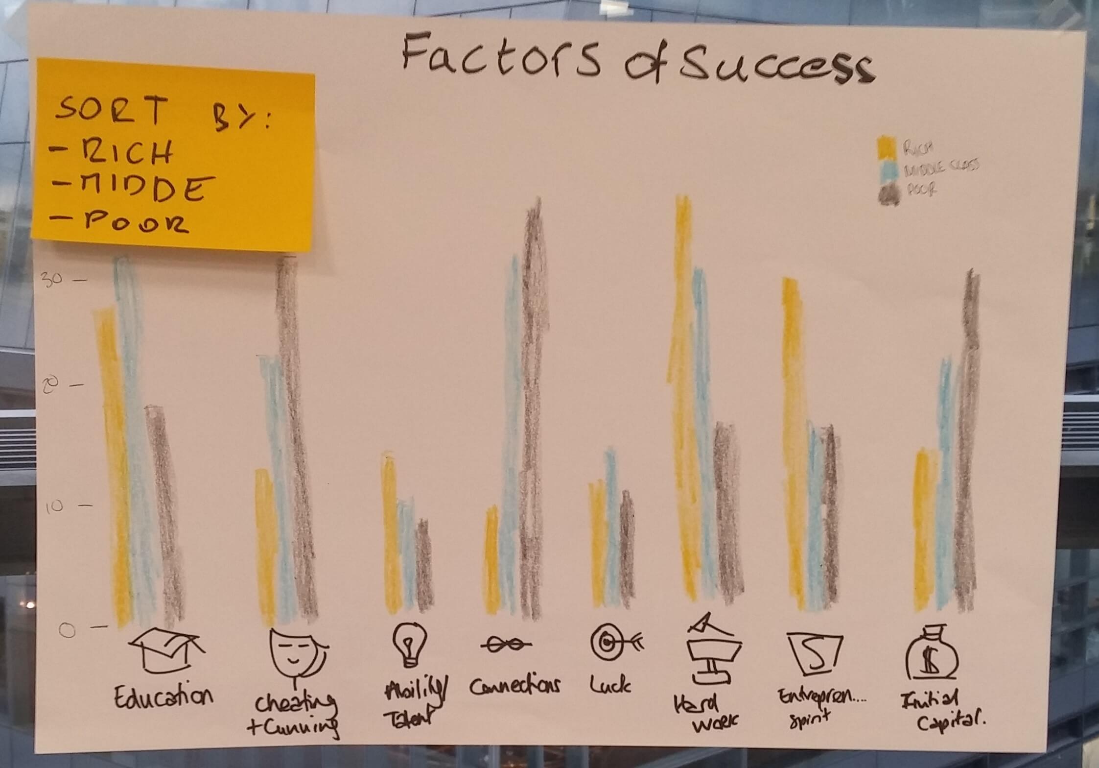
We were missing a subtitle, as we ran out of time. But the biggest cardinal sin was the use of yellow on a white background!
Future data schoolers: There is a reason why the yellow crayons look unused and neglected. Take pity on them at your peril.
I have not heard the end of it, all week!
2. Discrete and continuous fields, the blue things and green things in Tableau
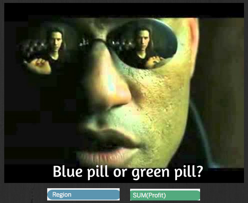
In Tableau fields in your Dimensions pane are generally your discrete fields, things you can categorise. And your Measures are the continuous variables like profit or sales. But things aren’t quite so simple.
In fact, a Dimension can be continuous and a Measure can be discrete – so how do you know what’s what?
- When you display a discrete field in Tableau it creates a “header”. A title of a column or row with that field.
- When you drop a continuous variable into the view it will give you an axis instead.
This is my attempt at summing up Tom Brown’s blue things and green things post. I had to do a presentation on it for the rest of DS4, which made it a fairly memorable part of my week.
Future data schoolers: Don’t be the last person to do the homework, unless you want to do extra presentations.
3. Clearing up container confusion with the Layout tab
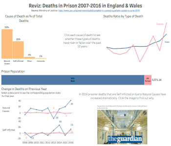
We had a lesson on dashboard design where were enlightened to the world of dashboard actions, which I made the most of in my latest viz – an attempt to improve the data visualisation I originally submitted for the Data School application process.
But there was also one super simple thing that has made my dashboard design much easier.
Paying some serious attention to the “Layout” tab in Tableau makes a world of difference.
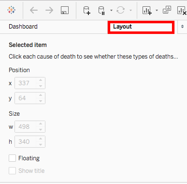
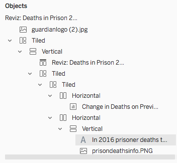
I’ve used tiled containers before in my dashboards but often been confused by the fact that they didn’t always arrange the objects in the way I thought it would. Especially when there’s a lot going on, like text and images as well as sheets. The layout view lets you keep track of the containers you’ve added and shows you the hierarchy, within each.
I also watched a few videos by Tim Ngwena on the topic that really helped clarify my understanding of how containers work. Highly recommend giving them a watch if you find this all a little confusing.
Sometimes the simplest of things can make a big difference.