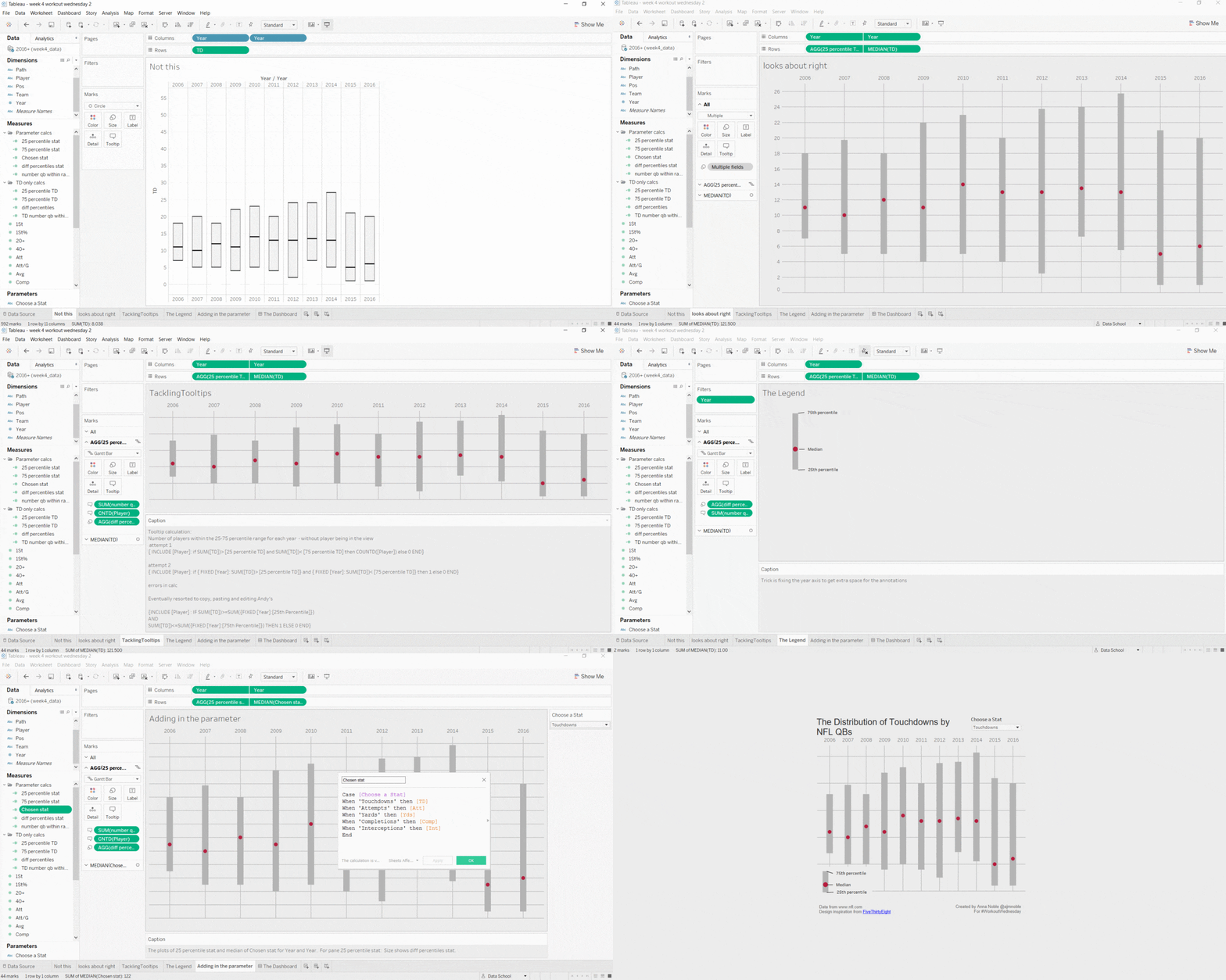
Andy’s Workout Wednesday looking at the distribution of NFL players performances between 2006 and 2016 took me a seriously long time to figure out. Here’s a quick explanation of what I found tough and why.
You can take a look at my workbook here
First up the instructions
- All of the elements must be floating on a dashboard sized 650×650.
- You cannot use the Player dimension anywhere in the view.
- Match my colors including the background
- Create the legend (HINT: It’s not an image)
- Match the tooltip (Note the stats that are displayed in the tooltip. This will be a bit tricky. Essentially you need to count the number of players that are contained within each band.)
- The viz should update based on the stat selected. The user should be able to choose between: Attempts, Completions, Interceptions, Touchdowns, and Yards
- The title should update dynamically based on the stat the user selects.
- Optional: Use Montserrat font (you can download it from Google fonts
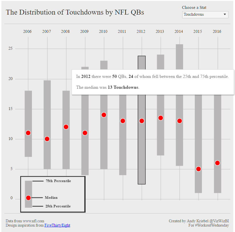
The viz to aim for
Click the image for interactive version
Creating the initial chart took me a while. Once i’d figured out that the box plots options weren’t to cut it. There may have been teh word Gantt overheard at the Data School, which helped a lot. I was puzzled as to why I my gridlines didn’t match up for quite a while – i couldnt get them to align in the middle of the bars. Year needed to be a green pill (continuous) and not a blue pill (discrete). It’s extra annoying when you get stuck and the solution turns out to be painfully simple.
But the thing that had me stuck for the longest time and I tried really hard to figure out was the calculation to figure out the number of players each year who fell between the 25th and 75th range for the stat selected.
“You cannot use the Player dimension anywhere in the view.” Spells LoD calc
By Andy’s instructions I knew that in order to achieve number 5, including the count of the players within each band, there would be a Level of Detail calculation. LoDs are something I have struggled with in the Data School. So I knew this was going make my brain hurt but I was willing to give it a go.
So I knew that player couldn’t be in my view but I needed in the calculation so using the {INCLUDE player: } function sounded about right. And I came up with this as my if statement.
{ INCLUDE [Player]: if SUM([TD])> [25 percentile TD] and SUM([TD])< [75 percentile TD] then COUNTD([Player]) else 0 END}
If sum of number of touch downs is > the 25th percentile but less than the 75th percentile count the number of distinct players and do this calculation for each player
This ends up with zero in all cases and completely ignores the fact that I need to do this for each year separately. But I’m realising as I type this that actually my logic is flawed too, as doing Count distinct of player is silly because of all conditions are met it should only be 1 or 0 for every player anyway and Tableau will do the aggregation for me.
So then I got this for attempt 2
{ INCLUDE [Player]: if { FIXED [Year]: SUM([TD])> [25 percentile TD]} and { FIXED [Year]: SUM([TD])< [75 percentile TD]} then 1 else 0 END}
This time I had the logic figured out and by adding in the { FIXED [Year]:} level of detail I was now asking for results to be calculated for each year. BUT I hadn’t quite got the formation of a nested if statement sorted out. But patience was wearing thin and ended up downloading Andy’s workbook to find out the answer.
{INCLUDE [Player] : IF SUM([TD])>=SUM({FIXED [Year]:[25th Percentile]})
AND
SUM([TD])<=SUM({FIXED [Year]:[75th Percentile]}) THEN 1 ELSE 0 END}
So close!
The Legend
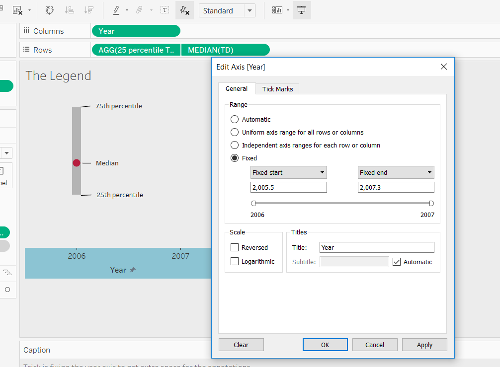
The legend was kinda sneaky. It was simple enough to duplicate the chart, filter to a single year, get rid of the extra details like grid lines and the second year pill on the columns to get things looking right. But there wasn’t enough room for the annotations. They were all squashed up. I tried a couple of things like adding a dummy variable to the collumns to create some space but this messed up the vew. Then I took a break from this for a few days and came back free from fustration and the solution became blaringly obvious. Now that I was only showing one year and i could go and edit the x axis to give me some room – fix it so that the chart spreads over a larger area.

Parameters: Finally something I know!
The parameter was pretty easy. We’ve had quite a few client projects during the DS, where we switched metrics and created dynamic titles to reflect this. Glad there was one bit I found easy!
If you’d like to join Workout Wednesday check out the #WorkoutWednesday on Twitter or stay up to date with the blog here.

