Tableau allows you to create many intricate charts, but frequently in a business environment your stakeholders want to see a simple bar chart showing total values for different categories of goods or services. In this post I would like to share a useful formatting trick we learnt from Bethany Fox in our Tableau Essentials training. For this example I’m using the Tableau default Superstore data set.
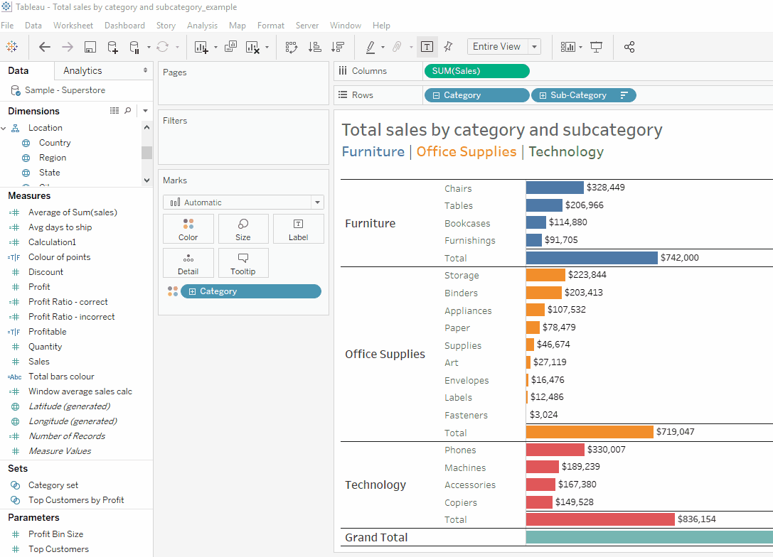
1 – Let’s start by creating a bar chart of Sales by Category and Sub-Category, sorted by the Sales field.
2 – Next, add the Category field to Colour mark on the Marks shelf. Don’t worry about changing the colours now, we’ll take care of it later.
3 – Now we need to add the totals for each Category and the grand total. You can either click on the Analytics pane on the left and drag Totals to the view (Column Grand Totals and then Subtotals). Alternatively, you can go to the Analytics menu at the top of the screen and select:
Totals > Show Column Grand Totals
Totals > Add All Subtotals
4 – Once the totals are added, we would need to create a calculated field that we will use to format the colours. Let’s call it “Total bars colour”:
IF COUNTD([Sub-Category])>1
THEN “Total Bar”
ELSE “One Sub-Category”
END
Alternatively, you can use IIF formula:
IIF(COUNTD([Sub-Category])>1, “Total Bar”,”One Sub-Category”)
5 – Add this calculated field to the Detail mark on the Marks shelf and change its type to Colour.
6 – Now you can click on the Colour mark on the Marks shelf and select the colours you would like to use for each category and totals. In this case I’m using a lighter shade for each sub-category and a darker shade for the totals.
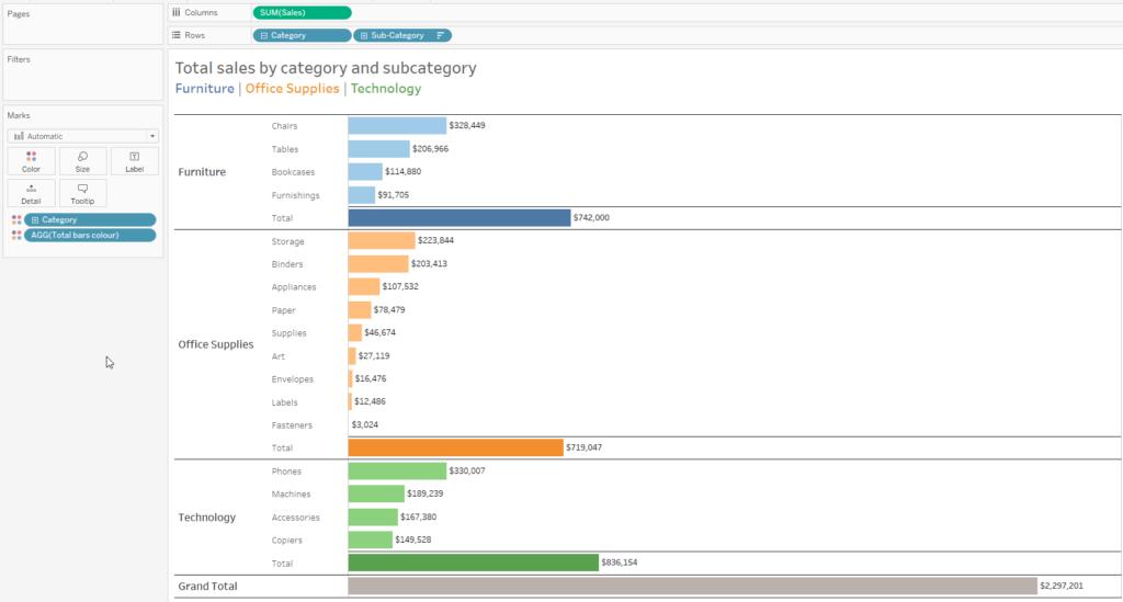
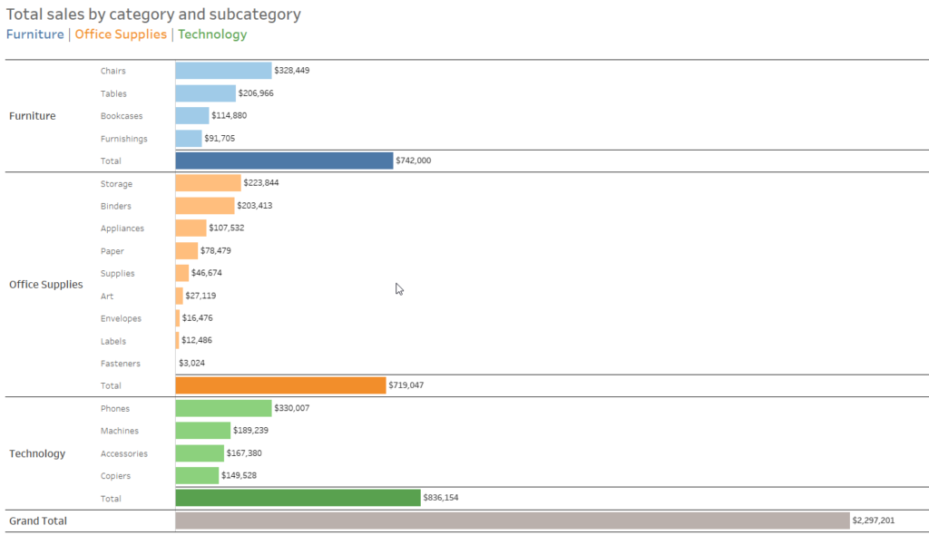
7 – Our bar chart is ready. Now we can hide headers for rows and columns, format the title, and turn off the colour legend.
8 – The last thing to do is to turn off grid lines and leave just two row dividers that will separate the categories and totals. Right click on the chart and select Format. In the Format pane on the left select the following options:
Format > Borders > Sheet > Row Divider > Pane
Format > Borders > Rows > Total > Pane
This is it. At this point your chart should look similar to the one below. Feel free to get in touch if you have any questions.