


Dashboard Week for DS17 is here, and today we looked at the water quality data from GEMStat. The task was to look at historical data from all stations within a selected continent and analyse the water quality focusing on the following parameters:
- Transparency (CLAR & TRANS in the dataset)
- Pigment (Chl-a for Chlorophyll A in the dataset )
- Temperature (TEMP in the dataset )
- Dissolved solids (TDS in the dataset )
Dataset
I selected Oceania and my dataset contained 93 stations with the data covering the period between 01/01/1950 and 06/01/2020. The dataset comes in .CSV format and is well documented. This helped greatly, however, after looking at the dataset for the whole continent I understood that only monitoring stations in New Zealand regularly collect water quality data. Because of this I decided to look at this country only.
Data prep

For data prep I went to Alteryx, where I did the following:
- Imported the data set and metadata tables to bring all relevant details into one dataset.
- Filtered for the relevant parameters: Transparency, Pigment, Temperature, and Dissolved solids. Later, I understood that I would need Dissolved Oxygen, so I’ve added it to my initial filter.
- Created points for the stations using existing Lat and Lon fields.
- Cleaned the data and changed the format of the date and time into DateTime format.
- Almost 95% of my dataset was about rivers, so I’ve filtered to river stations only.
- I also tried to get information about the actual river names so I could map them in Tableau, but I wasn’t able to find a good dataset quickly. Something to get back to after Dashboard Week…
Visualisation in Tableau
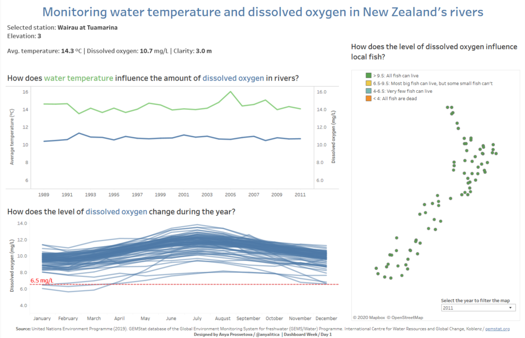
Once the data was ready, I brought it to Tableau and designed a dashboard showing how the water temperature correlates with the level of dissolved oxygen in water and how these parameters vary from station to station.
I wanted to focus on these parameters because after my research I understood that warmer temperature decreases the dissolved oxygen capacity of the water, and that, in turn, influences the growth rate and distribution of freshwater organisms, water insects, and fish. To highlight this, I coloured the stations on the map based on their measured level of dissolved oxygen and whether these areas are a healthy environment for aquatic life or not.
Link to the interactive dashboard on my Tableau Public page.
Let me know if you have any questions.