


Welcome to Day 3 of Dashboard Week. Today’s challenge revolved around public safety and transparency diving into the dataset on UK Street Crimes sourced from data.police.uk. The task was to process crime records from March 2024 to March 2025, build an Alteryx App to filter this data interactively, and finally, create a dynamic KPI dashboard using Tableau or Power BI.
The workflow may have tested my patience, but it was a masterclass in learning how to work with geospatial interactivity and large datasets.
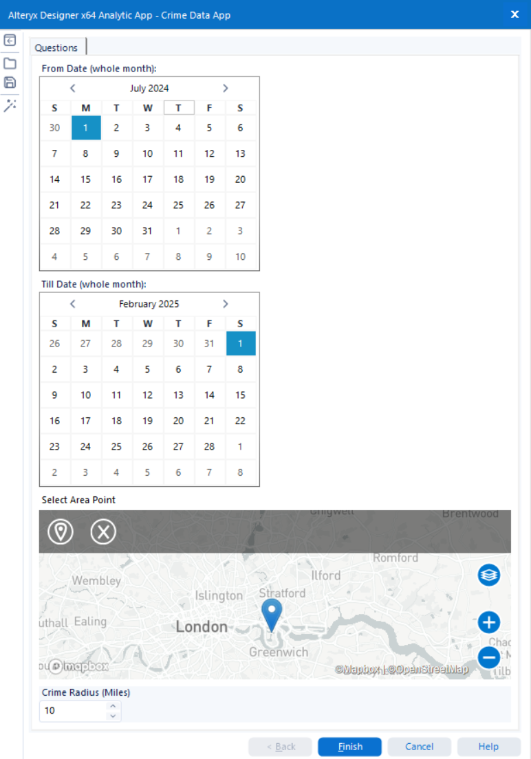
Building the Alteryx App Workflow
Our journey began with constructing an Alteryx workflow capable of handling millions of records across various months and locations. The initial dataset included both crime record files and crime outcome files, all bundled in the same directory but with different structures. So, the first step was to filter and separate them based on file names.
I then had to join street crime data with outcome data, convert date fields, and enable user-driven filtering for custom timeframes and locations using a map interface. The biggest technical hurdle? The map-based interactivity was new for me and introduced a steep learning curve in using spatial tools within Alteryx.

⏱ Lesson Learned: Handling filtering and joining after loading massive data caused sluggish app performance. Moving user-specific filtering upfront in the workflow could have saved significant runtime.
The User Interface
The Alteryx App allowed users to:
- Select a date range (between March 2024 and March 2025)
- Drop a pin on the map to select an area of interest
- Choose a radius in miles to define the crime search zone
This geo-filtered, time-constrained data then gets passed to a dynamic output file, which can be connected to Tableau, Power BI, or even synced through Google Sheets for public dashboards.
This interface was a crucial part of the experience, allowing tailored crime insights depending on what the user wanted to explore — a true self-service analytics tool.
⏱ Lesson Learned: Handling filtering and joining after loading massive data caused sluggish app performance. Moving user-specific filtering upfront in the workflow could have saved significant runtime.
Final Dashboard
Once the data was cleaned, filtered, and formatted via Alteryx, I loaded it into Tableau to create an insightful, location-driven crime dashboard.
Highlights of the Dashboard:
- 🚨 Total Crimes: 88,510 reported incidents
- 🗓️ Monthly Average: 8,851 crimes
- 📍 Most Affected Area: Newham with 15,365 crimes
- 🧭 Geo Insights: An interactive map visualising the spread of different crime categories across London

The dashboard, while rushed due to time constraints, was successful in delivering core insights clearly and interactively. Users could easily spot crime trends, review resolution rates, and visually scan affected areas — fulfilling the use case of a data-driven safety overview.
⏱ Lesson Learned: Given more time, I would have enhanced the creative design of the dashboard. Nonetheless, getting from raw data to an actionable visual report in under a day was a rewarding challenge.
Final Thoughts
Day 3 was perhaps the most technically demanding — not only because of the size of the data, but also due to the new concepts around Alteryx Apps, geospatial filtering, and dynamic dashboard integration. It pushed my understanding of user-focused analytics design and reminded us how much can be learnt and achieve in just one day.