


Today’s task took a unique turn. We were dropped straight into the dark, gritty world of one of the most revered action RPGs out there — Path of Exile. The challenge? To understand and visualise a slice of this game's player-driven economy.
Researching the Game & Economy
I’ll admit — I hadn’t heard of Path of Exile before today, so a good chunk of my morning was spent simply trying to get to grips with the game’s mechanics, terminology, and structure.
Once I dug in, it actually started to feel surprisingly familiar. The game’s economy isn’t too far removed from something like the stock or forex markets. Instead of using a single form of currency, players in Path of Exile trade using a variety of orbs and items, each with its own value based on utility, demand, and rarity.
What’s more, the game resets its economy every so often through something called a ‘league’. Each league starts with a blank slate, meaning no items or currency exist until players begin collecting and trading.
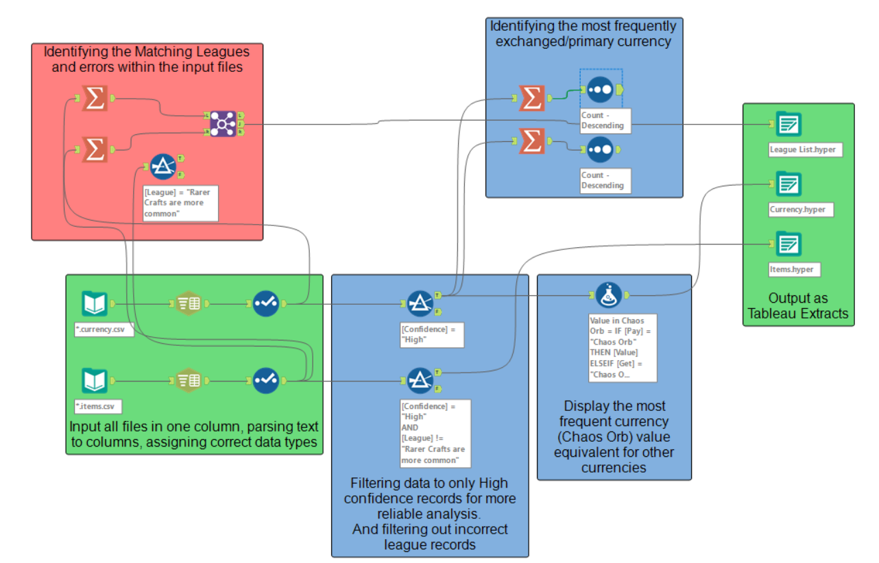
Data Download & Prep in Alteryx
Once I’d wrapped my head around the basics, I jumped into the data side of things. I downloaded item.csv and currency.csv files from a few different leagues and started prepping the data in Alteryx.
Here’s what that process looked like:
- Loaded multiple datasets from different league zip files.
- Filtered out low-confidence records to keep only trustworthy data.
- Identified the key currency, which was typically Chaos Orbs.
- Standardised values by converting all prices into Chaos Orb equivalents.
- Cleaned and renamed columns.
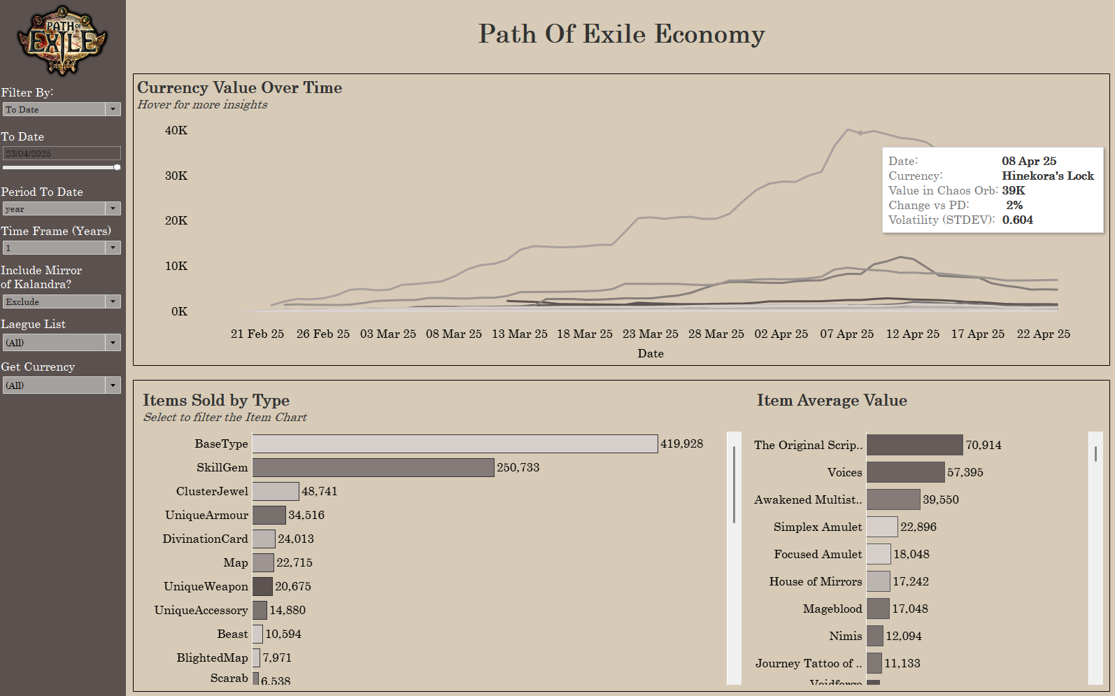
Building the Dashboard in Tableau
With clean, structured data in hand, I moved into Tableau to build the dashboard.
My goal was to help users explore the Path of Exile economy in a way that mirrors real-world market dashboards — intuitive, informative, and flexible.
Here’s what I focused on:
- Tracked standardised currency values over time with clean, interactive line charts.
- Added tooltips showing extra information such as:
- Percentage change from previous time points
- Volatility scores based on price variance
- Built charts showing the volume of items traded by type (e.g., Maps, Jewels and Weapons).
- Included average prices for items in each category to highlight high-value trades.
- Integrated parameter controls so users can explore trends across different timeframes and leagues:
- Daily, weekly, monthly, year-to-date
- Longer views spanning 1 to 5 years
This gives users the freedom to explore short-term spikes in demand or look at longer-term market trends across different leagues.
Reflections
This might’ve been the most creatively stimulating day of Dashboard Week so far. What started as a deep dive into an unfamiliar fantasy world turned into an exercise in economic reasoning, data cleaning, and intuitive design.
This dashboard could serve as a resource for players looking to maximise value in trades, or even for developers interested in how digital economies evolve over time.
Another fun and fascinating challenge in the books. On to the final Day 5 tomorrow!