


Today marked Day 5 of Dashboard Week, the final challenge of the Data School training. With the main training period now coming to a close, the next step is moving into client placements as a data consultant. It's been a transformative few months of learning, experimenting, and growing — and this last task offered the perfect opportunity to end on a high note.
The Brief: NASA API Challenge
The task was to explore one of NASA’s open APIs and create a dashboard based on the data. Out of the various options available, I went with the Near Earth Object Web Service (Neo - Feed), an API that provides details of asteroids approaching Earth within a seven-day period. Given the fascinating nature of the dataset, it felt like the right choice to wrap up the week.
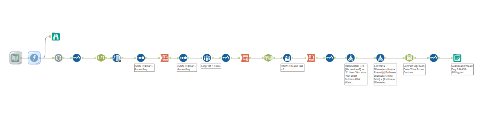
Getting the Data: Alteryx Workflow
The process began with building a workflow in Alteryx to connect to the API, retrieve the data, and convert it from nested JSON into a flat, usable format. The selected date range focused on the week surrounding New Year’s Eve, inspired by the idea of presenting incoming asteroids as “space fireworks.”
Once the structure was flattened, the next step was to extract and clean key fields, including:
- Name
- Close approach date
- Velocity (km/h)
- Miss distance (km)
- Estimated diameter (min, max, and average)
- Whether the asteroid was hazardous
- Whether it was on NASA’s risk watchlist
Additional calculated fields were added for creativity and storytelling, such as:
- An estimate of how many average-sized humans could stand on the surface of each asteroid (based on diameter and area)
- Size groupings with playful names like Pebble in Space, Space Potato, Astro Nugget, Orbital Menace, and Doom Bringer
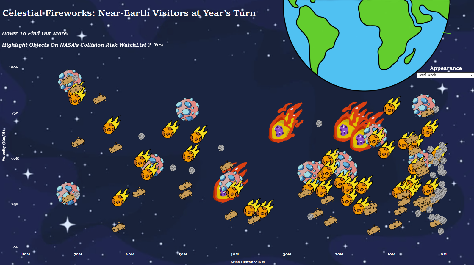
Dashboard Design: Drawing the Cosmos
Rather than take a traditional visualisation approach, the dashboard was designed to be more imaginative for the final day. I drew all visual elements by hand including the asteroids and The Earth — and brought into Tableau as custom shapes / background images.
These shapes were plotted on a scatter plot with:
- Miss distance from Earth on the x-axis
- Velocity on the y-axis
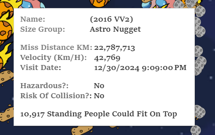
Each asteroid was positioned next to the Earth drawing, grouped by size category, and displayed with interactive tooltips. The tooltips showed key information such as:
- Whether it’s hazardous or on NASA’s watchlist
- Estimated surface area (in “how many humans could stand on it”)
- Approach date, name, speed, and more
A parameter filter was also added, allowing users to switch between viewing all asteroids for the week or only those arriving on New Year’s Eve — turning them into symbolic space fireworks.
Lastly
It’s been an incredible experience at the Data School, and there’s a huge sense of gratitude for all the brilliant coaches, supportive colleagues, and my cohort that made it all so enjoyable. There’s now real excitement about heading into placements, working with real clients, and applying everything that’s been learned to help solve problems with data.