


If there is one thing you need to know about me, it is that I LOVE coffee, and let's just say this affinity towards coffee often results in my desk space getting progressively smaller throughout the day due to the number of mugs I collect.
So when we were tasked to complete this Workout Wednesday [Link]. Safe to say... I was intrigued.
During one of our Power BI sessions, we learned how to create parameters and slice the data in an interactive way, and this challenge. helped solidify this process for me.
If you are struggling with parameters in Power BI/ or just want a refresher, this blog may help!
Consideration
There are a couple of end goals we need to be aware of before creating parameters in Power BI.
The first is
1. What do we want the parameter to do?
In this case, we want to use a parameter to update a calculation, which in this case is the calculation "Total Caffeine".
2. Where else will this Parameter be used?
For the current example, we will be updating the result of the Total Caffeine calculation, so users are able to dynamically see how much caffeine they are taking based on the number they enter.
- Is there any other ways the user may want to interact with our visualisation?
Yes ! For this visual. We want our users to be able to choose the drink they want to see from a drop-down. And this will affect the total caffeine shown in our bar chart. [This won't be covered in this blog, but a little hint: have a play with a slicer visual, see if it affects your chart in any way!]
Now that we are clear on the potential ways the user will interact with our visual, let's take a look at what we have.
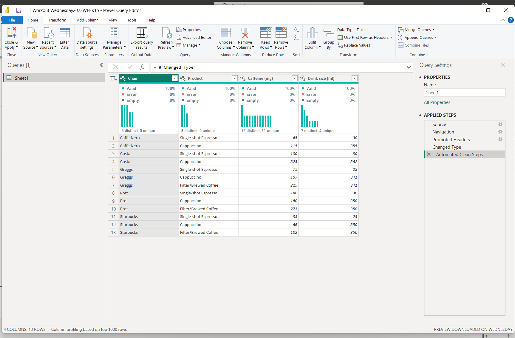
When we first load in our data and open up Power Query, we see that each record represents the Drink Size and the amount of caffeine in a product ( type of coffee) from a specific Chain.
After building out the Initial Bar chart, let's see how we can create our parameter.
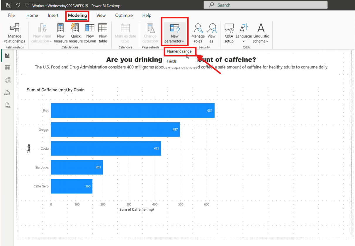
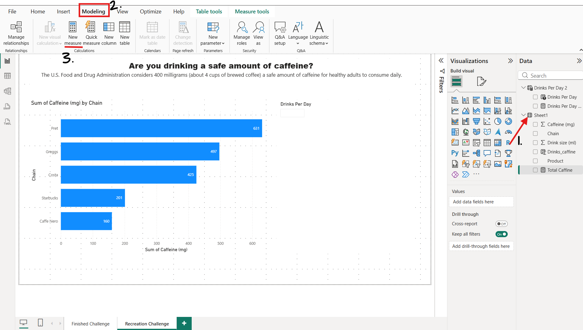
Once you have clicked on the canvas, click the modelling tab. Within this tab, you will see a new parameter element in the ribbon, select the drop-down and choose Numeric range.
This should then open up a pop-up window as follows.
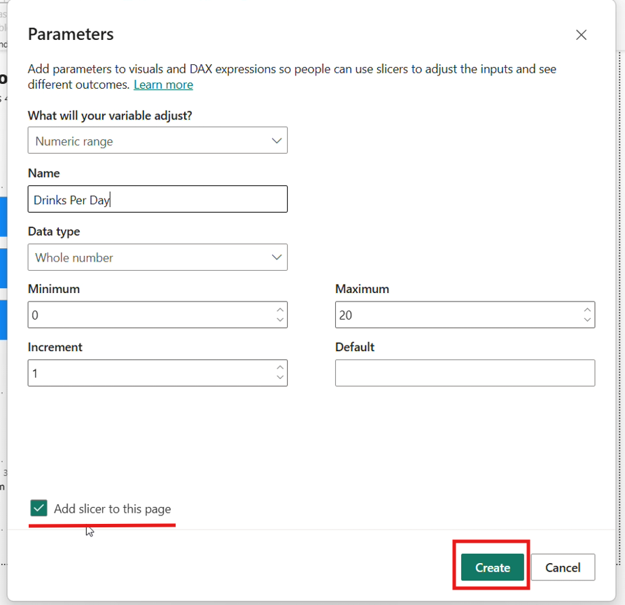
For this Challenge we would want to choose 'Numeric Range'. Make sure the "Add slicer to this page" is ticked as well!
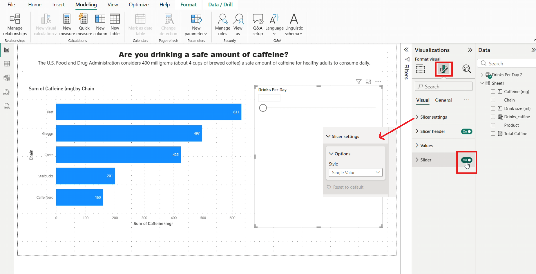
Once you have created the parameter, there should be a slicer on your page now.
For this specific challenged make sure to head over to your Format visual pane > Slicer Settings > Options and then select Single value. Then also turn off the slider setting at the bottom.
These are specific format settings for this challenge, but have a play around with the formatting settings here!
Creating the 'Total caffeine measure "
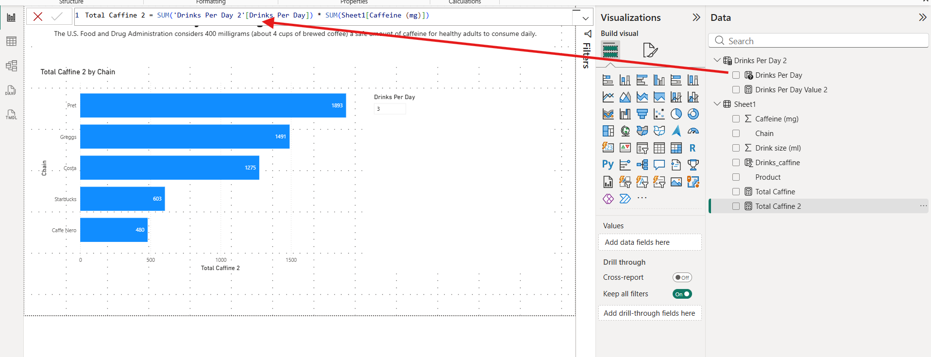
Now we have the parameter, we can use it to create a measure!
Once you have opened up the Formula Bar, write the following DAX code.

Notice that we are using the value returned from our parameter
Now lets add this measure to the X axis of your bar chart
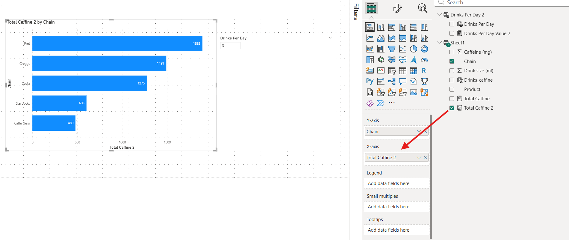
You are now able to enter a value, and it will update the count shown in the Bar Chart!
Next steps towards the solution are as follows:
- See if you can add a slicer to segment the displayed data into drink type.
- Add a reference line to the chart and only colour the chains that are above the safety limit.
Hope this blog was helpful!
See you in the next one :)