


This week's Workout Wednesday was all about creating progress bars in PowerBI.
Progress bars are a useful visual tool used to represent progress towards a goal or a target in a way that is intuitive.
Some key reasons are:
- Easy to read: Even non-technical users get the idea instantly.
- Compact: They take up less space than multiple KPIs or cards.
One thing I learnt from this challenge, was that you can use Error bars at the end of each bars to make them rounded.
Using the analytics section in the analytics pane to add these.
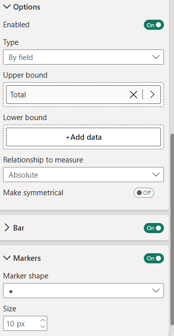
By changing the marker shape to a circle then doing some formatting of the size of the bar it will leave you with a chart like the bottom right.