


Today marked the beginning of DS53s Dashboard week, a culmination of the 16 weeks of training we have received here at the Data School.
Lorna kicked off this week with the following brief:
Today’s challenge was set by the Fabric Data Days Dataviz Contest. Creating a visual CV / Resume in Power BI.
Task
- Create your own CV dataset
- Build a visual CV in Power BI
- Publish to Power BI Service
- Make sure to follow the rules as above
- Submit your entry in the contests gallery
- Presentations will be at 3:30pm
Time Plan:
I began by giving myself a time plan to stick to, to ensure that all the tasks were completed by the deadline.
9am-10am
- Research Visual CVs on PowerBI and Tableau Public to find inspiration
- Research CV datasets to see best format
- Start building dataset and sketching data model
10am-10:45
- Chart options and Sketching
10:50- 12pm
- build build build
12pm-1pm
- lunch (hopefully)
1pm-3pm
- finish building
- blog and format
3pm-3:30pm
- presentation preparation
Research and Inspiration
I then began to look for inspiration and advice on the best way to approach this task. Below I've outlined the key takeaways I had from each of these websites.
https://www.datacamp.com/blog/9-power-bi-dashboard-examples
- simple and decluttered
- use a grid layout
- collect data
- job roles
- projects
- tools used
- duration at each company
- certifications
- industry exposure
- key metrics
- chart ideas
- work experience timeline
- tech stack usage (pie/heatmap?)
- certifications over time
- Skills word cloud? - is this possible on PowerBI
- KPIs
- years of experience
- tools ‘mastered’
- Companies worked with
- Total projects delivered
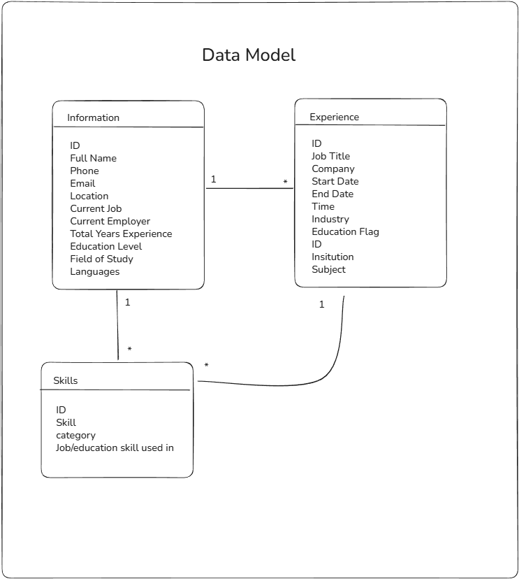
Sketching: Data Model and Dashboards
Given the brief was set to be completed using PowerBI I took some time to sketch out some tables and a data model with the cardinality. During this process I also started to think about the charts I wanted to build and what shape the data needed to be in.
I eventually settled on data model that looked like the following:
I then sketched a very basic dashboard sketch, beginning to think a little about design, something I want to implement into my sketches as the week progresses.
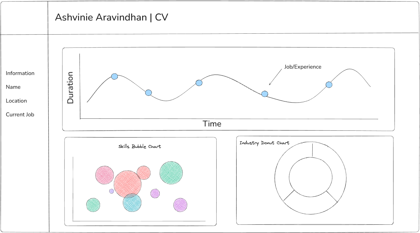
Given the limited time we had to build this dashboard I wanted to ensure I was able to complete all the charts I set out to build, so settled on a simple dashboard design showcasing the topline information from my CV.
The Dashboard
I then took to PowerBI to build out my sketch and my data model.