


The second challenge DS53 were tasked with in dashboard week was looking at various accessibility requirements. We were each able to choose a brief addressing a specific use case and accessibility requirement and asked to design a dashboard to present with that user in mind.
The Brief
This project focused on a common, yet often overlooked, user: Chloe from the Mayor's Office. Chloe is an intelligent planner, but she lives with dyslexia (affecting reading/text processing) and dyscalculia (affecting number sense/calculation).
Her problem is highly relatable: Standard city planning dashboards are often unusable. They are dense, full of confusing acronyms, rely heavily on colors for meaning, and require complex mental calculations to interpret percentages and rankings.
The objective was to transform raw attraction data into a usable, low-cognitive-load tool for a neurodivergent user, specifically using the London Attractions dataset in Power BI.
Initial Research
My initial research quickly established two key areas of difficulty for Chloe:
- Dyslexia: Struggles with dense text, small or stylized fonts, high visual clutter, and decoding blocks of information.
- Dyscalculia: Struggles with numerical comparisons, interpreting percentages, converting large numbers, and understanding abstract numerical relationships (like rankings or time-series data).
The solution had to solve for both, minimizing both reading effort and complex calculation.
Demonstrating Usability Improvement
| Feature Type | Legacy/Standard Dashboard | Inclusive Dashboard Design | Usability Improvement |
| Rankings (Dyscalculia) | Table with numerical percentages and rankings (e.g., 87% "Good") | Icon-based ratings (e.g., ⭐️⭐️⭐️) and simple descriptive text ("High Accessibility") | Reduces calculation effort and abstract numerical interpretation. |
| Layout (Dyslexia) | Dense grid of 10+ visuals, complex legends, small fonts | Grouped sections, large whitespace, clear section headers, 12-14pt font | Minimizes cognitive overload and visual tracking effort. |
| Labels (Dyslexia/Jargon) | Acronyms (e.g., "SFA," "YOY"), technical terms | Plain English (e.g., "Step-Free Access," "Change from Last Year") | Eliminates decoding and ensures immediate understanding. |
| Filters (Cognitive Load) | Sliders, long list-boxes | Drop-down selection, single-click buttons (Toggles) | Cleans up the interface and guides the user to the correct input method. |
This process ensures the resulting Power BI dashboard is not just visually appealing, but fundamentally usable and inclusive, allowing Chloe and other staff members to focus on city planning, not decoding data.
Structure of my day:
10:55-11:20
- understand brief and do some research
11:25-12:30
- user stories and sketching
12:30-1:30
- lunch
1:30-3
- build and format
3-3:30
- blog and presentation prep
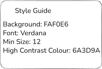
Sketch and Style Guide:
I then began designing a sketch to present the insights from the data in doing so, I was able to map out the real estate needed for each chart and ensured there was clear sign posting.
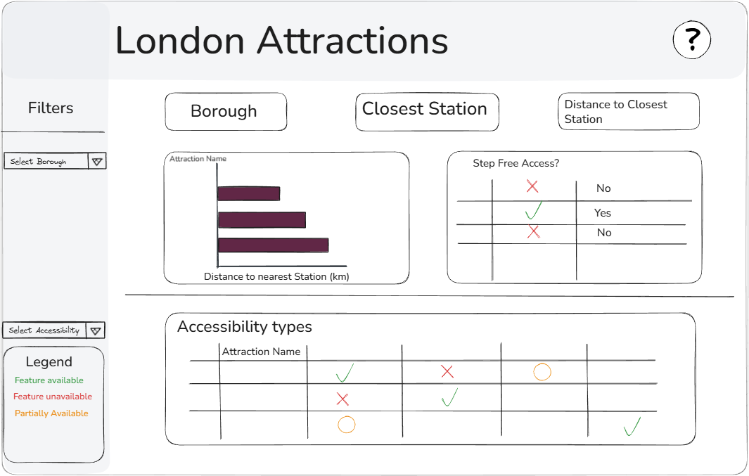
I then made a note of some style guidelines I thought would be good to follow.
The Dashboard and Feedback:
- Make the filters both dropdown to increase real estate and improve readability.
- Show the stations within a reasonable distance to the attraction selected to show user if there is step free access at another station near by.