Today's challenge for Dashboard week was to tackle The Data Lab Data Visualisation Competition 2025 brief. The goal was to create a compelling visual story on the co-benefits of climate action using the UK Co-Benefits Atlas dataset, focused on clarity, persuasion, and insight.
Time Plan:
9-10 : Go over Brief, get data and begin exploring.
10-10:30: Research on the atlas infographic styles
10:35-11:35: Sketching and data prep (plan)
11:35-12: Data prep
12-12:30: Lunch
12:30-3: Build and format
3-3:30: Presentation prep
The Data and Prep: Total Modelled Co-Benefits
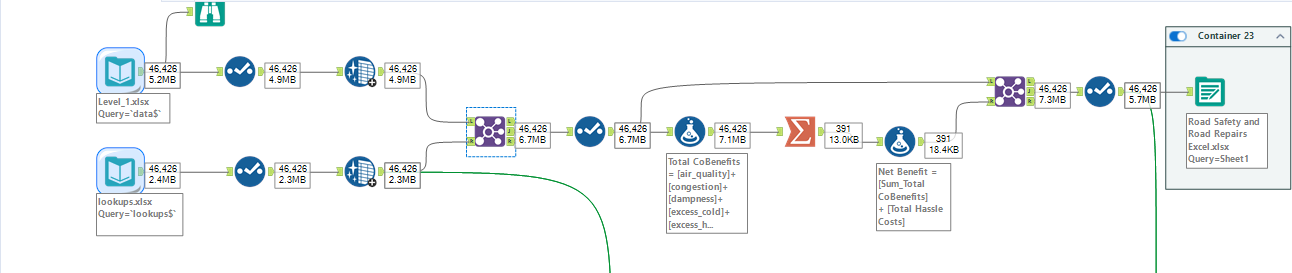
To maximise impact and minimise preparation time, I utilised the Level 1 dataset. This dataset included the total monetized value across the entire 25 period (2025-2050). This simplified the data structure, which was key to completing the project under the tight deadline.
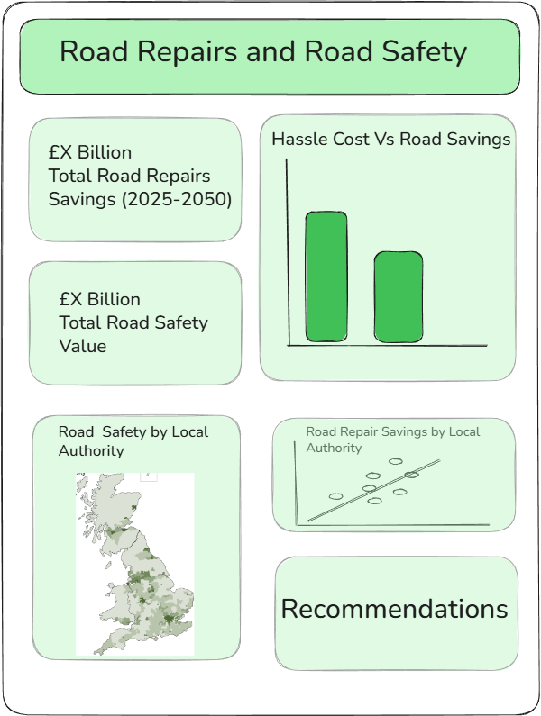
Sketch:
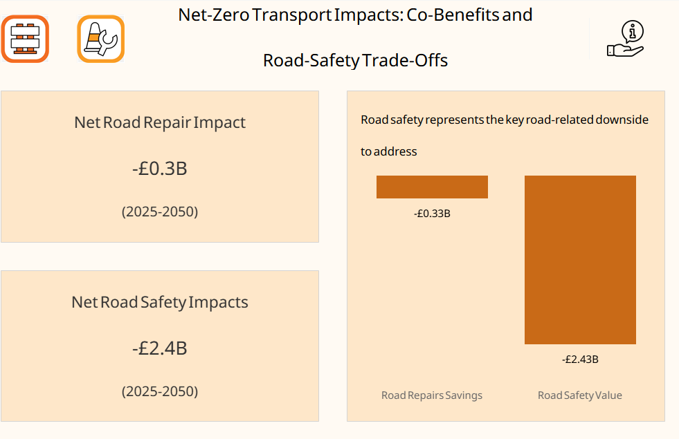
Despite a well-laid plan, the practical execution of the dashboard required crucial pivots. When initial visualizations failed to deliver the sharp, impactful monetary story needed to persuade Local Councils, I quickly switched the core categories being compared, settling on the high value, direct cost savings derived from Road Repairs and Road Safety to maximize persuasive power.
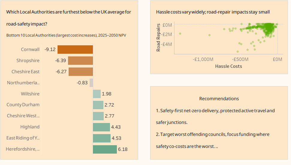
Some technical hurdles with Alteryx prevented a crucial join of the spatial data needed for the planned UK map. Recognizing the tight deadline, I made the pragmatic decision to replace the map with a high impact, actionable Worst Offending 10 Local Authority ranking list, ensuring the key message which councils stand to save the most was still communicated clearly and effectively, maintaining the focus on insight over perfect data integration.
The Dashboard