A common frustration for Tableau users is dashboard clutter, reports crammed with multiple charts that all look the same, just showing a different metric like Sales and another for profit. This isn't just an aesthetic issue; it creates a confusing and overwhelming experience for the end user.
This is where using a measure switch will come in handy. By using a simple parameter, you can give your users the power to select the measure they want to see, instantly transforming a static, messy dashboard into a clean, interactive analytical tool.
Step-by-Step to achieve this yourself
- First create a parameter:
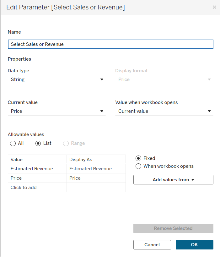
Note: ensure what is typed in the values boxes matches exactly as the field already there such as capital letters or trailing spaces
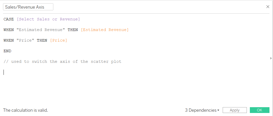
- Click show parameter and create a calculated field:
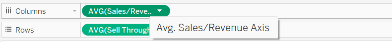
- Then use this calculated field in either your rows or columns field:
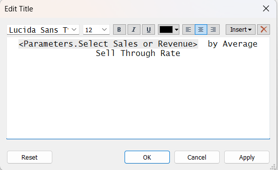
- To make the title dynamic and show what the axis is showing, use the calculated field to change when the measure is selected.