


The first day of our dashboard week was looking at accessibility. We were tasked to choose a specific type of design to accommodate for people who may usually struggle to use dashboards. This could be universal or inclusive design. The data we were given was pothole and footpath damage in the Glasgow region. We were tasked to design a customer facing dashboard so users could get information out of the dataset.
After being told by various outlets that time management is a big deal this week, I decided to plan what I was going to do and to journal what I did by each hour. It really helped me understand the scope of what I could do and stopped me from over-promising things.
9:00 - 9:30
I started by looking at the dataset given on Tableau Prep, understanding what the data was saying and starting to try and put myself in the shoes of a customer and what they would want to do with the data. I spoke to Louisa, who set us todays challenge, to make sure I was on the right track. This helped me build out the user story. I also looked at potentially giving a user an option to report an incident, however after a bit of googling I realised this was out of reach with time constraints and also may have taken away from the main brief, which was to make a dashboard accessible.
The user story of my dashboard was for a member of the public to be able to locate pothole and footpath issues on a map, so they could plan better routes, or avoid certain areas. If the data was updated, this could be really useful for people with mobility issues to avoid problems on their commutes, especially if they could check in real time.
9:30 - 10:00
After completing the user story, I decided to dedicate the accessibility options to someone who may have problems with dexterity, due to building a dashboard around mobility problems. This meant getting the dashboard to be useable without a mouse. I made a version for the phone, so it could be used in a way a user may be familiar with. It also required large text and clear labeling, with captions so a narrator could speak instructions out to the user. Time was used researching the best methods to aid someone with dexterity issues. I attempted to downloaded (and redownload) Funkify for inspiration, which simulated a webpage with specific disability issues, but unfortunately it wouldn't work and had to move on.

10:00 - 10:30
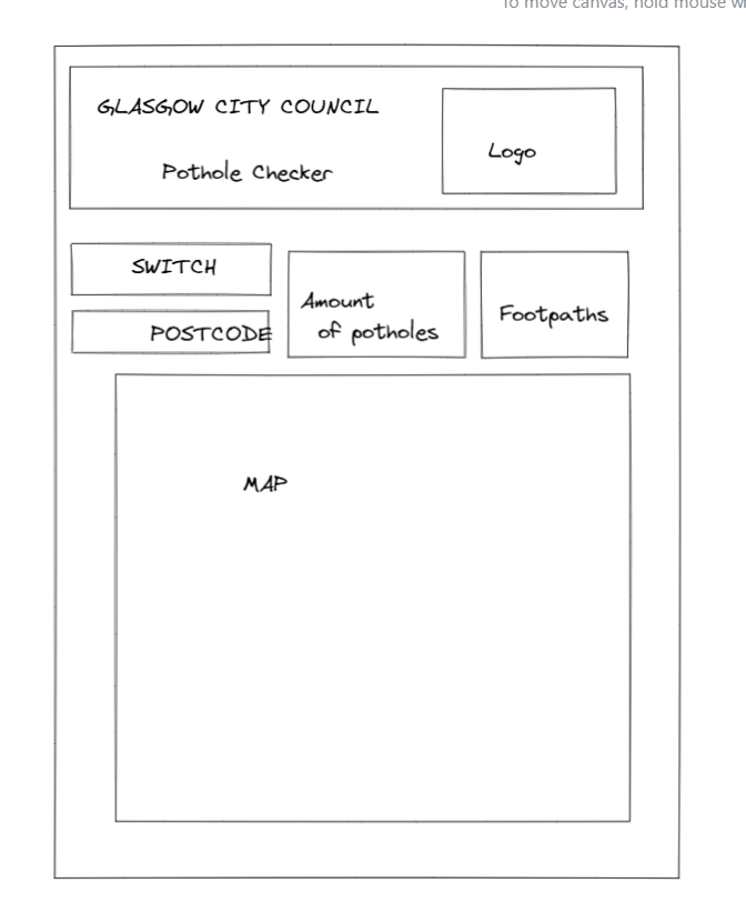
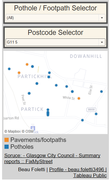
After a quick break, I started to design the dashboard on Excalidraw. I decided to make the map the main focus of the dashboard, not to overwhelm a user. I added two KPIs so a user can get a general insight on how the whole pothole problem is changing over time (when logging into the dash again). There were filters added in for the user to select either potholes or footpaths, as well as choosing specific postcodes for a closer view. It was important that the map was not explorable due to the interface being quite hard to navigate even for a user without dexterity issues.
10:30 - 11:30
It was time to start creating views. Bringing up the incidents on a map, changing map layers and options. I washed out the background and changed it to satellite view, whilst taking some of the layers off such as houses. This is to still give the user familiarity, but so it wasn't distracting from the datapoints. I started creating KPIs for the total amount of incidents.
11:30-12:30
I started formatting a dashboard with the charts I had made. I found documentation on formatting directly from Glasgow City Council with official colours, spacing, and requirements for accessibility.
When using the filters for postcodes, the postcodes often only had one incident, which didn't correlate with my user story. I used Tableau Prep to split the postcodes after the second number identifier with REGEX. After a bit of revision and a play on regex101.com, I found a formular to trim the last two letters of a postcode.

13:00 - 15:30
After food and a break, it was mostly about making the dashboard perfect. I continued the formatting, made sure the tabbing worked on Tableau Public. I added an information button found from the internet and updated the shapes file in Tableau repository. The instructions were hidden in a caption so a narrator could read the instructions for anyone struggling to read. The words were made a font size of 1 and the same colour as the background so they couldn't be seen. The KPI calculations had to be added to the title of the KPI worksheet so narrator would be able to read it aloud.
Once completed, I made the dashboard in a mobile view so this could be used on the move, as well as to aid users who are better suited to use their phone.

Once the dashboard was competed and uploaded to Tableau Public around 14:25, I used the journal to write up this blog post.

Next time, I won't try and squeeze in extra requirements if I have time remaining. I did this with narration on this dashboard and I think that this watered down the use-case. This time would have been better used to drive home accessibility features for the specific use case, or it could have been used to add more features, such as a download button for the data.
Overall, I was happy with the outcome of the dashboard. It hit the user story and I did it without stressing (too much) about time restraints. Good start to dashboard week. Let's see what the synopsis is on Friday. Stay tuned.
Link to the dashboard:
Potholes - Glasgow City Council - Accessability | Tableau Public