


Today's task was again about analysis. We were asked to look at historic museum data and come up with insights and display them in the best way. No dashboard required but design of charts best for analysis was.
There was reading which helped guide the analysis. Soon after I read this, I decided to start prepping the data on Tableau Prep. I took out fields I wouldnt need as well as splitting columns to get the right opening and closing dates for different museums.
When planning the visualisations, I looked at Birkbeck's own visualisations to see where I could improve them. They were all bar charts which were pretty similar. Today's task involved using different chart types apart from bar charts.
I decided to plan my day by the half hour, making adjustments to timings due to yesterdays project. Today I decided to bring forward my plan from the day before, to leave time for any iterations I may need to do once the dashboards had started to be created.
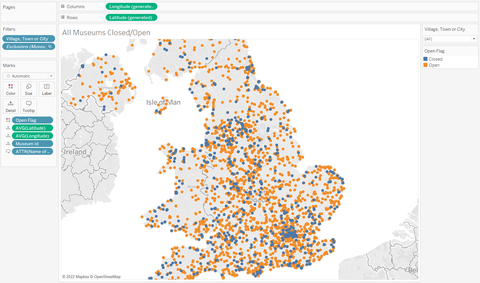
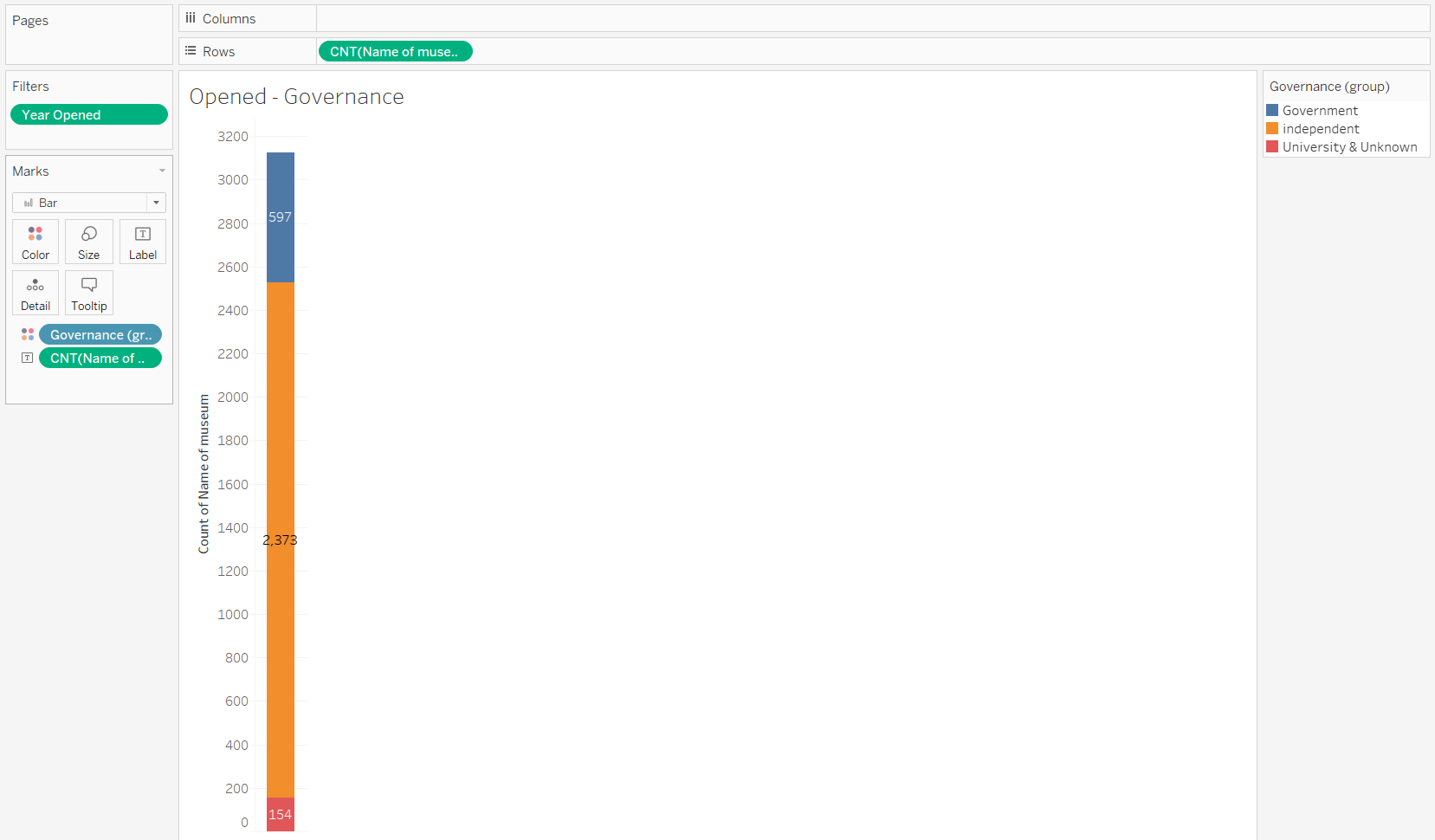
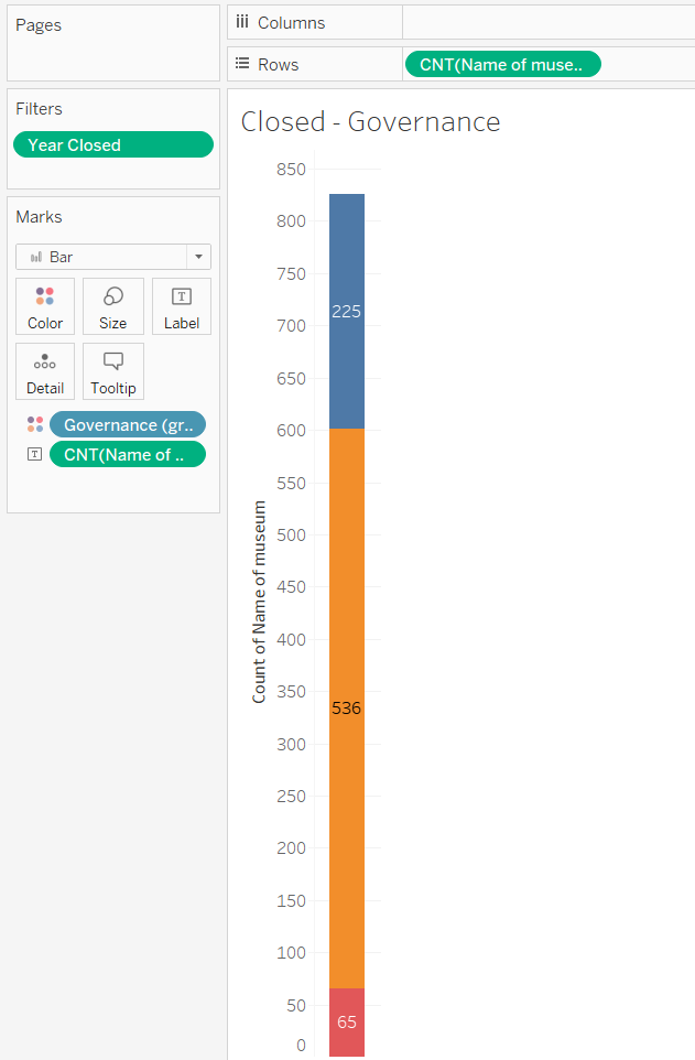
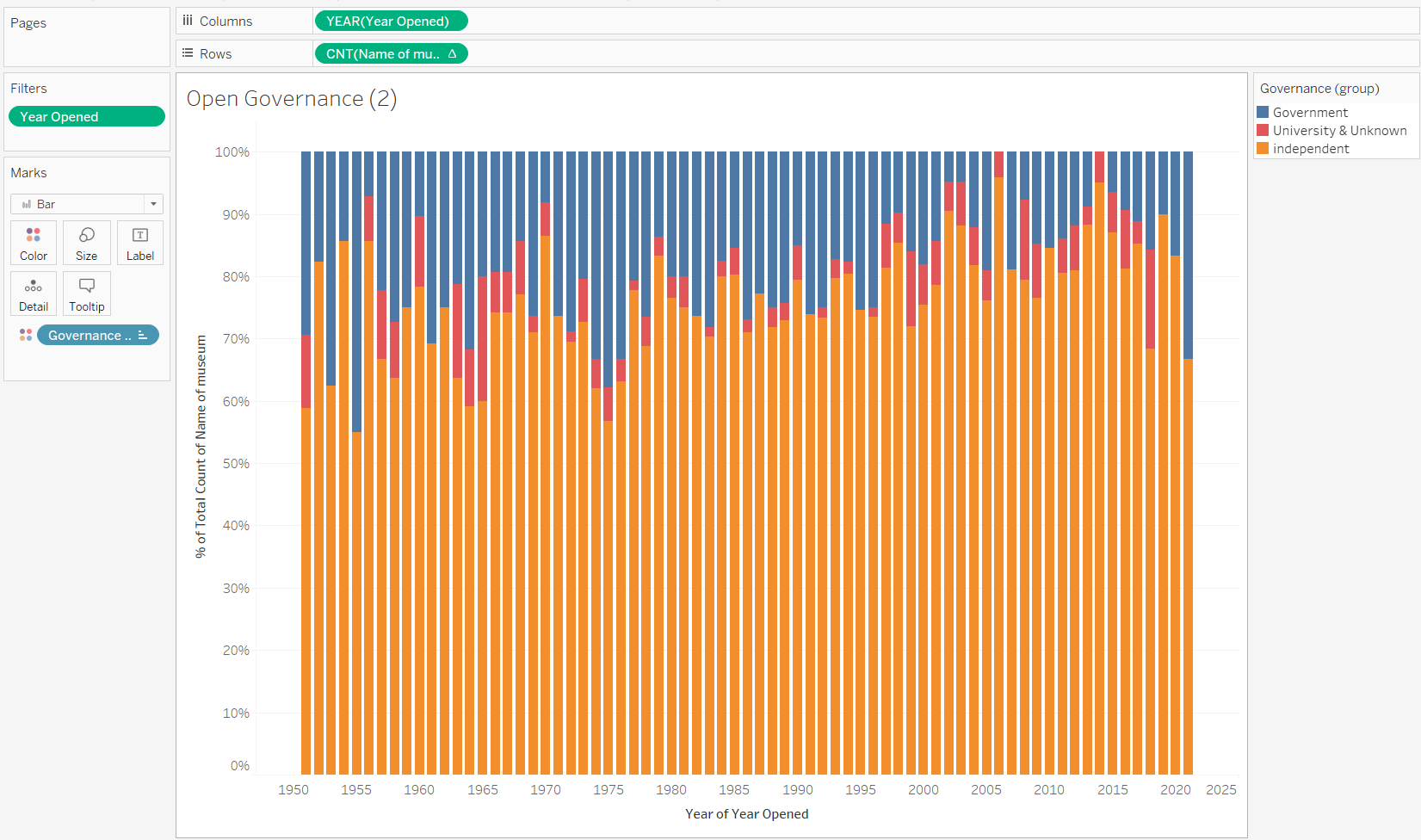
I decided to look for where the most museums had opened/closed. I also looked openings and closings over time. For a further bit of analysis, I decided to look at differences between independent and government-funded museums.
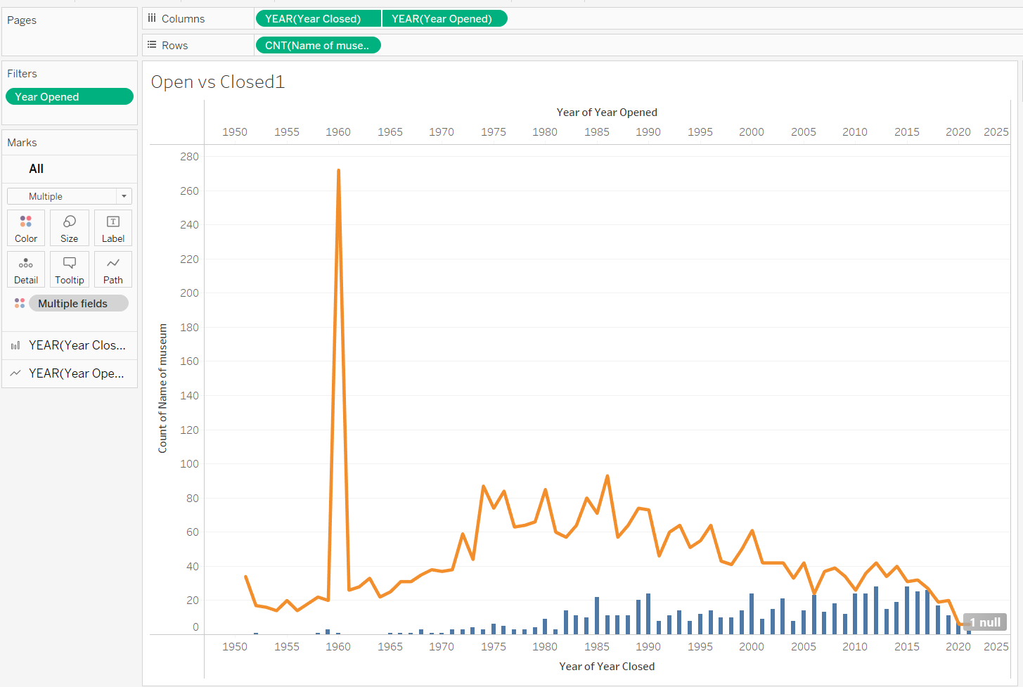
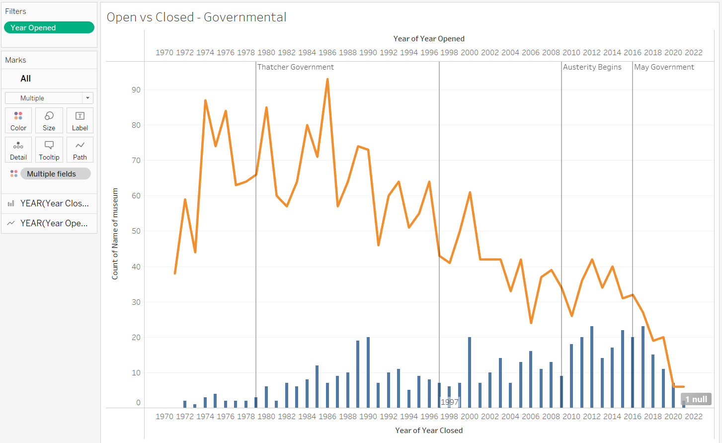
I noticed a spike in 1960, and various moments in time where there were increases or decreases in the opening or closing of museums. By splitting opening and closing museums and colouring by either independent and government funded, I could understand that there wasn't a particular trend of governance linking to closures or openings.
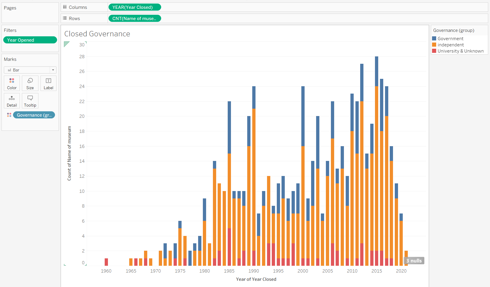
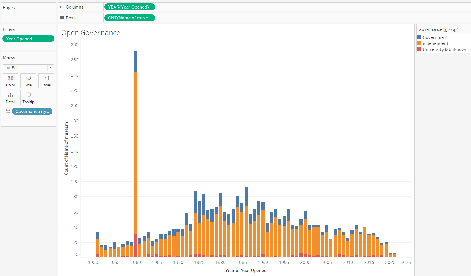
Totaling the count of museums over time further proved this, shown by these charts, as the ratios are similar.
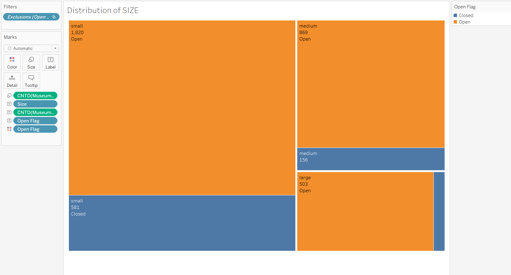
I then decided to see if the size of the museum effected the amount of openings or closures. I decided to use a tree map for this to understand the ratios between each category clearly.
After doing some extra research on the spike in 1960 and the increases in openings/closings, I couldn't find much. I noticed some of the changes in rates of openings/closings matched up with the changes in government. I decided to find out when each government came into power and use reference lines to mark this out.
This pushed me onto a path of wanting to understand different indexes of areas. I decided to see if the majority of opening or closing museums were in areas of particular deprivation.
I used deprivation indexes I believed would be influential, such as income, employment, services and education, as well as the general index. This resulted in 5 charts which looked very similar, and told a similar story.
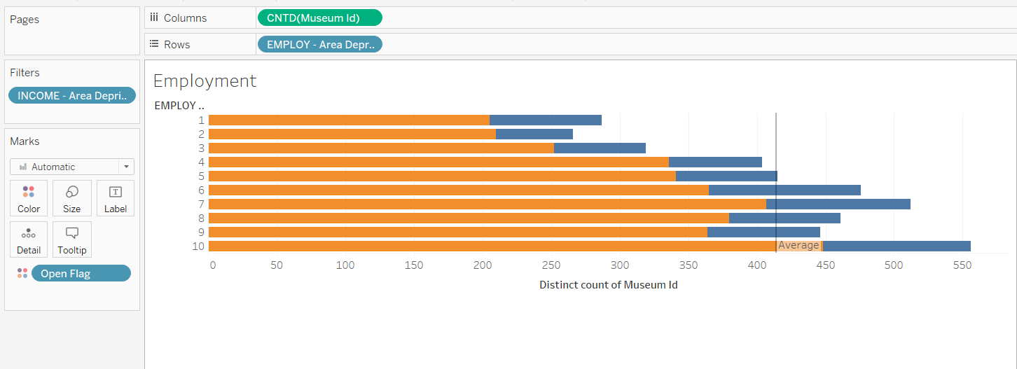
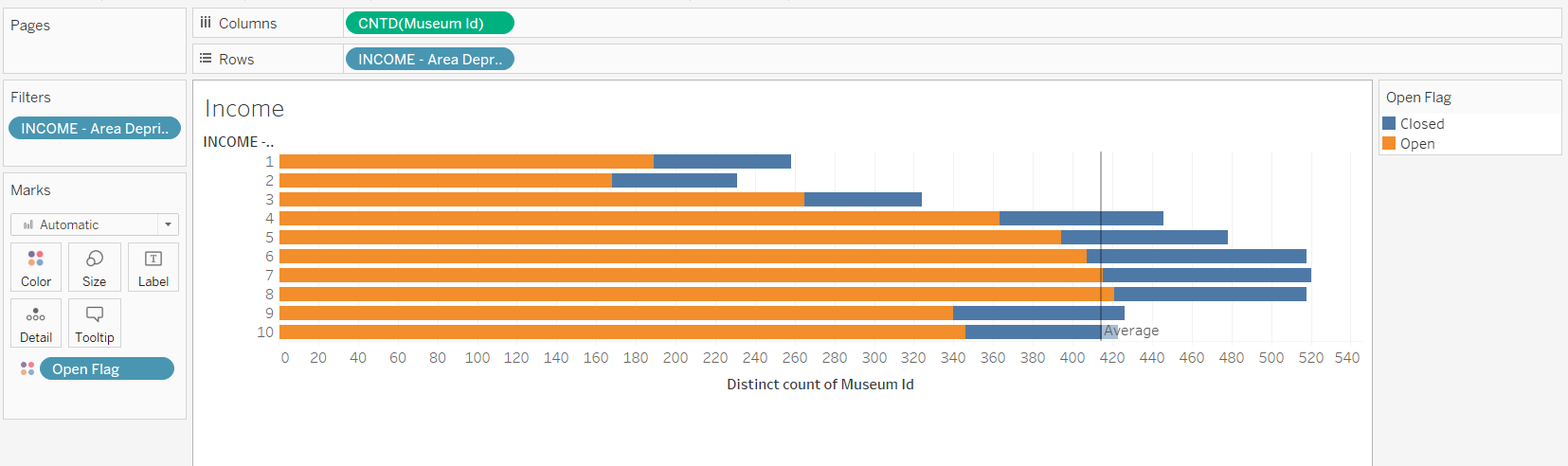
Rates between opening and closing were similar, regardless of index, however there was an obvious trend to certain levels of deprivation and the total amount of museums these areas had.
This was another place where I could have drilled down into the analysis further to get better insight from the data. This opened up many more questions which unfortunately, due to time (management), I could not go further on.
Looking back, I realise that my analysis was too broad. This was okay in the start to get a real understanding of the data and the many ways I could start tackling the analysis, but due to time constraints and a lack of definitive story, I should have really stuck to just doing analysis on some of the points I found interesting. For example, more analysis focused on 1960, or particular areas around the times of change in government. I didn't drill down into the analysis and kept it at an overall level, which left my analysis too thin.
By spending this time on extra analysis, there were certain charts which I could have slightly changed to make analysis more clear, which was a missed mark. For example, when using the bar charts to understand changes in ratio, a % of total stacked bar would have been more efficient.
Next time, I will spend more time on the analysis until I find a point worth exploring, then stick to it. Duplicating sheets and changing the charts to get the analysis needed. Opening Tableau earlier would encourage me to do this, instead of trying to go through a system of finalising and moving on, never to return, ie, data cleaning. This will leave me any extra time to go back over choosing the best charts, instead of undertaking more, surface level analysis, or having time to change my analysis or go back into the data prep stage without time constraints.
Overall, the last two days have highlighted where I need to spend most of my time getting better at finding insights. The word used should be 'practice'. These short tasks really replicate what Andy does in his Makeover Mondays, so I will be joining him on tackling these in the future.
Beau Foletti | DS33