Today's task was different to yesterday's task of accessibility. There were no requirements on design, not even a requirement for a dashboard. Today was purely about analysis.
My task was to look at wine data collected by the University of Adelaide. There were a lot of datasets and tables. A lot of the data needed to be cleaned before bringing into Tableau.
This meant the plan would be different from yesterday. Today research, data analysis and cleaning took me up until lunchtime. Without the task of creating a well-designed dashboard, building the worksheets to firm the analysis was my only task from noon to 3pm.
Before jumping in and cleaning the data, I decided to do some research around the data that Adelaide University provided. I then took a brief look at what each of the datasets were showing and decided on a few themes of my analysis which cut down a lot of the tables needed to use. This really helped me focus for the rest of the day and stopped me getting dragged into things I didn't have time for.
I made a list of questions to answer, which ranged from differences between Old World and New World wines, which countries produced the 'Prime' wines and how their production changed over time. I also added some supplementary data on wine consumption, so some comparisons between countries highlighted by the initial analysis could be made.
When cleaning the data, I decided to use Tableau Prep. There was a lot of data cleaning techniques that I didn't feel 100% comfortable with, especially with the time constraints. Tableau Prep's data interpreter really saved me a lot of time to get a basic, usable dataset. It didn't clean the data completely but with some renaming of fields, I could get the data into a usable state. It did however highlight that I do need to spend some time getting more familiar with the data preparation side of the job.
Once I had explored the data, had a cleaned dataset and a list of questions to answer, I started to try and answer the questions on Tableau. From spending a lot (maybe too much) time on exploring the data and finding the questions, I already had a good idea of what I needed to do. This made it easy to quickly work through the questions, with minor amount of problems. Saying this, I didn't get to complete all the questions, but I felt like the questions were focused, and despite not having a dashboard, there was a clear data story to the analysis I had made.
The charts were not the nicest to look at, or the easiest to navigate. If I was to do this task again, I would plan out 15-30 minutes just to round off any particularly sharp edges, such as axis formatting, colours and sorting charts.
When creating charts, I duplicated sheets and changed measures freely. I essentially asked that 'What, Where, Why, etc.' multiple times with different charts and measures. I believe this was very helpful in finding the best charts, though I did have a lot of charts which I didn't use.
One thing I will try to do for the rest of the week, is to finish slightly earlier and use this time to review and do a short plan of my presentation. Clarity when presenting can make or break some charts. I also think I could have spotted some of the feedback given myself with 15 minutes at the end of the day.
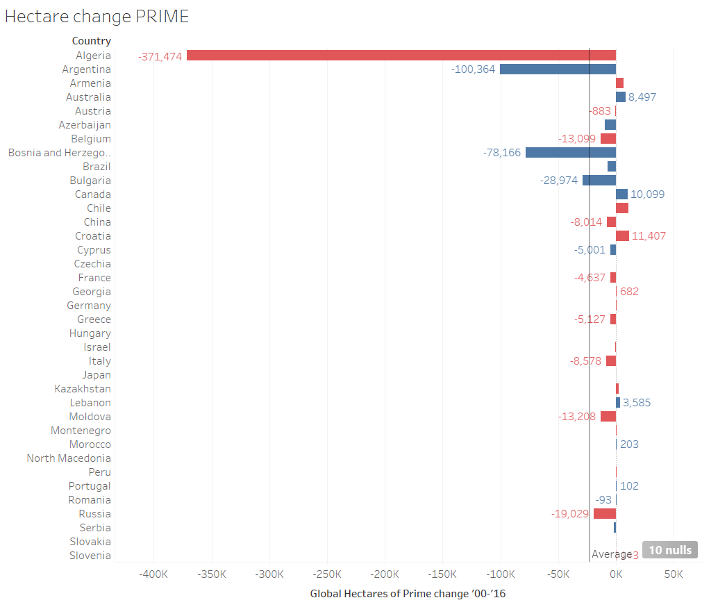
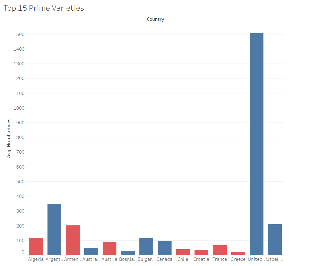
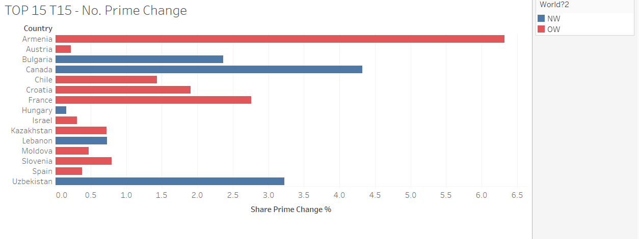
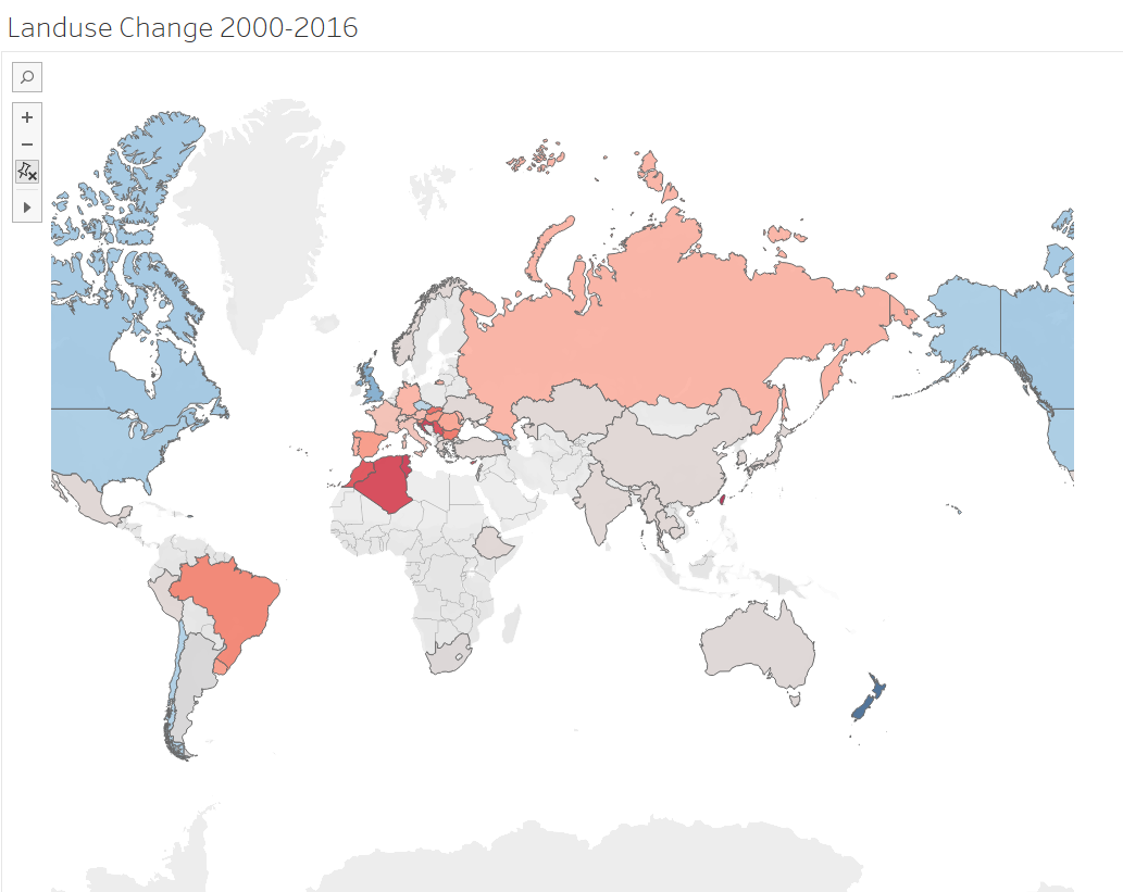
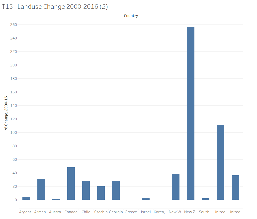
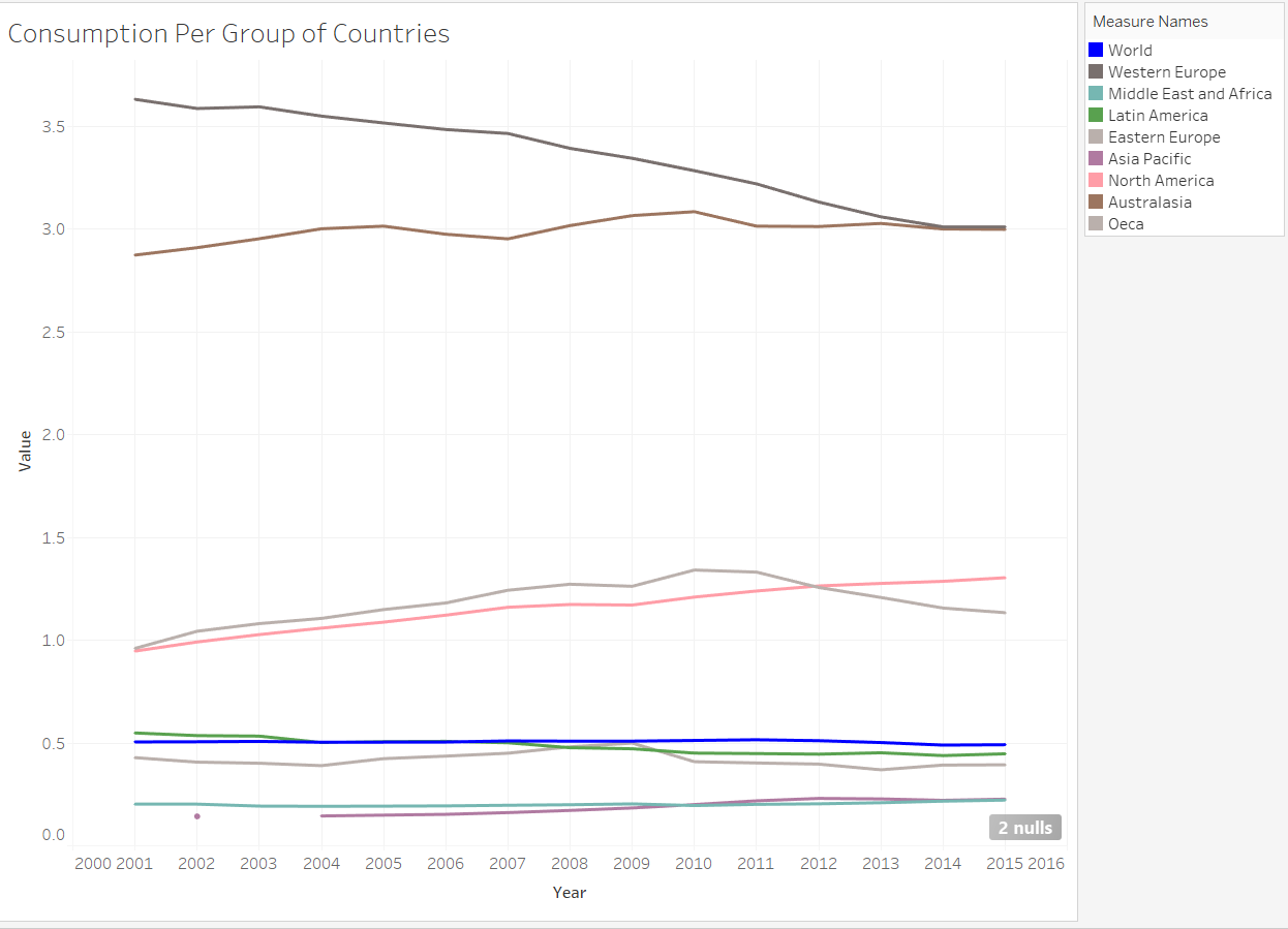
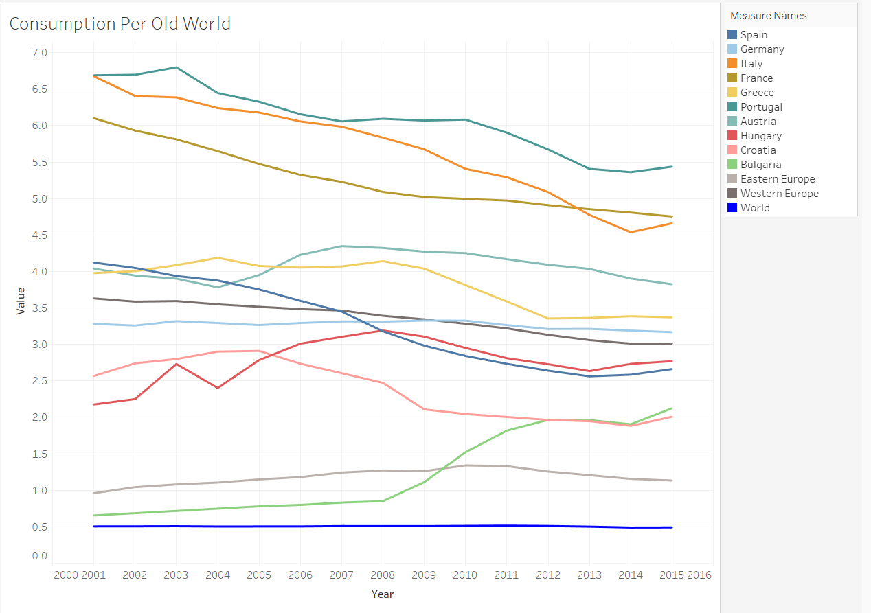
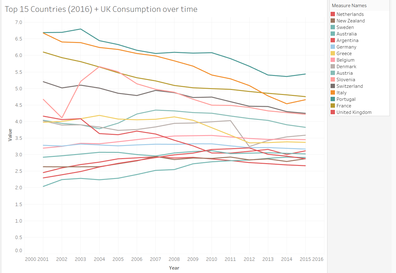
Worksheets which held the best analysis are below:
If anyone wants to see the rest, you know where to find me!