


Say we are interested in the extreme or outer values of a chart. It would make sense to flag these visually somehow, to aid our interpretation of the data.
For instance, we may be interested in values that exceed or fall under some fixed threshold level – like a store manager who wants to be alerted when stocks fall below critical levels. This would be fairly easy to execute in Tableau using a Calculated Field.
In some cases, a pre-determined threshold may not be appropriate, but a more dynamic threshold is required – sensitive to the shape of the data being plotted.
For instance, during a recent project, clients from Experian mentioned they were particularly interested in detecting values 1.5 times above/below mean ‘Target Market Penetration’.
This could be easily executed with the following syntax:
In a similar sense, we may want automatically highlight values occurring at extreme ends of a variable’s distribution using standard deviation (ST DEV). This could be particularly useful when comparing extreme values across a range of variables in a standardized way.
I have demonstrated this technique in the following example, which flags up values falling outside a changeable standard deviation (ST DEV) band.
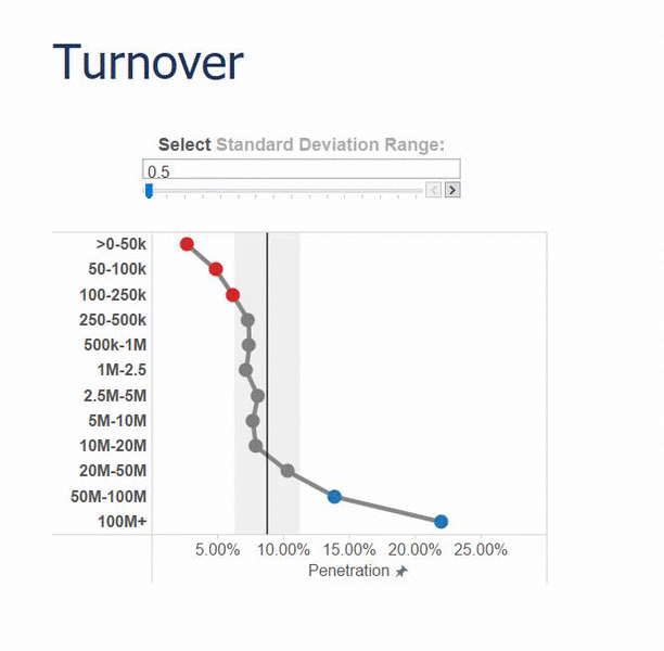
Controlling the slider alters the width of the ST DEV band on the chart. In turn, data points occurring either side of the band automatically change colour – as if they are being helplessly swallowed by the incoming tide of deviation!
Here’s how to create a similar chart:
STEP 1: set up a Parameter with your desired increment size and range of values. This will eventually become a slider allowing us to select our desired ST DEV range.
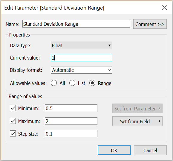
To display the slider on the worksheet, right click on the green ‘Standard Deviation Range’ pill in the ‘Parameters’ section of the sidebar, and select ‘show parameter control’.
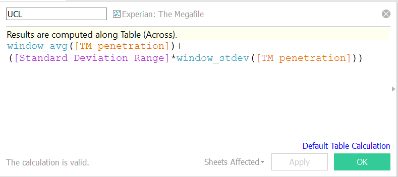
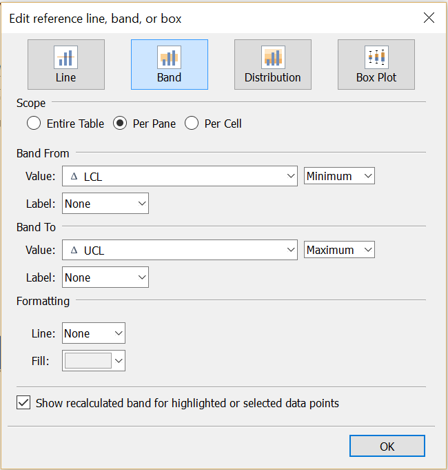
STEP 2: To plot a ST DEV band onto our chart, calculate the upper (UCL) and lower (LCL) standard deviation limits by adding/subtracting the window (window = the data plotted in the chart) standard deviation to/from the window average.
Notice how I have also multiplied the window standard deviation by ‘Standard Deviation Range’. This purple element is our pre-set parameter, and integrating this will allow us to manipulate the width of the ST DEV band using our parameter control (in which we pre-set a range of 0.5-2 standard deviations).
To calculate the lower standard deviation, repeat the syntax below, but switch the ‘+’ for a ‘-‘ .
STEP 3: We then use the upper and low ST DEV limits to set the bounds of a reference band.
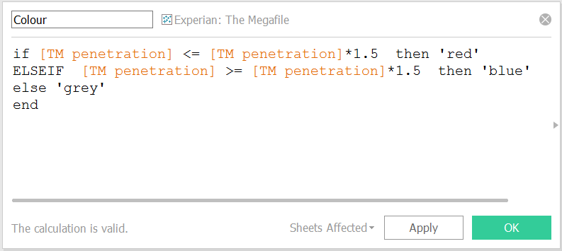
STEP 4: Finally, to automatically highlight values falling outside the selected standard deviation range, we drag the following IF statement to the colour card.
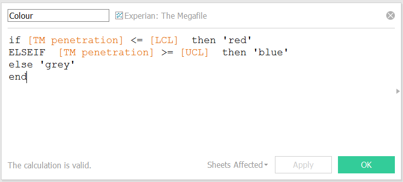
The end result is an effective and dynamic way of flagging up key ‘outside’ values in response to the user’s specified settings.
Pretty neat, right?