


Here I will continue with my theme of dynamically highlighting key data in Tableau (If you missed it, my last blog post demonstrated how to dynamically highlight extreme values in dot plots).
This time I will focus on scatter plots.
With scatter plots you are not always looking for trends or correlations between two variables.
Often the story will be at the scale of the individual points or groups of points in your data cloud, and identifying points that meet certain criteria. For instance, a company might produce a scatter plot to help identify longstanding customers that have spent a lot of money. In such a case, it would be helpful to make the relevant data points ‘pop’ by highlighting those that exceed threshold customer duration and sales criteria.
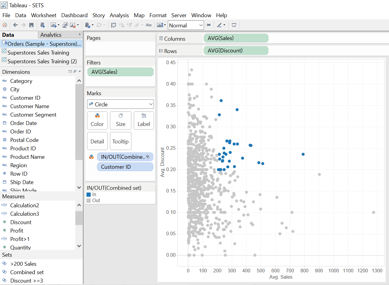
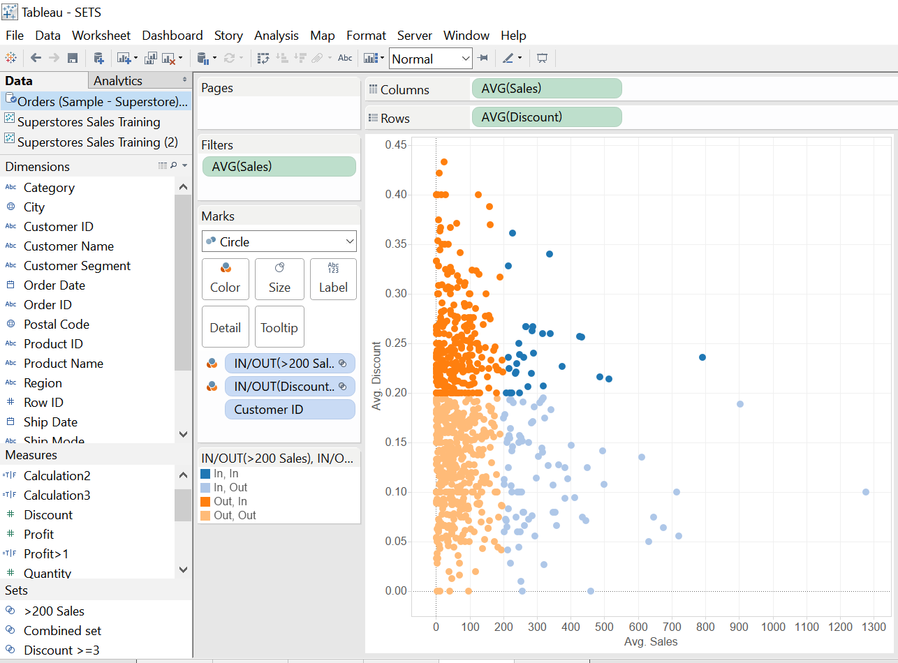
I have done a similar thing in the plot below using average ‘Discount’ and average ‘Sales’ from the Superstores dataset.
Here, we can instantly pick out the key customers that have met the specified dual criteria (i.e. above a certain sales and discount threshold). Meanwhile, this type of formatting it is also useful to interpret the extent and position of these ‘key customers’ in relation to the broader data cloud.
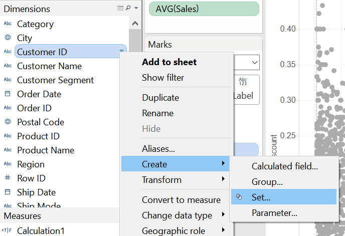
This dynamic formatting is simple to carry out in Tableau using Sets.
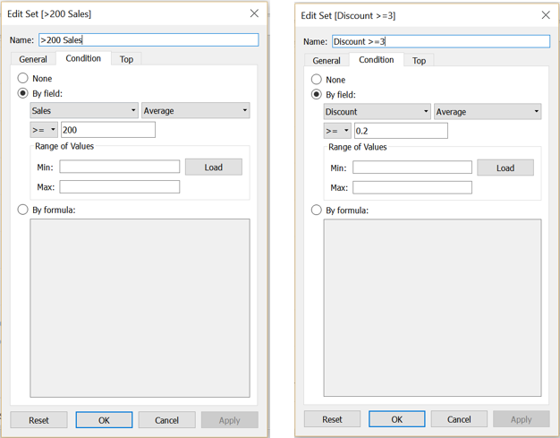
Sets allow you to subset your data using conditions based on your existing dimensions. For instance, in the example above I have sub-setted the ‘customer ID’s’ (which pertain to the individual data points) based on ‘Sales’ and ‘Discount’ conditions (the axes).
Notice how the Set options look very much like the Filter options. This is essentially what they are, but instead of excluding the data based on the specified conditions, they split it out for further formatting.
Now, moving on to the formatting…….. Dragging one of these sets from the data pane to the Colour card, will essentially split the data points above/below this single pre-set threshold.
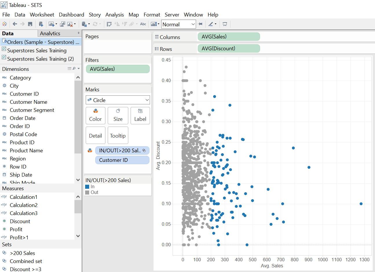
Dragging the second set to the colour card will replace the first.
However, if you select both Sets using Ctrl + select and drag them to the Colour card simultaneously, something magical happens. The plot is split into 4 different coloured quadrants, based on relationship of the points to all combinations of our 2 thresholds (in in, in out, out in, out out).
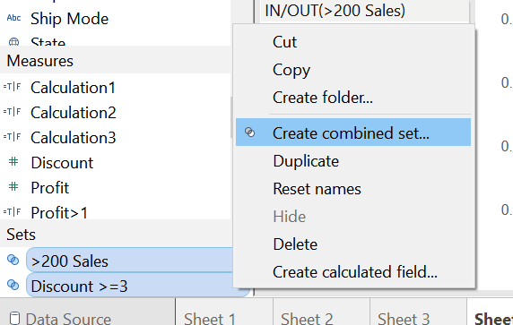
To get the dual thresholds to work in concert (as per the original example) we need to highlight both Sets in the data pane, right click and create a Combined Set, then drag this to the Colour card.
Splitting up your scatter plots using sets is a great way to help identify key values. It also allows a dynamic representation that can change with time. In other words, as your customer data continues to feed in, the highlighting of the data points will automatically update too.
Pretty neat, right?