Second to last day in the training phase of the Dataschool and the fourth day in the Dashboardweek. Like on our first day we had to access an API - this time a fandom API to the Breaking Bad / Better Call Saul universe. To series which are both highly recommended to watch. The API is very good documentated and here accessable.
The data contains information to every episode, the characters, deaths and quotes. I downloaded first the whole data - because it wasn't that much effort - and I could see everything and decide then on which part I want to focus and how I build my story.
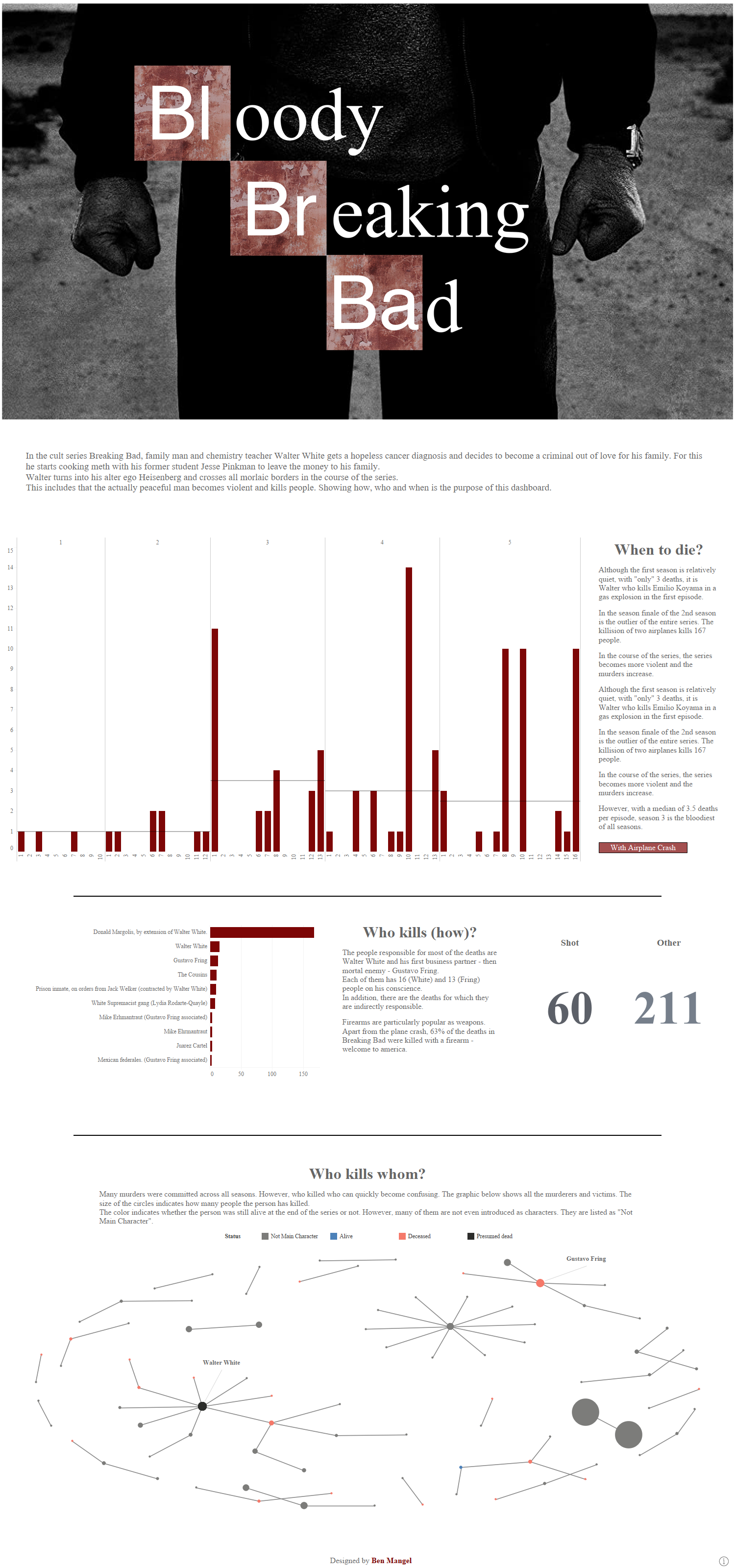
At the end I went into the "Deaths" table, like the title picture of this blog indicates, and enriched these data with some parts from the episodes and characters tables. The quotes were not interesting for me.
I prepped everything in Alteryx and wrote an R script which allowed me to calculate a network chart. A network chart shows in this case who killed who in the series. There are nodes and edges, the nodes are for every character and the edges show the relationship between these character nodes. Alteryx offers a tool which renders a d3.js graph wich shows the same, but wasn't useful because I wanted to visualise in Tableau.(A very good blogpost to the tool in Alteryx which gives you also some theory on how these kind of vizualisation works)
The output from the R script needed some more prep which I've done in Tableau Prep, just to have all 3 tools used, lol.
For my Dashbaord I decided to vizualise when people died, who kills and how and who kills who (network graph) and focused here just on Breaking Bad.
This is the result: