


‘Jittering’ is an amazingly easy trick that allows us Tableau users to quickly spread our data across one-axis using the INDEX() function. Visually this means that there are no points that are plotted directly on top of each other; every individual data point has its impact.
The best example that I can use to show your how effective this can be is from a piece which we worked on in week 2 of The Data School.
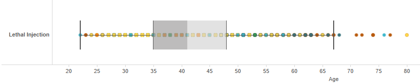
In this example we were looking to show two stories, firstly, the variance in age of those executed by lethal injection in the US, and secondly their ethnicity. From the unjittered chart I would like you to make a summary point for each of those questions…
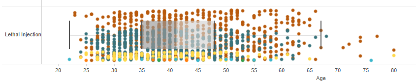
Now do the same for the jittered chart….
Straight away you can quickly acknowledge the sheer number of points that were layered upon each other in the unjittered data.
The jittered example is far more impactful in showing the true volume of data, it tells the real story.
In the unjittered example you likely surmised that between the ages of 20 and 68 there is an even spread in the number of people executed by their age. Secondly you would have likely surmised that there are far more latinos (represented by yellow points) put to death by lethal injection than those of other ethnicities. As the jittered version quickly illustrates, this is far from the case.
So how do you jitter? As I said at the start it is an ‘amazingly easy’ trick to do, so quick that it would probably take me all of 14 seconds to do a video on the topic. So that is exactly what i have done.
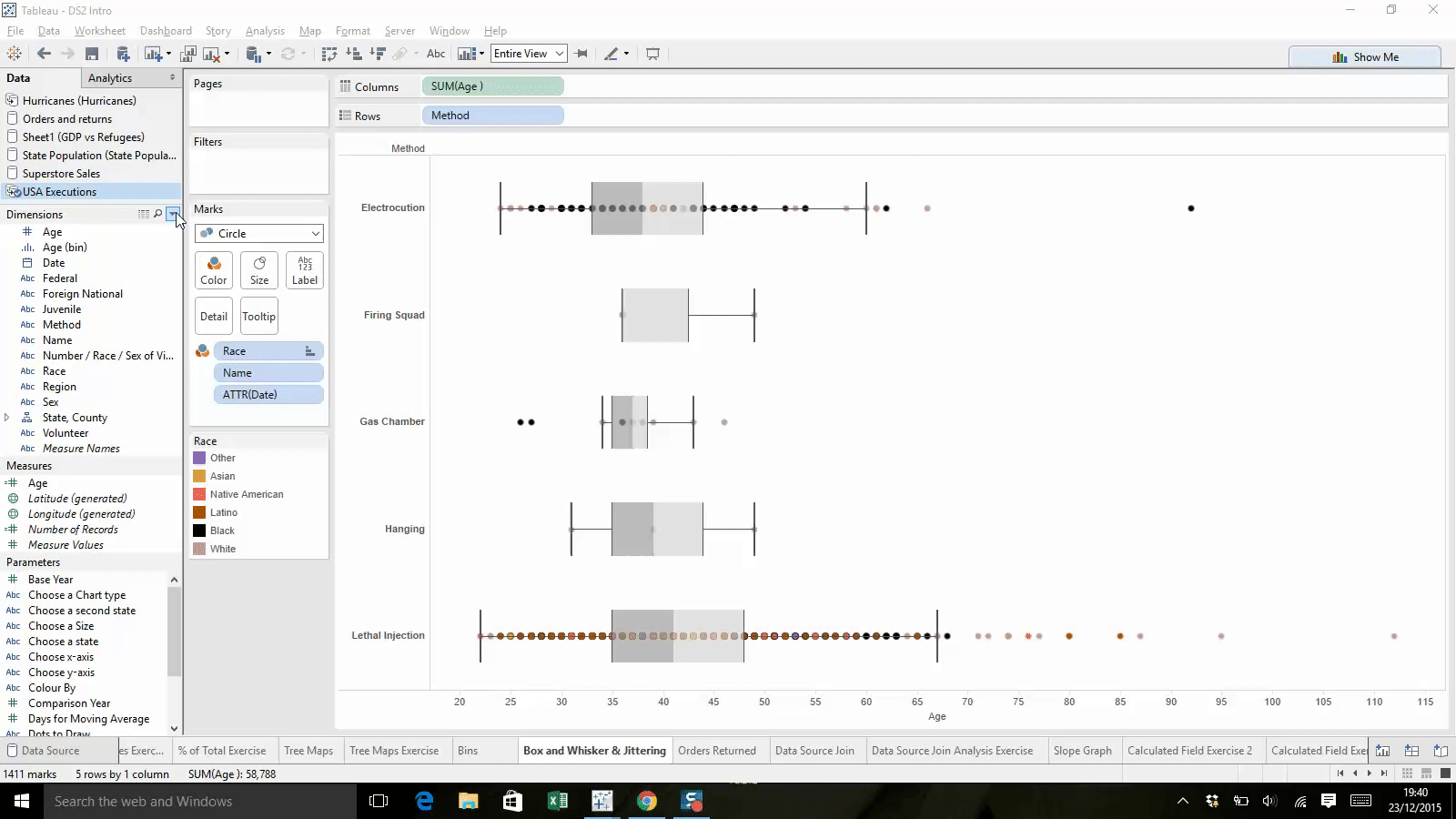
- Create a calculated field, the calculation is simply: INDEX()
- Drag this onto either your columns or row shelf
- Edit your table calculations to adjust what your INDEX() function is calculated by
I hope this simple trick can prove very useful! As usual any feedback or comments are very much appreciated!
Ben