


Every friday we usually have a small project with a following presentation but on this friday we had to improve our dashboard, the one we had to prepare for the final interview. My dashboard was looking like this:
Before I show my improvements, I’m going to introduce you to my dashboard what I didn’t do within my presentation. I decided to make a slide show and jumped into my improvements I did directly. This was a bit confusing for the audience because they had no idea how my dashboard actually works. So if you have to present your dashboard make sure that you’re not the only one who knows how your dahsboard works.
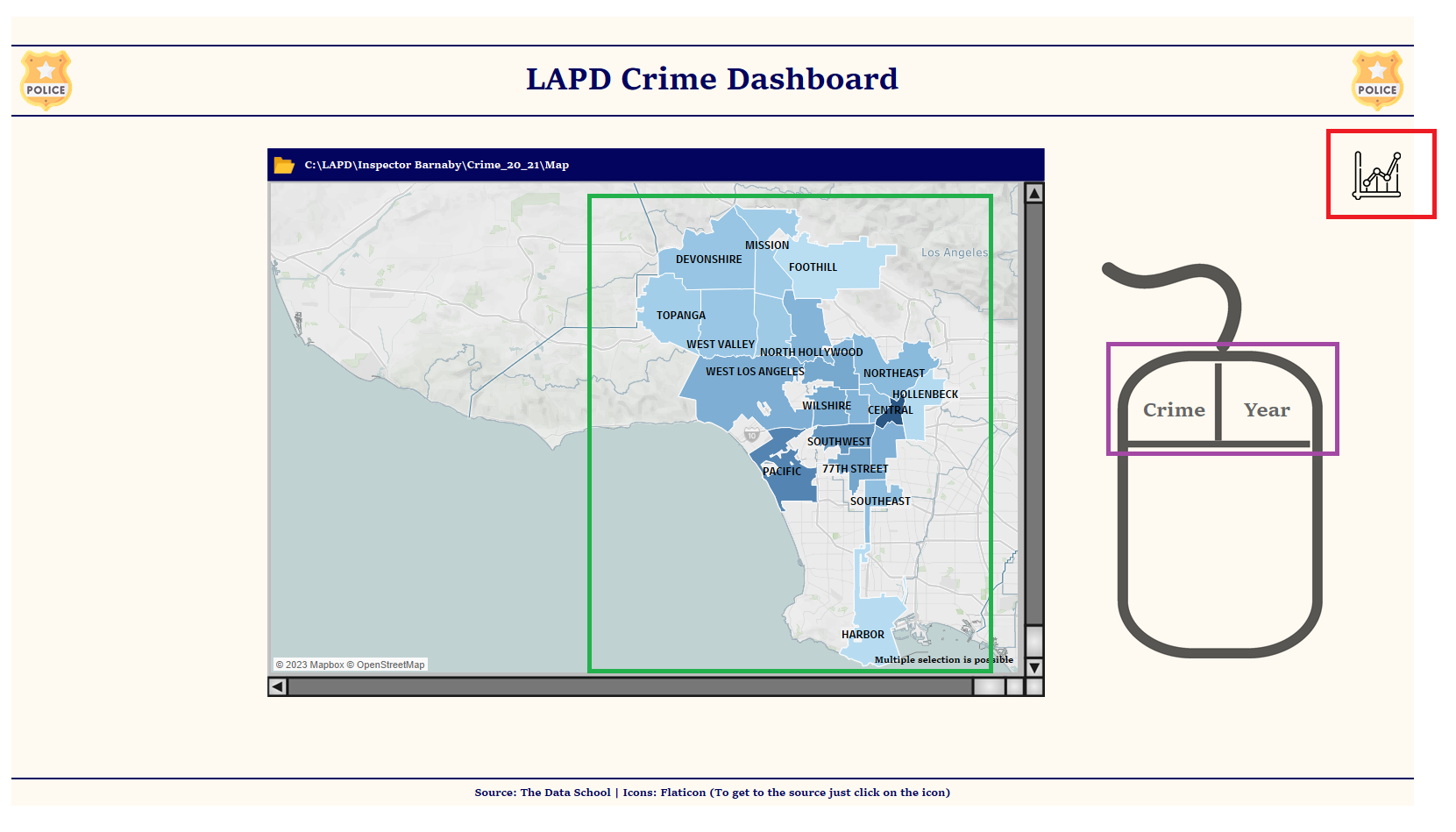
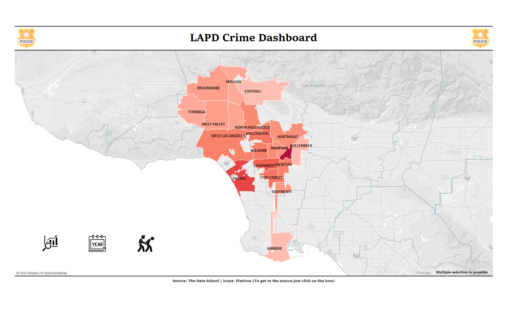
Back to my introduction. The main topic is crime that happend in Los Angeles in the years of 2020 and 2021. The picture above shows you the main page of my dashboard. Over the map you can choose a district of L.A that you are interested in. The color tells you how many crimes happend there. The darker the blue the more and the brighter the less crimes happend there. On the right hand side you can see a mouse with two buttons where you can choose the year and the crime type and on the right upper corner there is a button where can reach the following page:
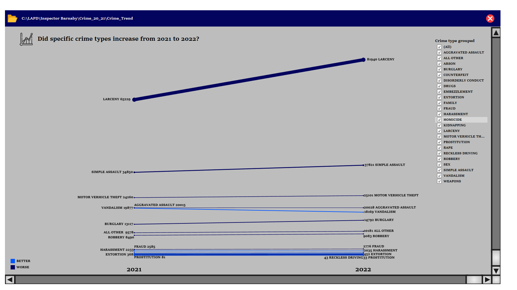
This is a simple slope chart that tells you how crime changed between 2020 and 2021. The darker and thicker the line the worst the changes. Whereas the thinner and brighter the blue less crime happend in 2022 compared to 2021. So far and so good let’s get back to the main page and let’s select a district we’re interested in, we should reach the following page:
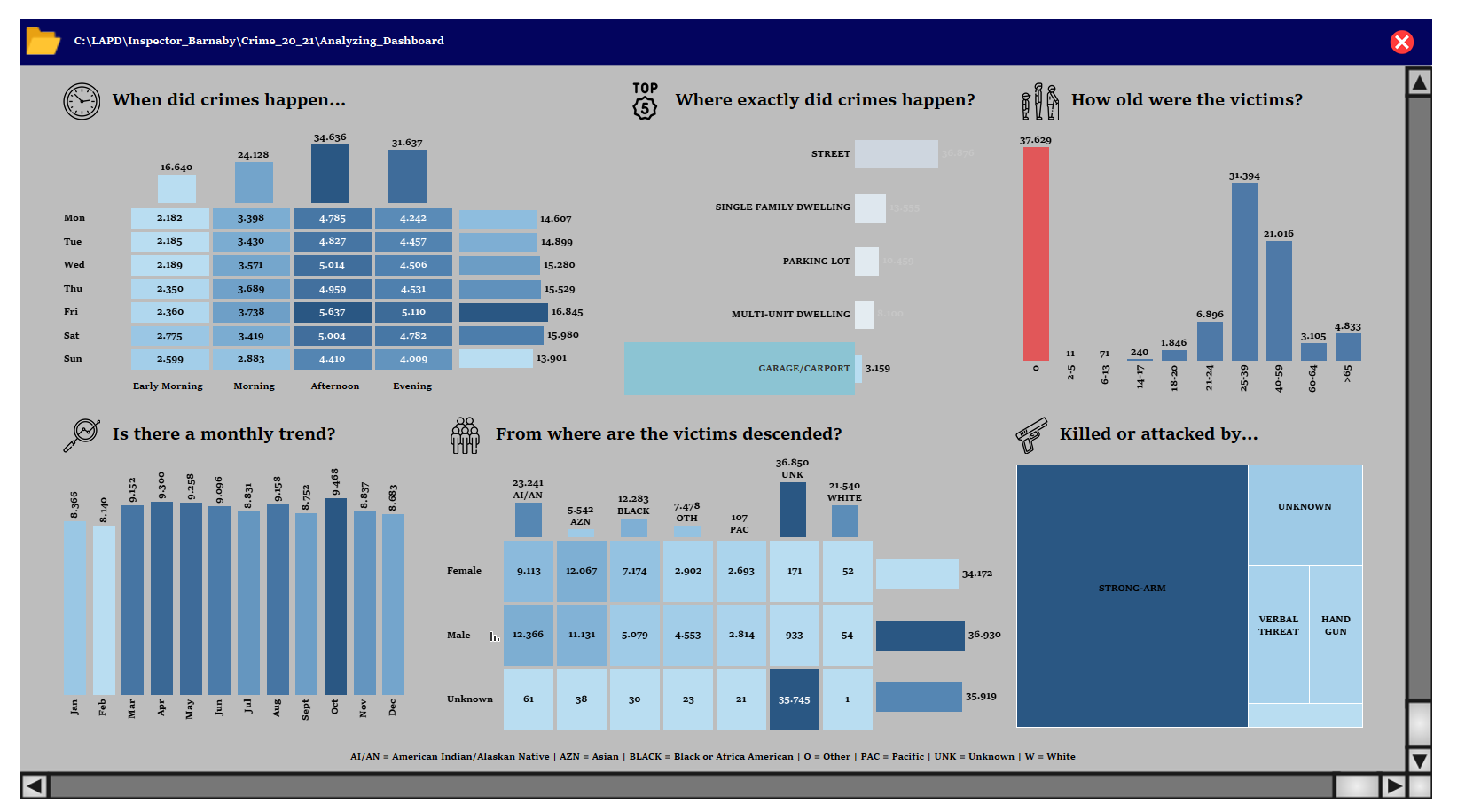
This is the analyzing page where I decided to ask six simple questions to get an insight and find a pattern regarding the location, year and crime I choosed before. So now where you get an insight to my dashboard what were my improvements?
First of all I changed the color from blue to red because blue doesn’t really represent criminality. Due to changing the color my background images doesn’t suit to dashboard anymore. So how does it look like now? Let’s see:
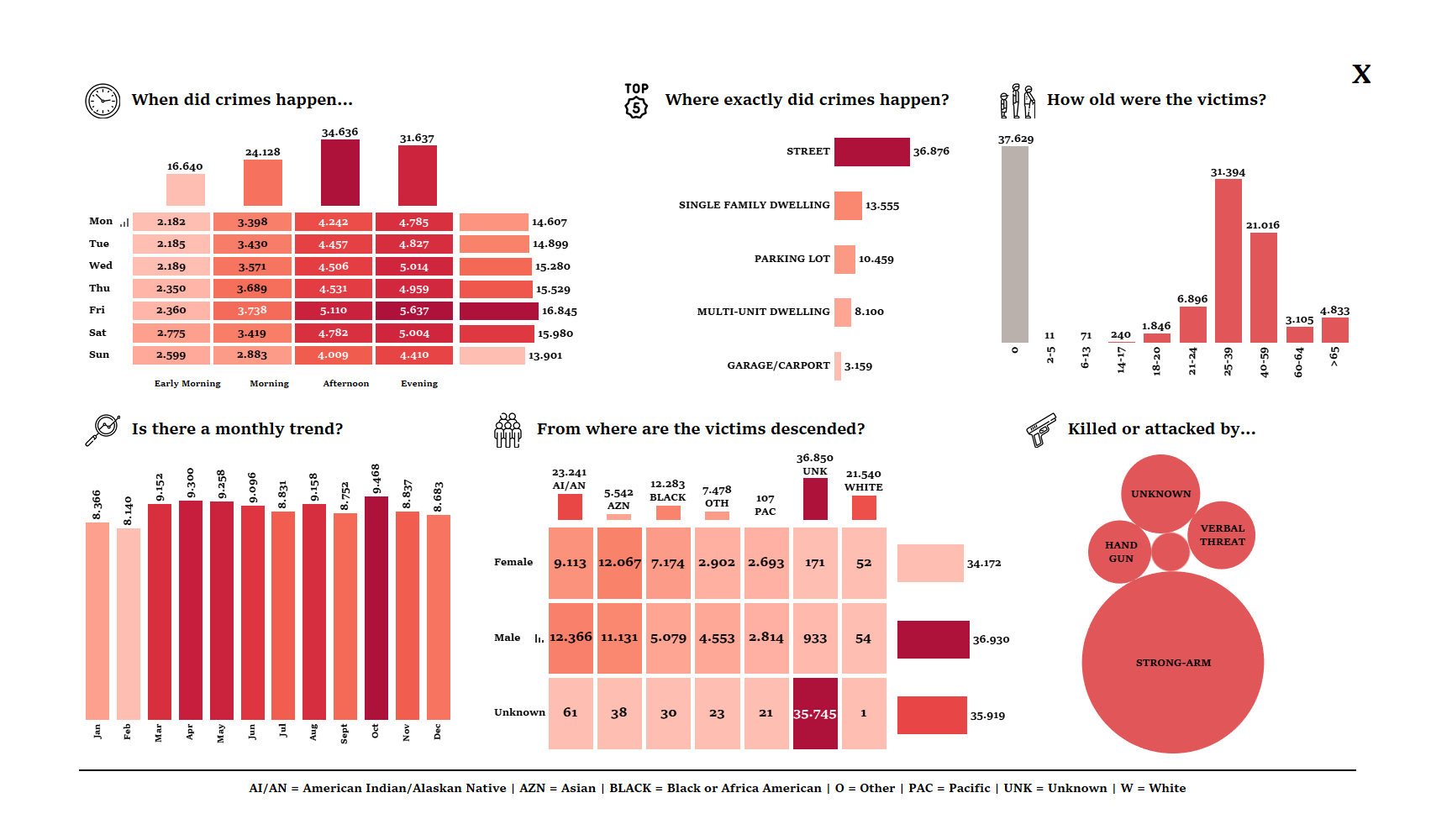
It looks way to much cleaner now and of course the color is red now but with the same meaning as before. I also played around a bit with the margin between each chart and changed the chart type in the right lower corner. Due to the fact that I’m only interested in the quantitative crimes that happend the bubble chart is a good choice. Let’s take a look into the main page:
It was reduced to the essentials and it also looks way to much cleaner now. For the last page let’s get back to it:

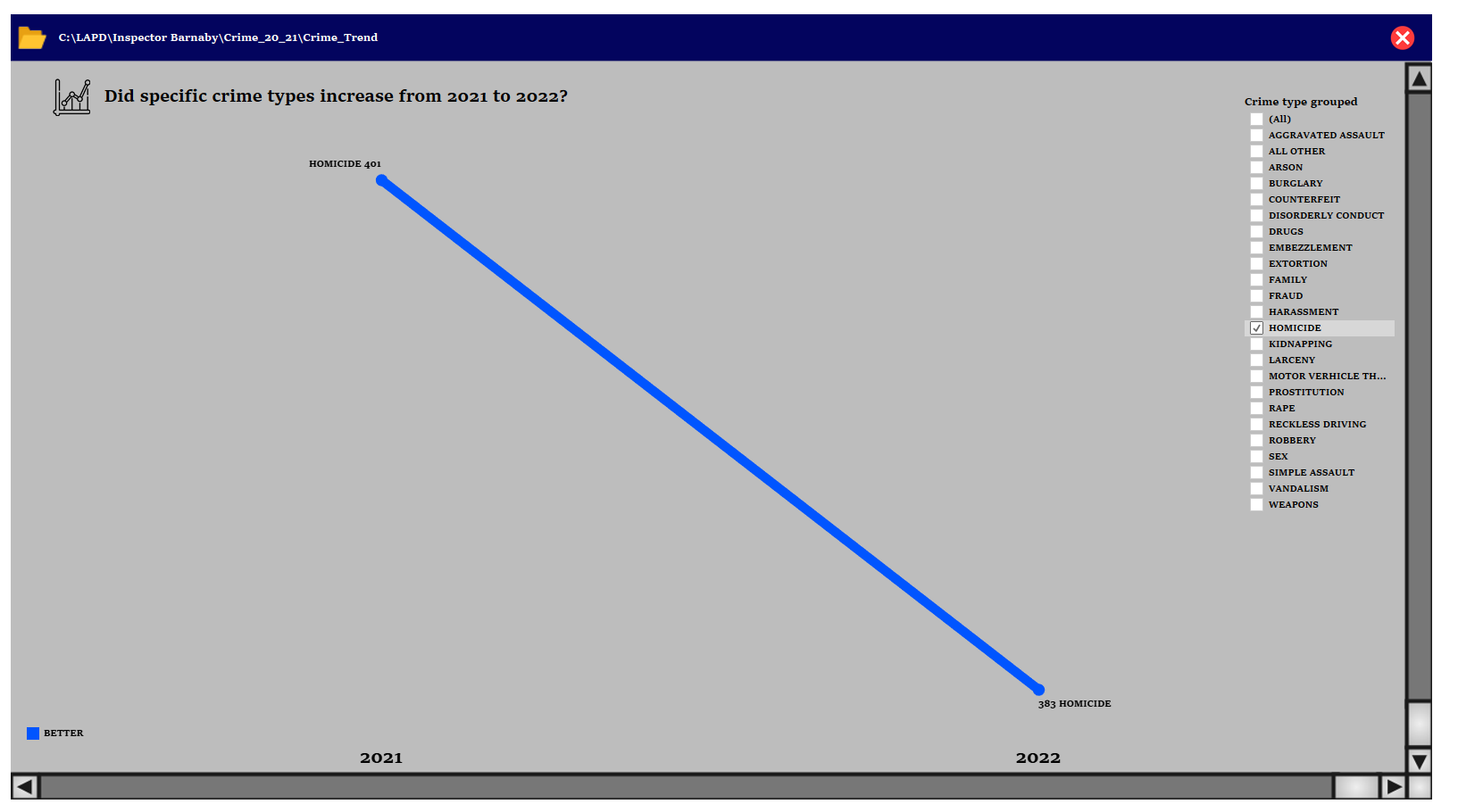
On the right hand side there is a menu where I can choose the crime type I’m interested in and in this case I chose Homicide but something changed. Now we only see how Homicide changed from 2020 to 2021 and your may audience think that it changed a lot but when we take a closer look to the numbers we see a difference of only 401 - 383 = 18. This is actually not a lot but the chart tells us something different. In this case I decided not to use this chart anymore and used the following chart type instead:
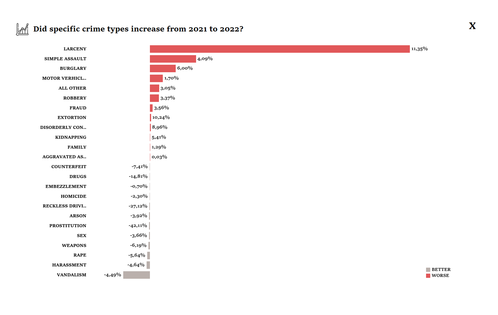
Now I’m able to see what kind of crime increased from 2020 and 2021 and which decreased.