On this friday we had to improve any visualization we chose before. We had free choice and we could pick whatever we felt comfortable with. In my case I chose the following visualisation:

It shows the relationship between the count of dogs and count of canine assaults per district of New York City divided by zipcode. Start by having a closer look into the data to get insight what the visualisation shows me and what the data actually tells me. So let’s take a look:
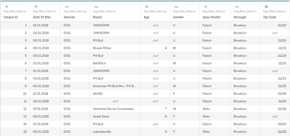
What do we have?
- A date
- The breed
- The age
- The gender
- Is the dog neutered anyway?
As you might see there are a lot of additional information that the visualisation isn’t telling us. We don’t know when the canine assaults happend, we don’t know what breed attacked the most, neither the gender nor if the dog was neutered and this brings us to the next point: What do I don’t like?
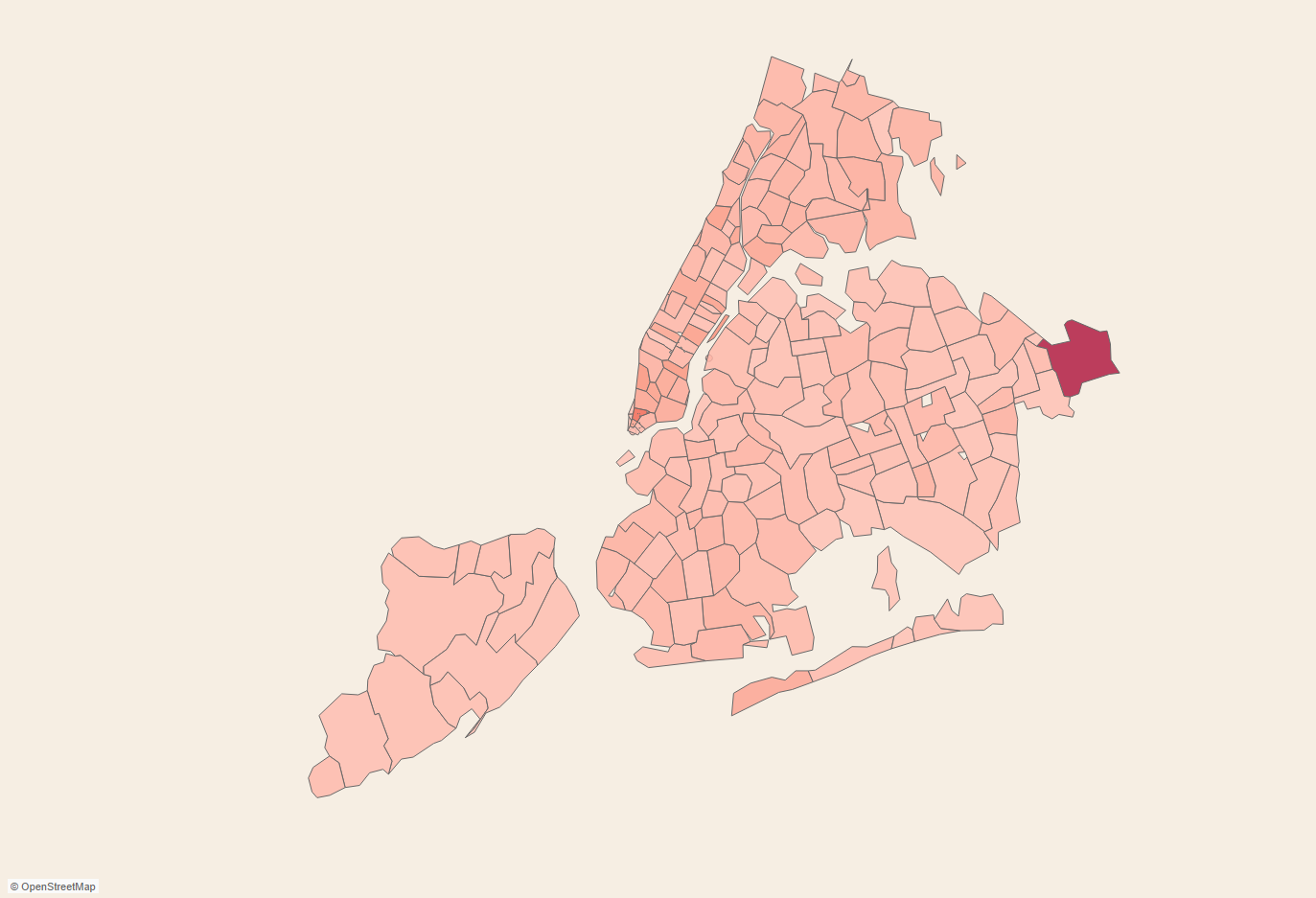
Beside the information we got from the data, let’s take a look into the original visualisation again:
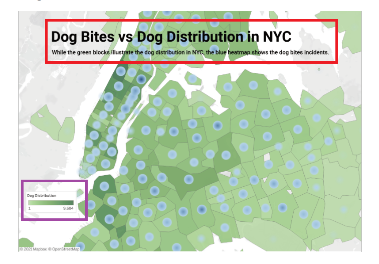
Firtsly the color isn’t a good choice we’re talking about canine assaults, right? Red could have been the best choice. Then we only have a legend for the dog distribution but not a legend for the dog bites. In general what is this visualisation trying to tell us? The thing is: both distributions are Independent from each other and can poorly be put into relation visually. Another point is that the title is poorly placed and hides a part of the map. So what could we do better? Due to the fact that I didn’t have much time on this friday I only came up with a sketch like in the following picture:
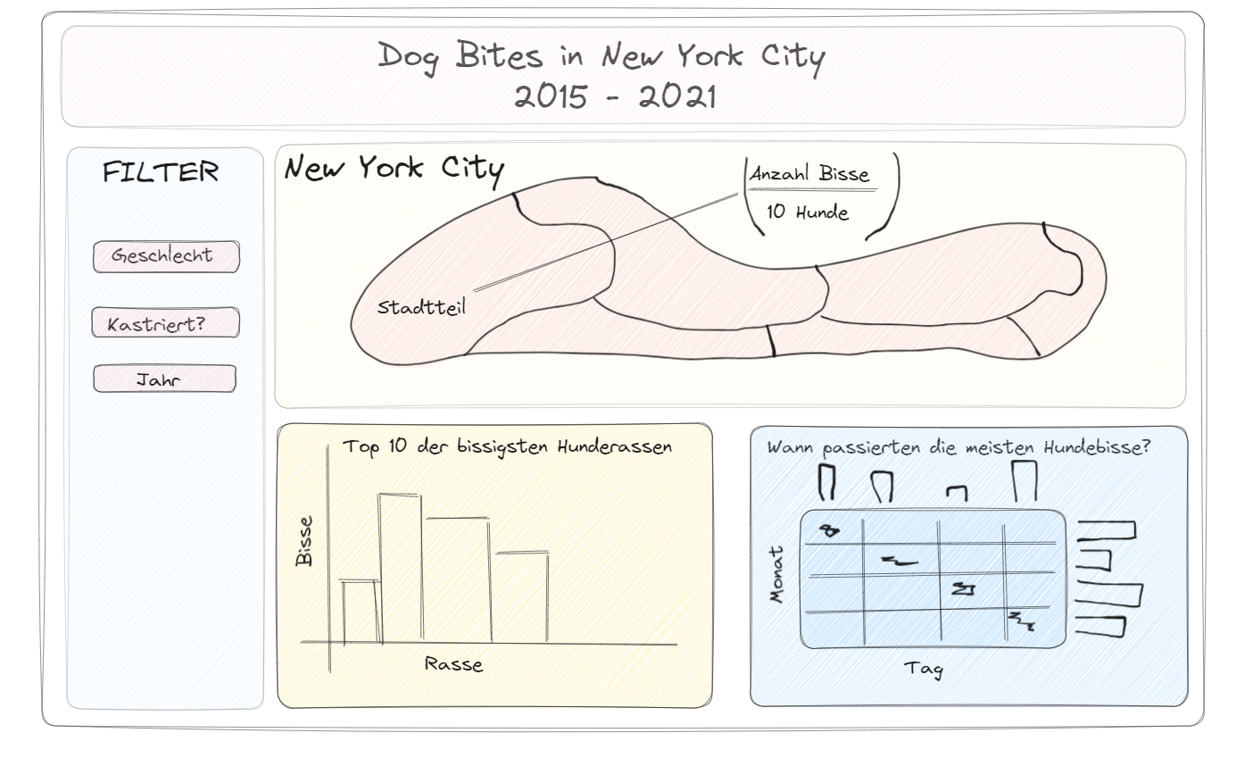
According to the data set, I was trying to put more information into the new visualisation like filter functions, the top 10 of the most biting dogs and when did it happen. There was may be a pattern. Regarding the map my first thought was calculating a ration between the count of dogs and count of bites per district but what I got looked like this:
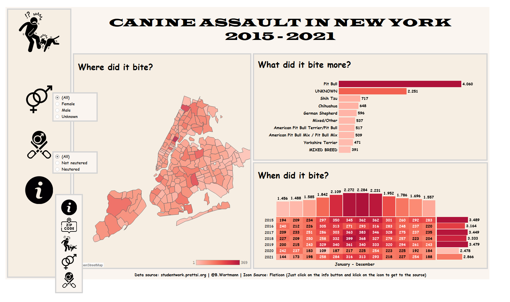
So what’s the point? There is may be a hot spot but honestly there isn’t really useful information, for this reason I decided not use the ratio but the sum of canine assaults per district. Due to the fact that I wasn’t able to finish my new visualisation I finished it afterwards anyway and this is what I came up with: