


One of the first things I liked about Tableau when I started using it was its ability to present data on maps. But if you don’t have any spacial data to use in Tableau, don’t fret, Alteryx is here! Alteryx is a great way to build spacial data to use in Tableau, and it’s super easy to do so! As with everything in Alteryx, there are a thousand and one ways to do this, but I will be focusing on the different ways to use the Map Input tool. So here’s how to do it:
First things first, this is what the tool looks like: 
After dragging this onto the workflow pane, the configuration pane pops up with a map, and a mini tool bar with four main options, which looks like this:
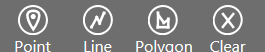
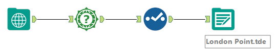
First I’ll go through how to use the Point option, and then I’ll get on to the more fun stuff like drawing polygons. So, just click on the point option, and then click somewhere in the map and name it whatever you want. I’ll call this one ‘London Point’.
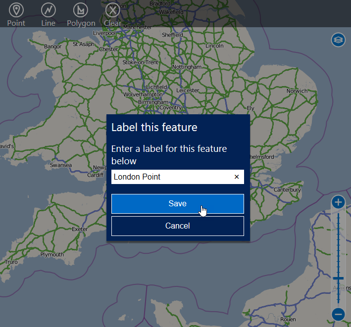
Then, drag on the Spatial Info tool, and click the option in the configuration pane that says ‘Centroid as X and Y Fields’:

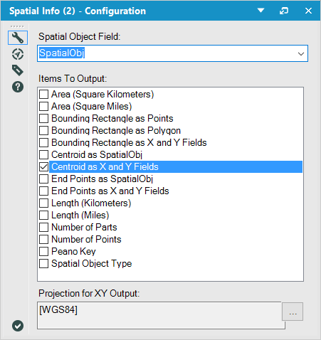
Then use the Select tool to rename the two X and Y fields you’ve just created:
It’s a good idea to rename CentroidX as Lon, and CentroidY as Lat, as these are phrases that Tableau will pick up as geographic fields. After this, just pop on an Output tool, save it as a .tde file, and you’re done!
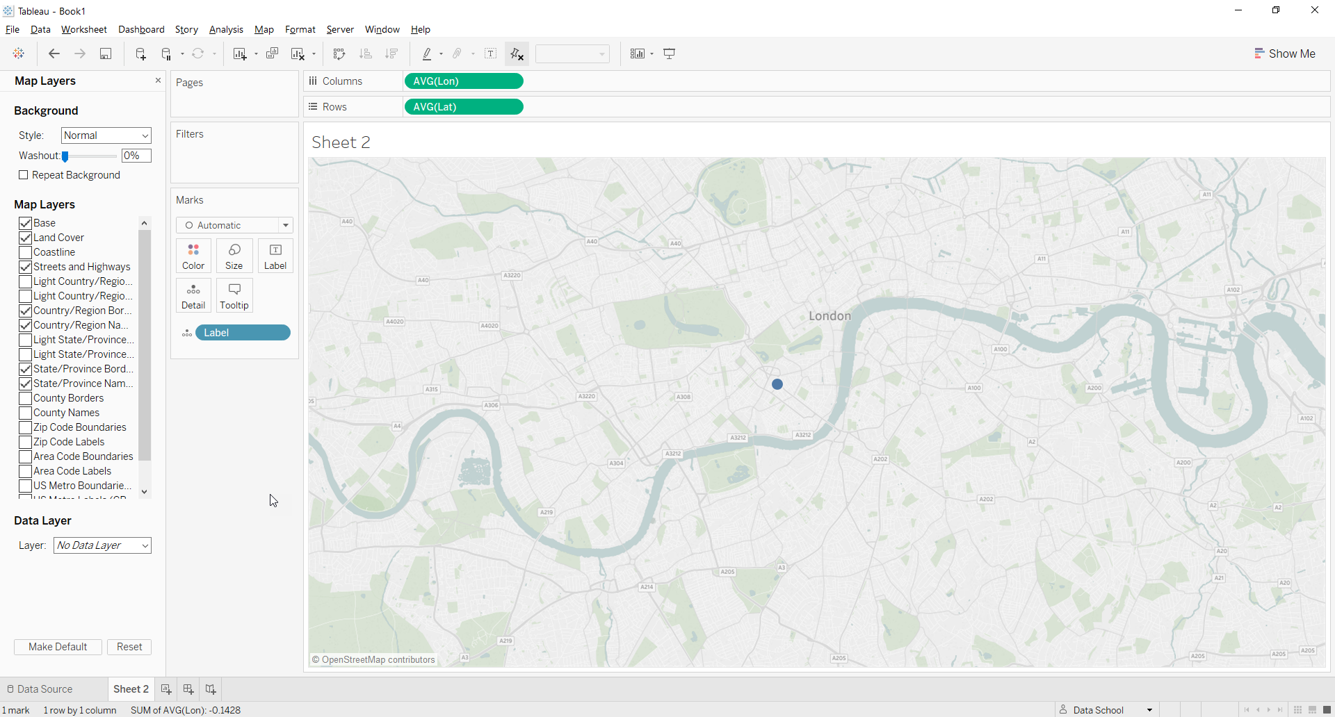
Now, simply load this data set in to Tableau, double click on your longitude and latitude fields in the measures, and you can see your point plotted in Tableau:
Okay so now on to the more interesting stuff – the lines and polygons! So I figured the best way to show you this is to just video capture the screen. So, here’s how to draw the lines:
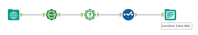
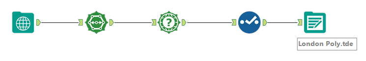
As you can see, it’s pretty simple. This time, before we use the Spatial Info tool we just add in the Poly Split tool, leaving the default settings, and then carry on as before. So we end up with the final workflow as follows:
The most important thing to note about this output, which is different from the point output, is the Split_SequenceNum column,
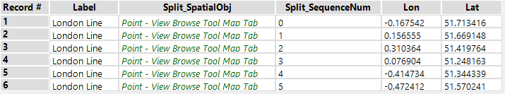
which is basically just giving a number to each point in the line you created, which is the order in which we chose the points. Now on to using this output in Tableau. Again, the most easy way to understand how to put this in to Tableau, is through a video. So here’s another one…
As with the point option, just double click on the longitude and latitude options to start off. Afterwards, this is where that Split_SpatialObj column comes in to use – as it’s a number, Tableau automatically thinks it is a measure, but as it is simply telling us which order to connect the points, we need to drag it to dimension, and then drag it to ‘Path’ on the Marks card.
Now all that’s left to look at is the polygon mapping option. This basically follows the same steps as the line option, with the same workflow:
As with the line option (why break the habit), here are the videos which show you how to use it in Alteryx to specify your polygon, and how to load and visualise it in Tableau:
Alteryx:
Tableau:
So there you have it! Create your own mapping data in Alteryx, and visualise it in Tableau – see, told you it was easy!