


Having to create a dashboard without the right data readily available can be a challenge, but it can also be an exciting opportunity to explore ways to further analyse the data you do have.
‘Love To Travel’ was our client for an internal client project: a company looking to improve rail travel in the UK. Part of the brief was to use Footfall Data (a dataset showing daily footfall numbers for 18 major stations across the UK) to answer the question ‘When are stations busiest and how can we prepare for busy times?’. One of the things the client was interested in was whether events in the surrounding area had an impact on the footfall at the stations. The only issue was that they had no data on these events…
Alongside the other dashboards we delivered, we wanted to explore this ‘impact of events’ route, so part of my role for the project was to create a Proof of Concept dashboard for the client analysing footfall against events, to see how collecting this data could be a useful addition in future. In order to achieve this, I had to gather event data, combine it with the footfall data we had, and create a dashboard for this in Power BI.
Collecting the Data
As this was a proof of concept, I decided to limit my exploration to only looking at data for Leeds (one of their major stations) within the year 2025.
Since Love to Travel had no existing data structure, I began by planning what sort of fields would be useful for their analysis, both in this example and in future exploration.
I decided that each record in the dataset should be an individual event and came up with 9 data fields that I wanted to include:
- Event Name
- Start Date
- End Date
- Event Category (Broader groups eg Sport, Performance, Public Holiday etc)
- Event Subcategory
- Location (To add the offer for spatial analysis at a later point)
- Location postcode
- Capacity (To give an idea of how many people might be traveling to that station)
- Closest Train Station (For future expansion of the collected data)
Once I had these data fields, I used Gemini to collect the data for my example window of Leeds 2025. I decided to limit it to large events (500+ capacity) and public holidays. Gemini gave me a Plain Text output to put into Notepad, which I then saved as a .csv file. I had my events data!

Combining with footfall data:
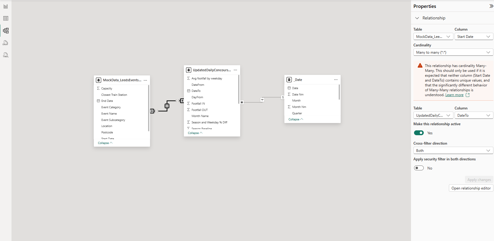
Now I had to combine this events data with the footfall dataset. In Power BI this is relatively simple within the data model.
First I imported the new dataset through the ‘Get Data’ button. Then, in the Model View, I dragged the ‘Start Date’ from the Leeds Event Data onto the ‘Date’ field in the Footfall Data. This set up a connection between datasets, and I set the cardinality of this to ‘Many to Many’ and the cross-filter direction to ‘Both’.
Creating the Dashboard:
We already had a Footfall Overview dashboard, so when creating this Proof of Concept dashboard I decided to keep it to a small selection of charts.
Within the overview dashboard we had created a measure to calculate the variation of daily footfall, which gave a more accurate representation on when the busier periods were. I decided to use this measure here as well.

Chart 1: Variation from daily footfall by event type
This chart shows the average daily variation for each event category (with a drill down to subcategory), and uses a colour gradient from least to most events in each category. It is designed to show which event types will have the biggest impact on stations, to help with planning in the future.
Chart 2: Events per day against footfall variation
This chart builds on a line chart from the overview dashboard, which is a clear representation of which dates differed most from expected footfall. I added bars on each date with events, to add context to the key points on the chart. Clicking on a bar then filters Chart 1 to show which categories the events on this day fell into. For this, I added a time period filter - since this example only looked at 2025, I set the period to monthly.
Chart 3: Dates with highest footfall
This chart gave a clear indication of the busiest days at this station, to make it easier for a user to quickly identify the key points in the data.
Once I had built the charts and formatted everything, I was done! When I presented this to the client, I highlighted some interesting points in the view (e.g. May 5th, the date with the highest footfall and multiple large events).
Check out the final dashboard here.