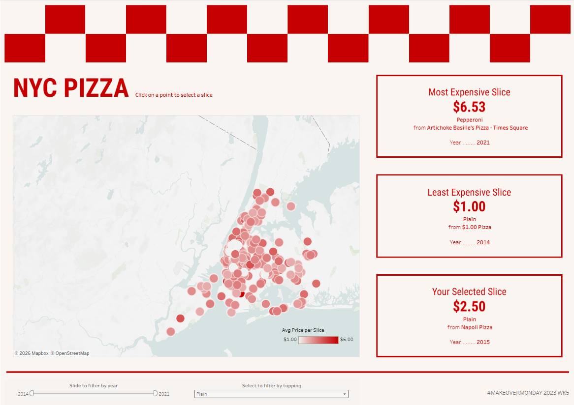
In a recent Makeover Monday, I decided to use the time to focus on formatting. In this challenge, I created a dashboard looking at prices of pizza slices in New York. Check out the final dashboard here!
This Makeover Monday used data gathered by Liam Quigley from 2014 that logged every slice of pizza he ate in New York City, including data on the style, price and location. Given the fun origins of this data, I decided to play around with creating a fun dashboard allowing users to explore the locations of these slices.
Planning
Since I wanted the focus of this dashboard to be the layout, I started by sketching my layout. I knew I wanted to include a map with points for each location, with filters for year and topping. I also wanted KPIS for the most and least expensive documented slices. Finally I wanted to include a dynamic KPI that shows the price of a slice at your selected location.
To help my design process, I searched pinterest for inspiration. I found lots of fun pizza menu designs, and decided to use the colours and layouts of these as my main reference.
At this point I knew I wanted a red and off white colour scheme, boxes for my KPIs formatted like menu items and a chequerboard pattern above the title.
Build
Next I had to build!
Map:
The data included longitude and latitude as numeric data fields, so I started by creating a calculated field to find the exact location point
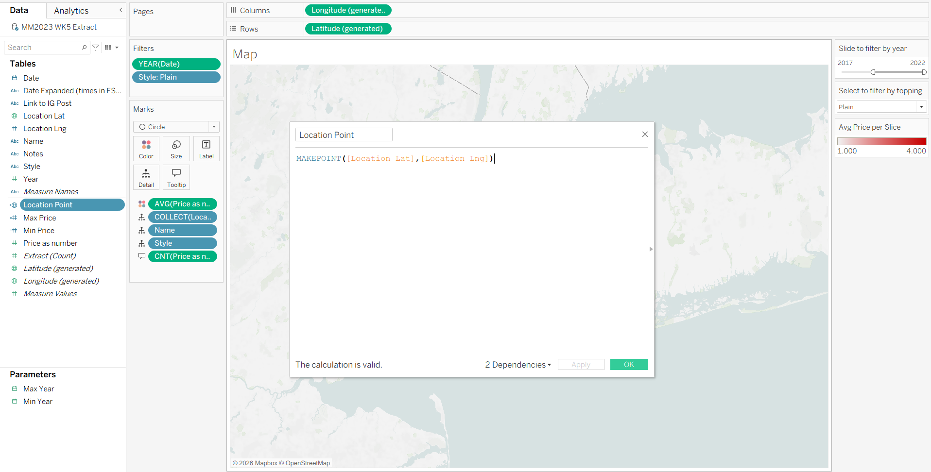
This generated the spatial coordinates for the dashboard, and I was then able to create a map where each point was a circle. I coloured these with a gradient from least to most expensive Avg. Price per Slice.
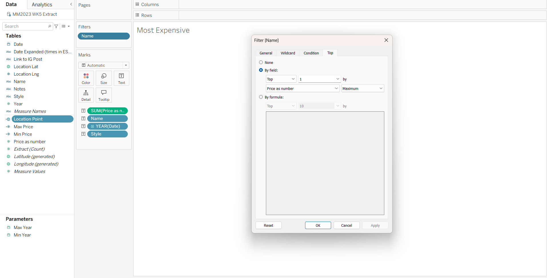
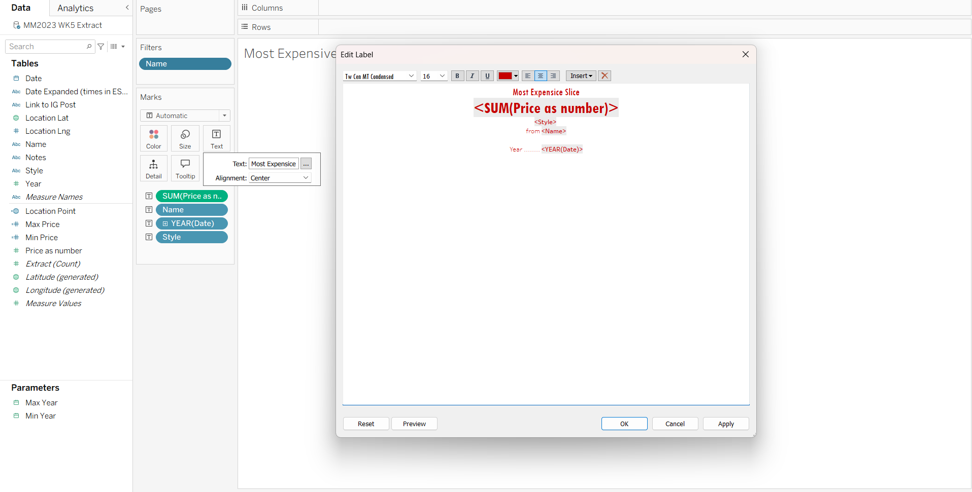
KPIs:
Next I created my KPIs. For these, I added Price, Location Name, Year and Style to the Text on the Marks Card.
For the Most and Least expensive slices I filtered the location name to Top 1 by Maximum / Minimum Price:
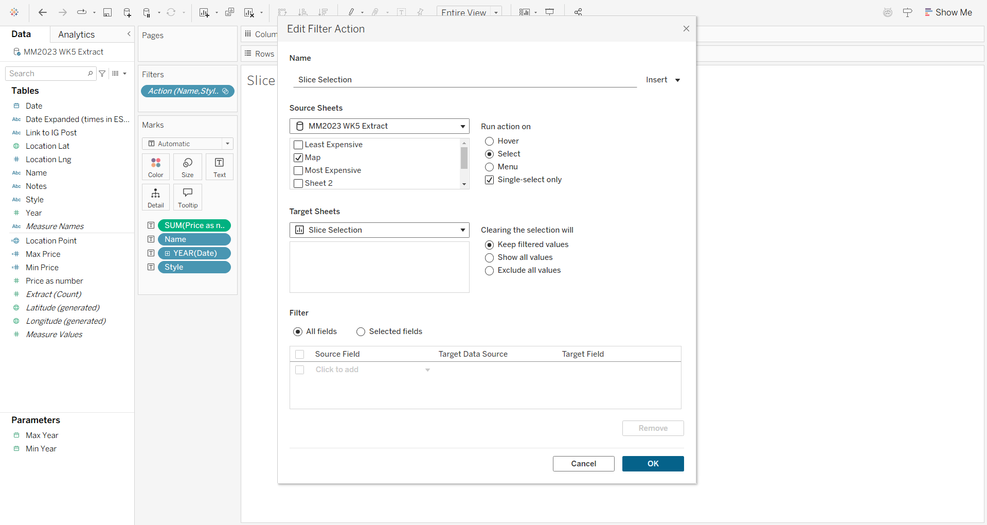
For the Dynamic KPI I used a filter action so that it would filter the KPI to one selected point on the map:
To create the KPIs themselves, I formatted the text mark to imitate the pizza menus I was using for inspiration:
Dashboard Layout
Finally I combined all of this in my dashboard and formatted it to fit my plan: