


Indicator bars are a simple but effective way to show whether a metric has increased or decreased over time. By combining parameters and calculated fields, you can build a single indicator that dynamically switches between Month-on-Month (MoM) and Year-on-Year (YoY) change, with colour and directional arrows to highlight positive and negative movement.
This approach assumes that the MoM and YoY percentage change calculations already exist and focuses on how to visualise and switch between them.
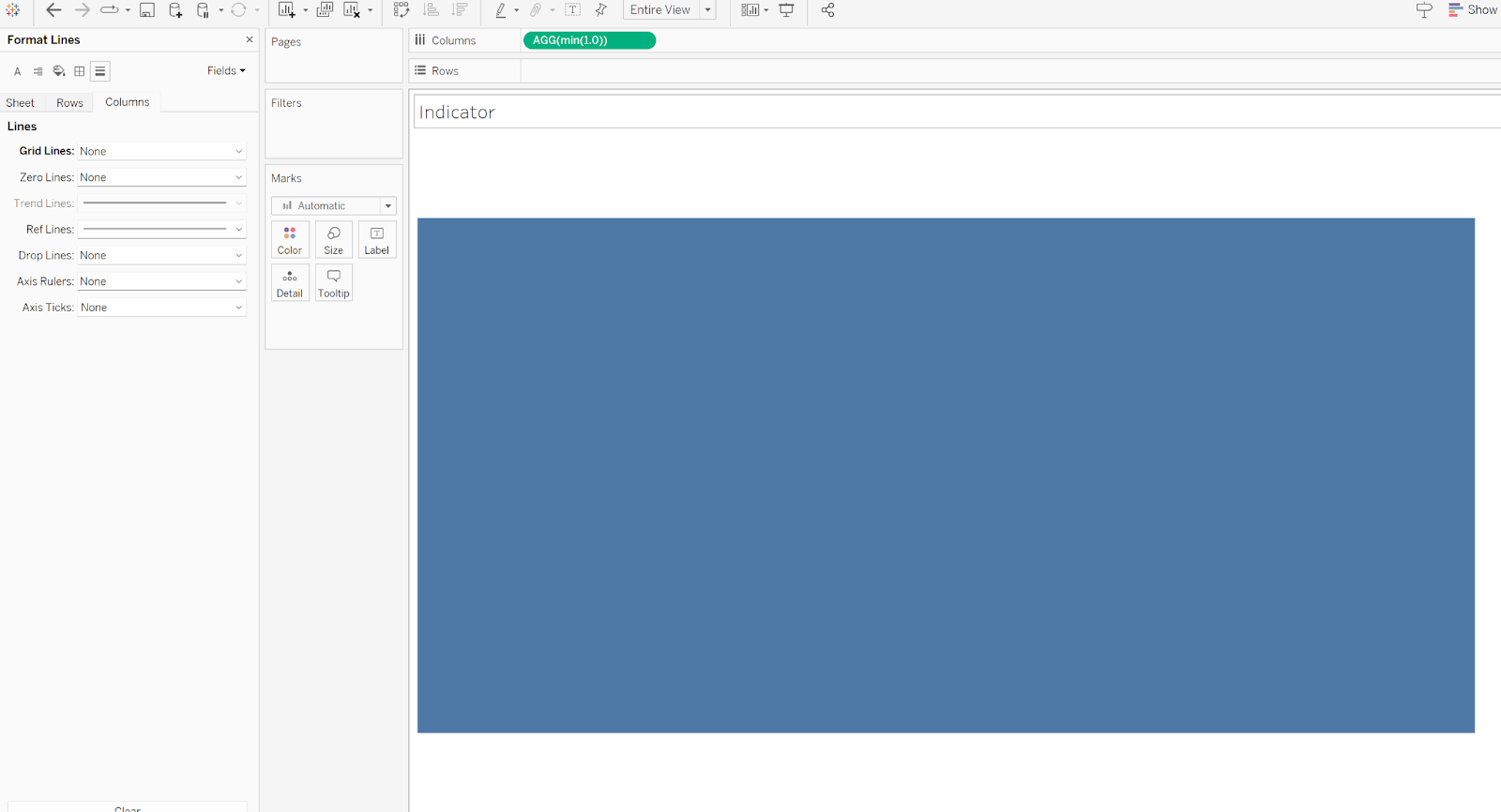
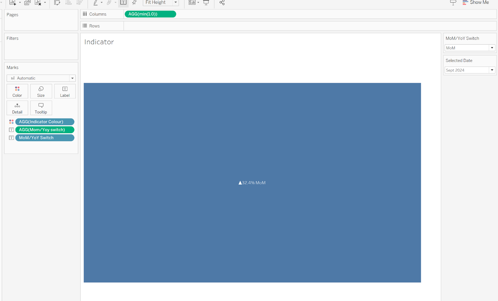
Step 1: Create the Indicator Bar Base
Start by creating a blank, coloured indicator bar.
To do this:
- Type
MIN(1.0)directly onto the Columns shelf - Remove all axes, borders, gridlines, and titles
This creates a simple, uniform shape that can be used purely as a visual indicator rather than a traditional chart.
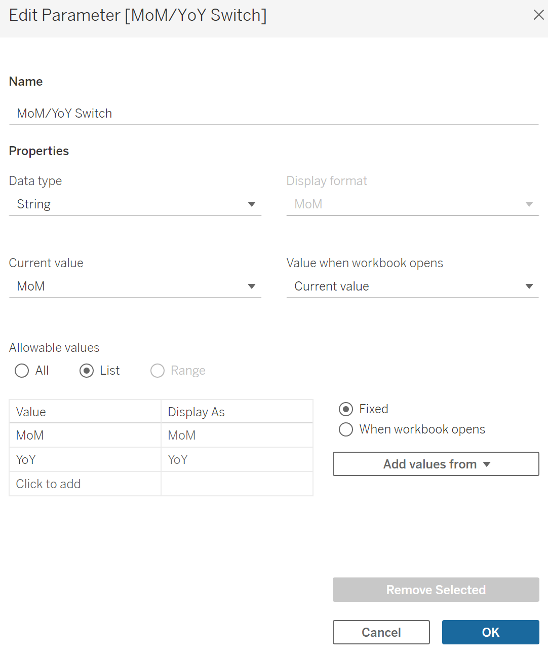
Step 2: Create a Parameter to Switch Between MoM and YoY
Next, create a parameter that allows the user to choose whether the indicator should display a MoM or YoY change.
This parameter typically:
- Uses a String data type
- Contains two values: MoM and YoY
- Is shown on the dashboard as a toggle or drop-down
Step 3: Create a Calculated Field to Link the Parameter
Create a calculated field named MoM/YoY Switch to connect the parameter to the underlying percentage change calculations.
Example Field Calculation:
IF [MoM/YoY Switch] = 'MoM'
THEN [MoM Change %]
ELSE [YoY Change %]
END
This calculation allows the indicator to dynamically switch between the MoM and YoY percentage change values based on the parameter selection.
Step 4: Create a Calculated Field for the Colour Indicator
Next, create a calculated field that determines the colour of the indicator based on whether the change is positive or negative.
IF [MoM/YoY Switch] < 0
THEN 'Purple'
ELSE 'Blue'
END
You can customise the colours to match your own branding or dashboard theme, in this case I'm just using purple and blue.
Once created:
- Drag this Indicator Colour field onto Colour in the Marks card
- Click the colour legend and manually assign the colours to match the labels
📸 (Screenshot showing colour assignment)
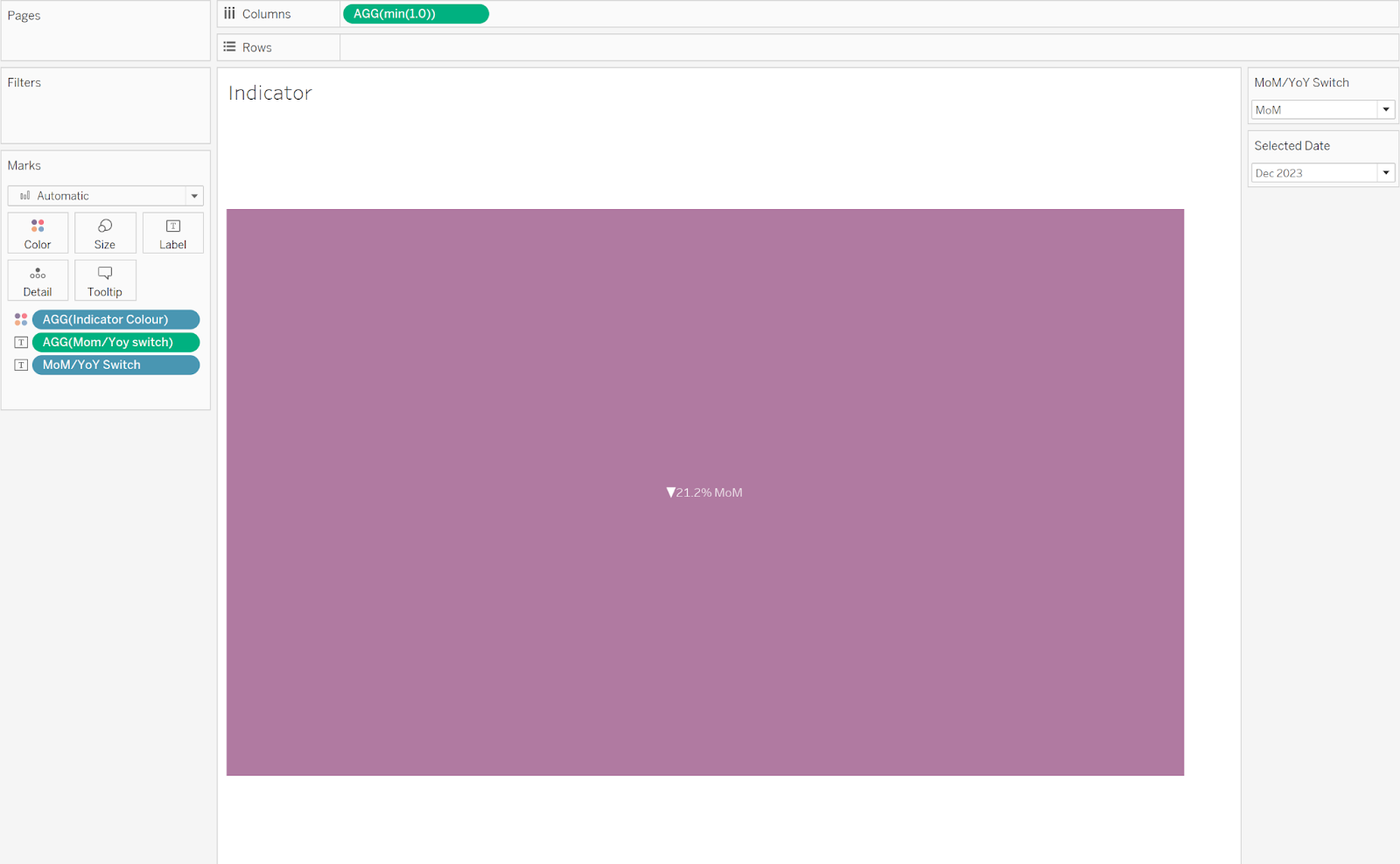
Step 5: Add Labels and Directional Indicators
To complete the indicator:
- Add the MoM/YoY Switch calculated field to the Label shelf
- Also add the parameter itself so users can clearly see which view is active
- Set the label alignment to Centre
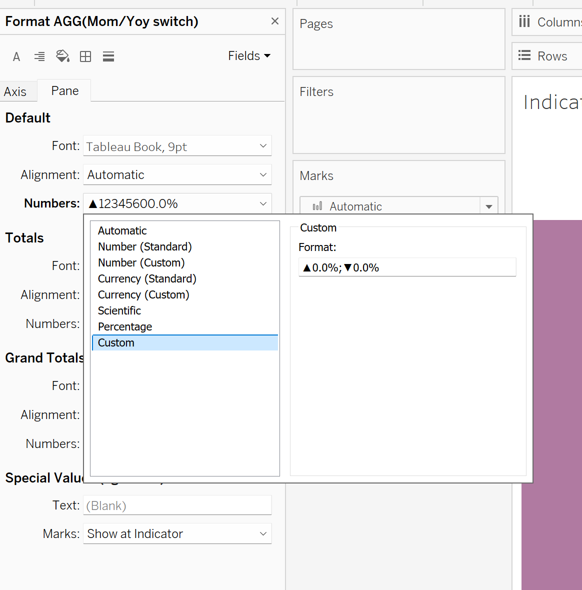
Adding Directional Arrows
To display arrows that reflect positive or negative change:
- Format the calculated field in the Label section
- Choose Custom number formatting
- Enter the following format:
▲0.0%;▼0.0%
This ensures:
- An upward arrow appears for positive values
- A downward arrow appears for negative values
Final Formatting Touches
To keep the indicator clean and focused:
- Turn off tooltips
- Remove any remaining borders or gridlines
- Ensure spacing and alignment are consistent across the dashboard
These can then be added into KPI cards for finishing touches.