For the Second Day of Dashboard Week, DS42 has been given the task of creating 2 dashboards. One in Power BI and one in Tableau using HR and Sample Superstore data, respectively. Our Coach had provided some minimum requirements:
- Title and Sub-Title design outlining font type and sizes
- Spacing guidelines outlining inner/outer padding (to allow for appropriate white space)
- Colour scheme considerations
- Example Charts & KPI's - make you provide as much scope for insight as possible, e.g., add context to KPIs with YTD/MTD's and trending indicators, etc.
- Interactivity examples (on hover, click and/or drillthroughs)
- An information button, image or separate dashboard page that outlines how to use the template
- A footer containing your designers signature
- Templates must be published to Tableau Public and your PowerBI workspace (shared publicly) respectively so they can be linked/embedded in your blog.
I started off today by creating a plan of action with timings. First on my list was seeking out colour inspiration and general dashboard layout for Power BI and Tableau.
With this, I next went onto using Excalidraw to sketch out my design idea, shown below:
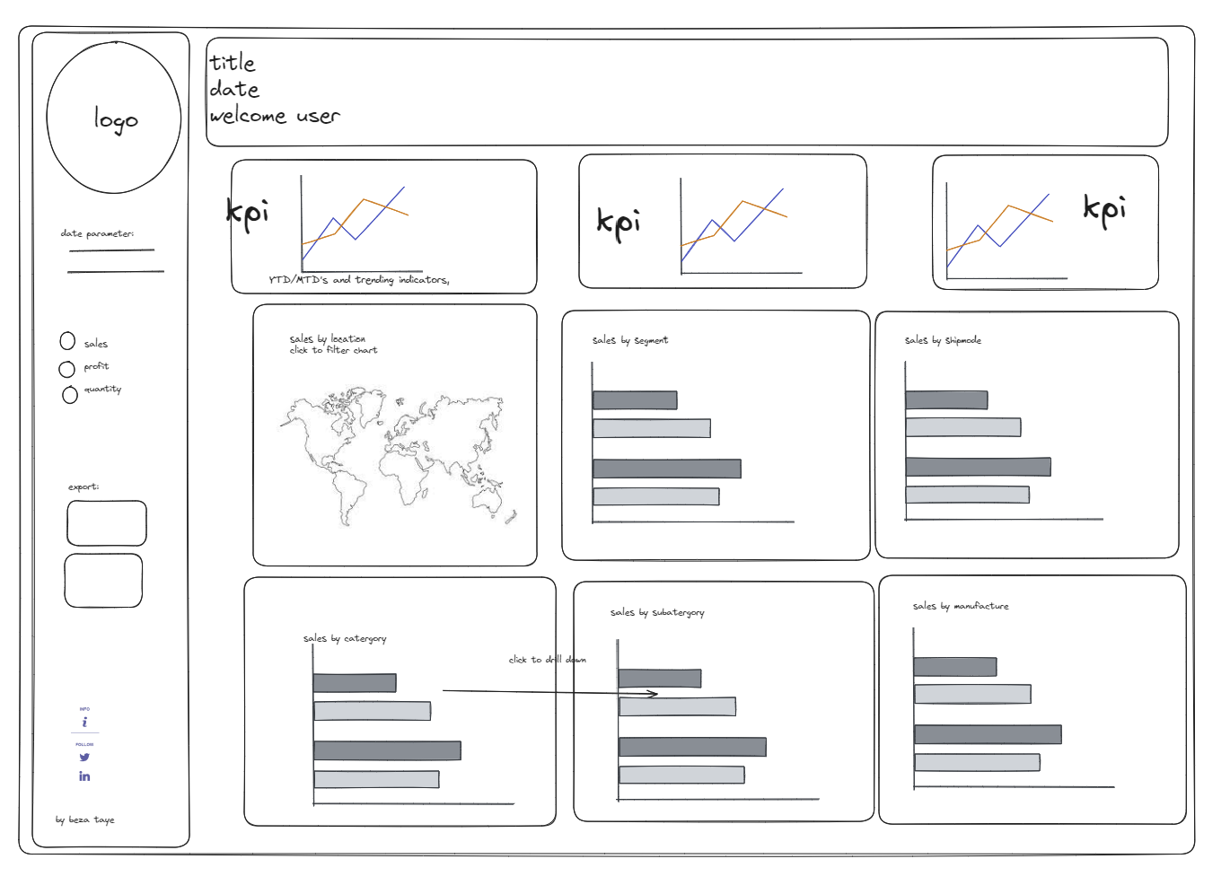
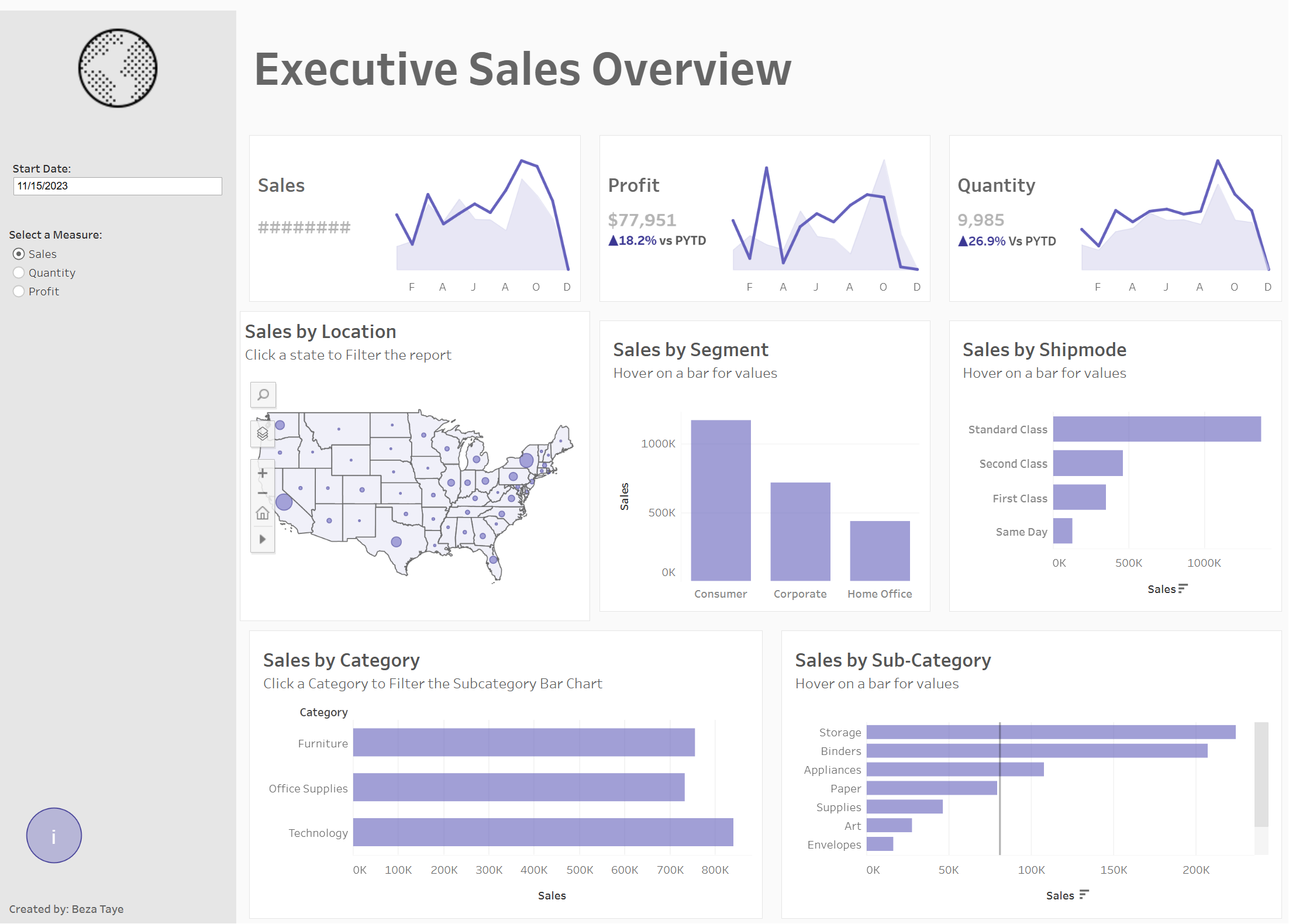
As one of the main points for these reports was to include descriptive KPI's with PYTD/MTD and indicators, I set about doing this in Tableau, and started to build out the charts. Within the given time frame I was able to produce something close to the sketch - definity a WIP I'm looking forward to finishing up in some spare time.
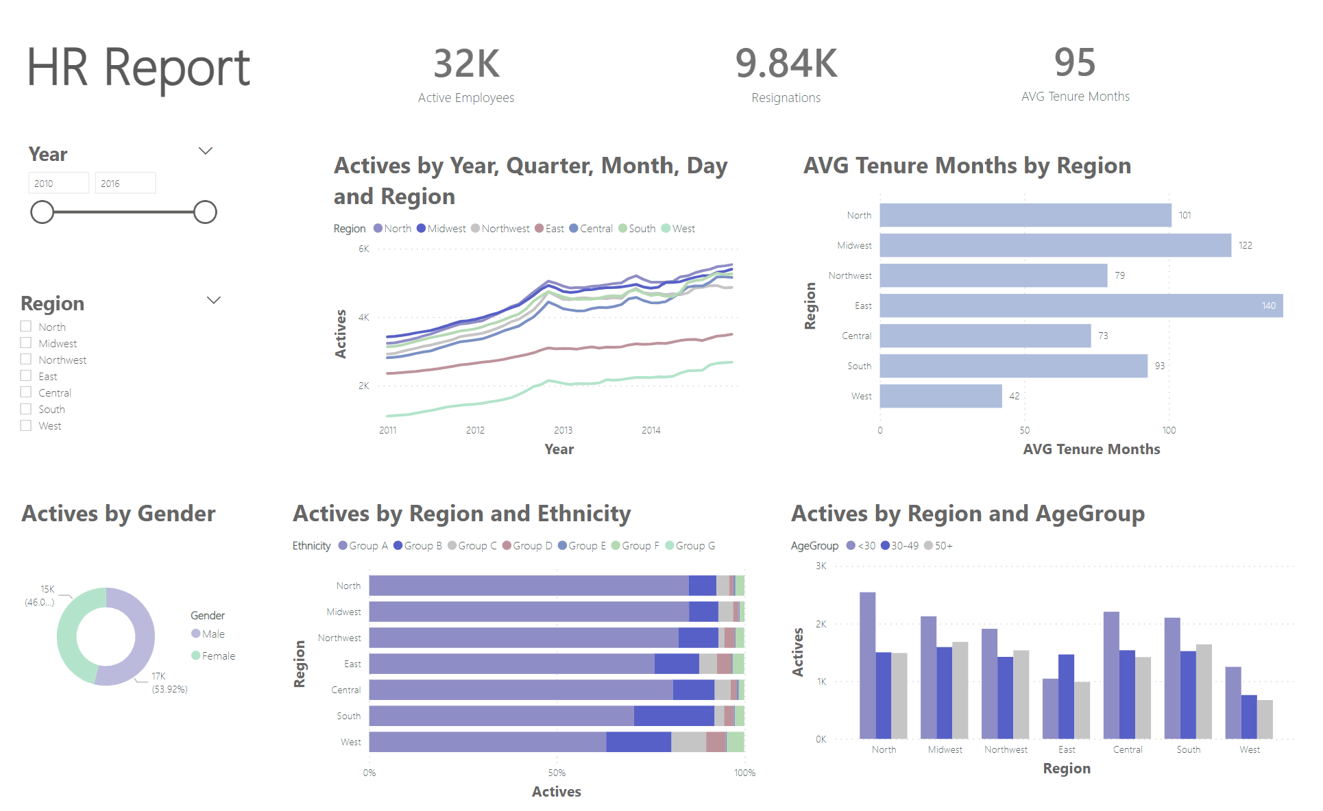
Next I moved onto Power BI.
I again started off with a sketch in Excalidraw:
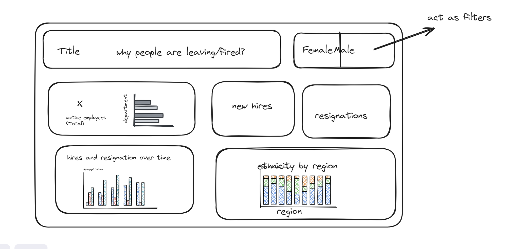
I knew that I wanted to slice the data by year, region and gender and have the KPI as mentioned above.
My final out put was: