


Did you know that the first Coxcomb chart (pictured above) was created by British nurse Florence Nightingale in 1858 to visualize soldier deaths during the Crimean War? She wanted to prove to British Parliament and military authorities that the vast majority of deaths were caused by preventable, contagious hospital diseases rather than battlefield wounds. By representing each month as an equal slice whose area scaled with mortality, her dramatic visual persuaded decision-makers to enact drastic sanitary reforms in military healthcare.
Nightingale used careful arithmetic and geometry to create her chart; lucky for us, we can create this right in Tableau.
Before we start, note that a Coxcomb Chart is best for visualizing cyclical or seasonal continuous data where you want to compare relative proportions across equal time intervals or categorical segments. For strict analytical tasks where you need to compare fine variations between categories, horizontal bar charts are generally better, since our eyes perceive straight lengths far more accurately than radial area sizes.
With that, let's build a Coxcomb Chart!
- Set Up the Data
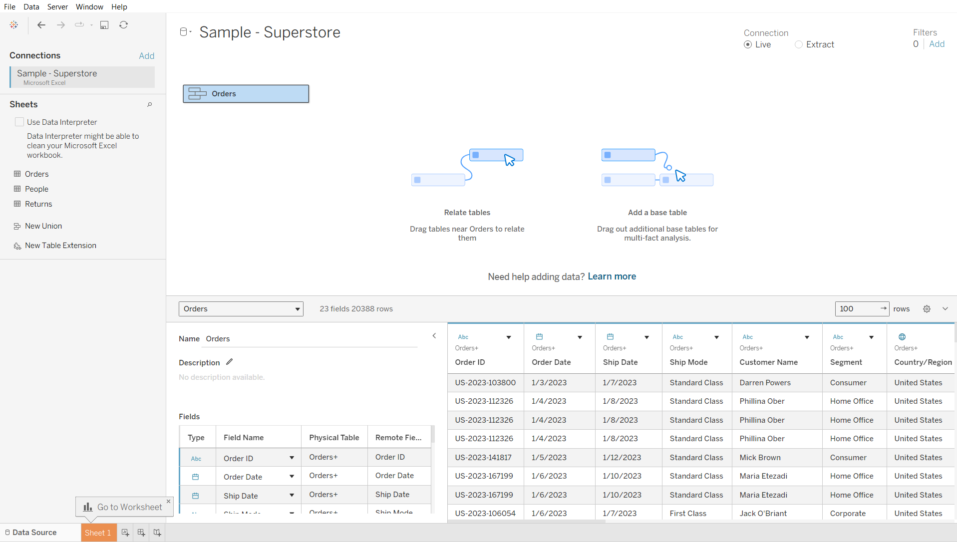
We'll be using Superstore data to build this chart. To get the data ready, go to the Data Source tab in Tableau and remove the People and Returns tables from the logical layer. Then drag a second Orders table onto the existing Orders table until you see the Union option appear underneath.
We essentially duplicate the data to be able to have a continuous sequence of points and draw filled polygons for the chart.
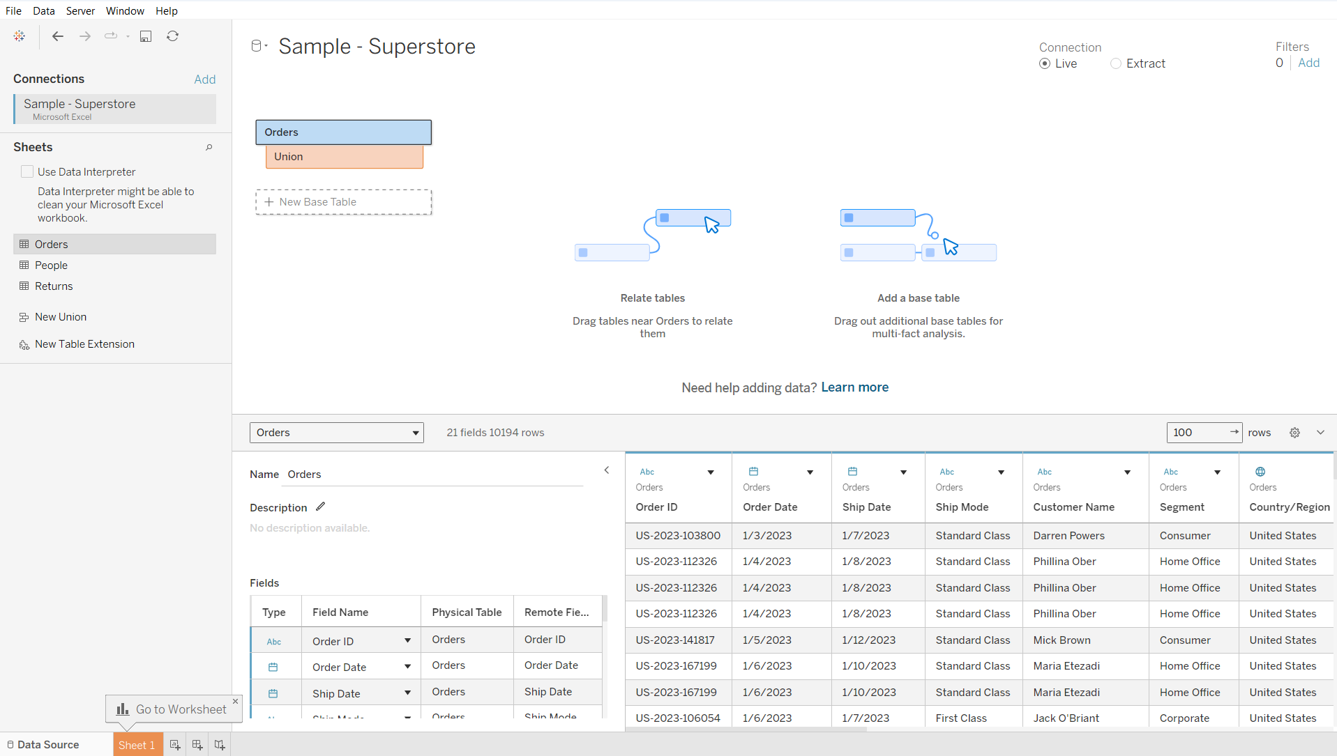
You should see the Union symbol afterwards:
- Create the necessary Calculations:
Having successfully gotten our data in its desired shape, we can move on to creating the necessary calculated fields for the Coxcomb Chart.
For the following 9 calculations, create a Calculated Field, set its name to the string before the colon and its value to the expression following the colon:
- Num Subcategories: WINDOW_MAX([Subcategory Index])
Returns the number of subcategories that are included in the chart.
- Num Increments: 99
This is equal to Pad – 3. It is an auxiliary calculation for X and Y.
- Increment Index: INDEX()
Keeps track of the increment within each wedge. This is an auxiliary calculation for X and Y.
- Radius: SQRT(SUM([Sales])/PI())
Calculates the radius/length of the wedge so that its area is directly proportional to the Sales value, derived from the circle area formula A = pi r^2. This is an auxiliary calculation for X and Y.
- Subcategory Angle: ([Subcategory Index] - 1) * (2 * PI() / WINDOW_MAX([Subcategory Index]))
Returns the segment position multiplied by degrees per segment. Segment 1 starts at 0 degrees. This is an auxiliary calculation for X and Y.
- Subcategory Index: INDEX()
Keeps track of the subcategory for the view. This is an auxiliary calculation for X and Y.
- X: IIF([Increment Index] = 1 OR [Increment Index] = WINDOW_MAX([Increment Index]), 0,
WINDOW_MAX([Radius]) * COS([Subcategory Angle] +
((([Increment Index] - 2) * WINDOW_MAX(2 * PI())/([Num Subcategories] * [Num Increments])))))
Determines the X-coordinate for plotting each point of a wedge. Returns 0 for the first and last points of the path sequence to anchor the slice back at the center origin, and calculates the outer arc position for the points in between.
- Y: IIF([Increment Index] = 1 OR [Increment Index] = WINDOW_MAX([Increment Index]), 0,
WINDOW_MAX([Radius]) * SIN([Subcategory Angle] +
((([Increment Index] - 2) * WINDOW_MAX(2 * PI()) / ([Num Subcategories] * [Num Increments])))))
Determines the Y-coordinate for plotting each point of a wedge. Returns 0 for the first and last points of the path sequence to anchor the slice back at the center origin, and calculates the outer arc height for the points in between.
- Pad: IF [Table Name] = 'Orders' THEN 1 ELSE 102 END
This will a create start and end point for the curve within each segment.
Once created, right-click on Pad and click Create > Bins.
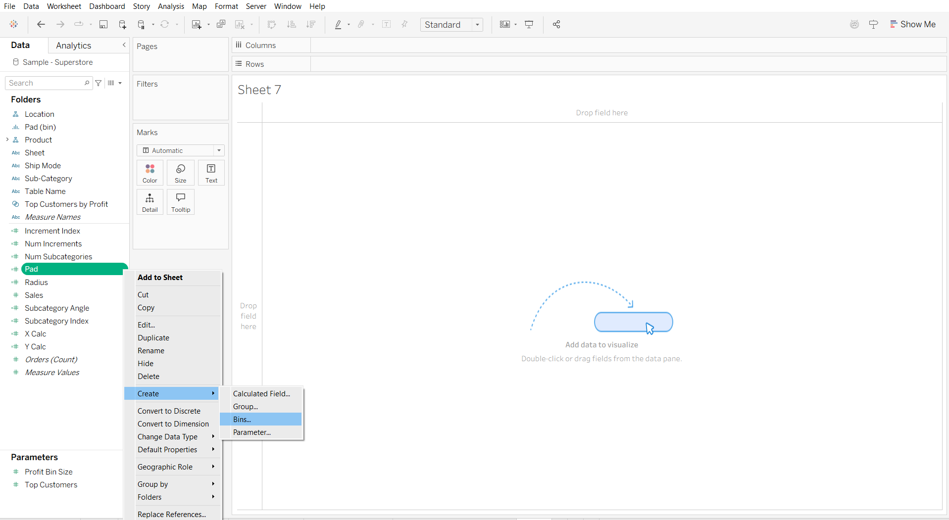
Binning the Pad field is necessary because self-unioning the Orders table only gives us the two endpoint markers—1 and 102. Creating the bins is what makes Tableau automatically generate all the missing integer values between those start and end values.
- Build the Chart
Now that we have all the calculations in place, we are ready to build the chart. For this, drag X to Columns, Y to Rows, Subcategory to Color, and Pad (bin) to Path. Switch the Marks type to Polygon.
- Edit Table Calculations
The final step before seeing the Coxcomb Chart is to edit the Table Calculations to specify addressing and partitioning. Start by right-clicking on the X field (on Columns) and clicking Edit Table Calculation. There, click Specific Dimensions (under Compute Using) and check Pad (bin).
This tells Tableau to compute the table calculation along the Pad (bin) dimension while keeping Subcategory fixed (partitioned).
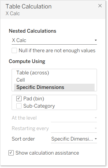
Under Nested Calculations, switch to Increment Index and do the same.
Next, choose Subcategory Angle from Nested Calculations and select Compute Using > Specific Dimensions > check Subcategory.
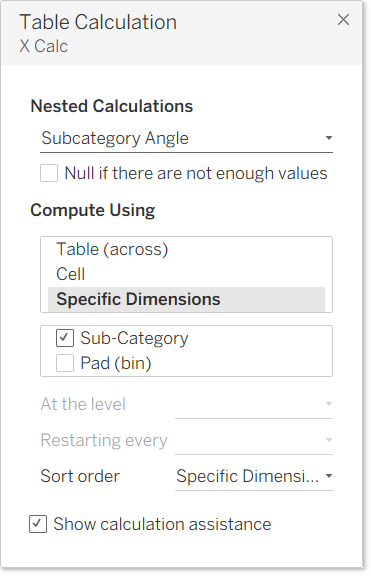
This tells Tableau to compute the table calculation along the Subcategory dimension while keeping Pad (bin) fixed (partitioned).
Do the same for Subcategory Index.
Finally, choose Num Subcategories under Nested Calculations and Compute Using > Specific Dimensions > check Pad (bin) AND Subcategory.
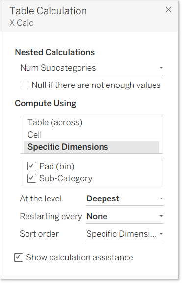
Checking both fields means Tableau calculates the number of subcategories across the entire view, without partitioning.
One last thing: repeat these configurations for Y (on Rows).
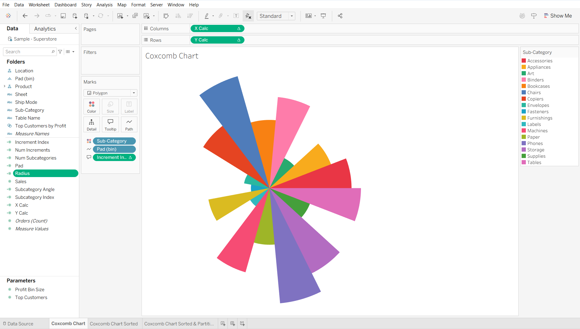
And there you have it, your very own Coxcomb Chart! It should look something like this:
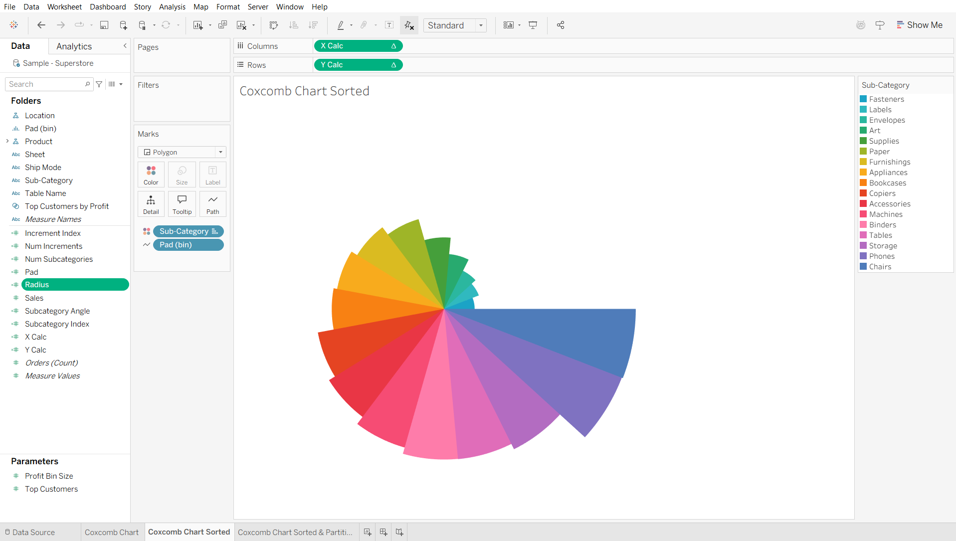
You can also sort the Subcategory dimension based on the Sales field, which will give you this view.
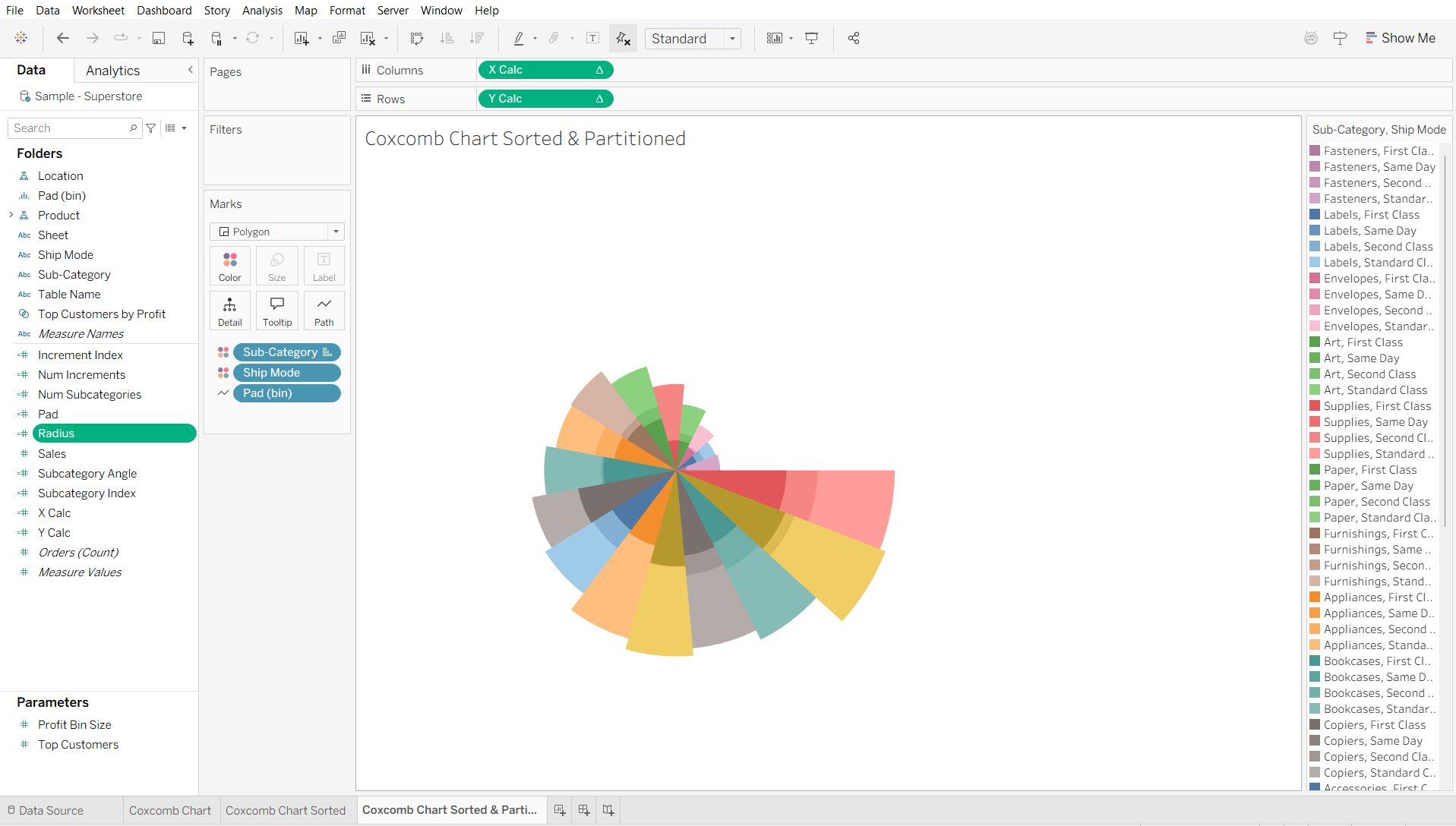
Finally, you can also add Ship Mode (or another Dimension) to Detail and then switch it to Color to get a partitioned Coxcomb Chart like this one:
Before wrapping up, I would like to give credit to Ruth Amarteifio's video and template, which served as the foundation for my own Coxcomb charts as well as this walkthrough.
Hope this helps!