


For day three of dashboard week we took on Data on the US Coronavirus Aid, Relief and Economic Security (CARES) Act. We looked at the loans for businesses across the USA. The data can be found here https://home.treasury.gov/policy-issues/cares-act/assistance-for-small-businesses/sba-paycheck-protection-program-loan-level-data.
One issue with the data right out of the gate is that loans above $150’000 are not reported to a specific value, they are only reported as five different categories within a pretty large range. An example of this is category C being loans from $1-2 million.
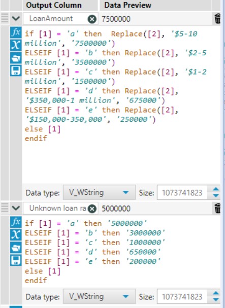
Loan ranges aren’t usable for aggregation so I made the decision to treat every loan as if it were the mid point of it’s respective loan range. Along with this I decided to record the unknown for each loan category, the loan in category b for example would have an unknown loan range of $3 million (5-2=3). I did this by splitting the LoanRange column above and using a string replacement formula. It’s always nice to avoid hard coding as the workflow is limited to whatever you directly inputted but in this case with only 5 categories it was an acceptable choice.
The state data for under and over $150’000 was unioned with the accurate loan amounts unioned to the estimated loan amounts in the >$150’000 table. This is potentially misleading so I made sure to remember to highlight this in the dashboard I built. With the data prep out the way, let’s have a look at the dashboard.
Any time I need to visualise the individual states of America the hex map is always on my mind as a possible option. Hex maps are great for making every state equally visible while still maintaining a view that is still recognisable from a geographic point of view. I’ve added interactivity to the dashboard in a few ways, the states can be coloured by a few different measures such as amount loaned, jobs retained or number of loans. This colouring can be toggled to being coloured by the amount of the specified measure or by whether a given state is higher than a national average. The bar chart to the side also changes with each measure to provide an ordered view of the states by the selected measure. The colouring of the bars is separated by whether each state is above or below the national average, regardless of if that view is repeated on the hex map. There is a potential issue of the darker blue possibly having two different meanings on one dashboard which is generally something to be avoided. If colour has a meaning, it ideally will have the same meaning across the dashboard. On the left we have a couple BAN’s that can be filtered by selecting an individual state from the hex map. An issue with this is that there is no indicator of what state is currently selected which could easily cause people to misinterpret the data. This could be remedied with a dynamic title, this could be done with, dashboard, parameter or set actions.
There were quite a few considerations for my dashboard with some potential pitfalls in my design decisions. It can be really helpful to look at previous dashboards after a little while to see what things could’ve been done differently and see how your design sensibilities shift with time. As enjoyable as it is to learn about new techniques and chart types, it can be equally engaging to critique dashboards to appreciate all of the choices that go into building a good one.