


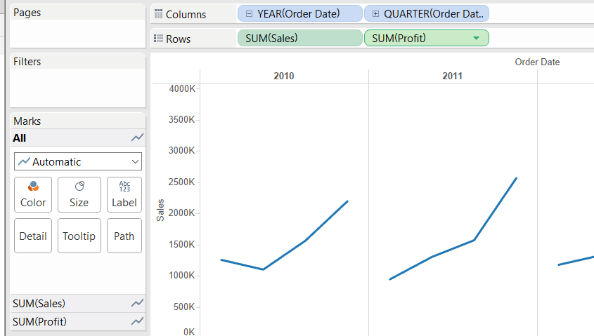
As we saw in my previous post, scatter plots use two axes, axis x and axis y, to show the relationship (if any) between two measures.
However, Tableau offers s different option to use two axes in a visualization, Dual Axis.
Dual Axis means that a view is using two axes that are opposite to each other with a common pane.
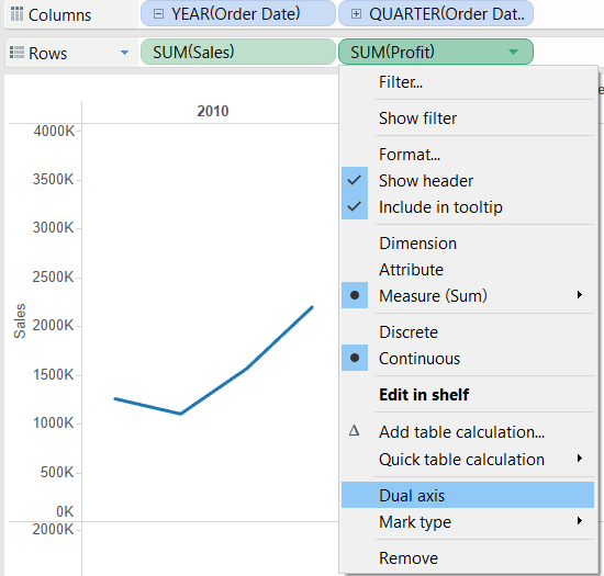
Dual Axis can be used with any field that define an axis (Continuous numeric fields, continuous date fields, and latitude and longitude).
Creating Dual Axis is really easy in Tableau, just drag and drop two continuous fields next to each other on Rows or Columns.
Then use the drop down menu on the second and select Dual Axis.
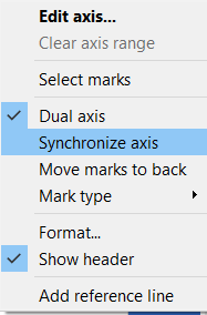
NOTE: Remember to Synchronize the Axes. Sometimes your data might look more or less equal in value at a certain point. This is unlikely to be the case. Instead, the axes are not synchronized.
And there you have your Dual Axis visualization!!