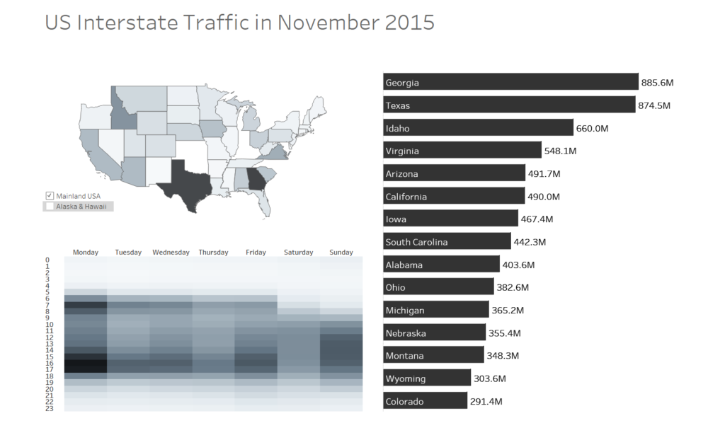
Under serious time pressure to write this one. We had to make something with data concerning the number of cars passing particular stations on interstate routes in the US. The data is from here: http://metrocosm.com/get-the-data/#interstatetraffic
I guess eyeballing the data would have you thinking that this is a simple dataset to work with, but really it wasn’t, and what’s more is that we were restricted to Tableau Prep for processing the data. A few issues that I came across:
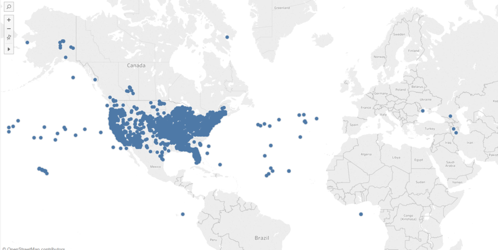
- The decimal places were removed from the latitudes and longitudes. They were simple to put back in with a formula, but still I was returned some whacky coordinates, considering the data was supposed to be US only. Because there were quite a few displaced stations, I decided to not visualise this at the station level.
- I was unsure about a number of fields in the data, like the number of directions (which ranged from 0-~9) and the number of lanes. I couldn’t understand how these could be used, or how they fit into the original visualisation.
- I couldn’t see anything that could be used as a path to join the stations, in order to visualise the highways. Again, I’d like to see how the original visualisation was made.
- The data seemed to be an amalgamation of two data sources, which were labelled within the dataset, and contained duplicate recordings at the same stations/times, but different counts for cars. In some cases they were off by just 1 car, so I assumed that these data sources were from different recording devices, attempting to measure the same thing. I grouped by whatever dimensions I could, and took the max count between the duplicate recording entries.
We had pretty much 30-45 mins to make something in Tableau, which is unfortunate because I think I could have made a much better dashboard given more time. Anyway, here’s the result, looks remarkably like what I made yesterday. Good riddance Dashboard Week!