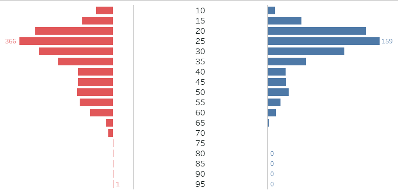
A butterfly chart can be used to make quick assessments about a population or a group of people; for instance, the age and genders of people who attended an event, or who replied to a survey.
Butterfly charts are not always the best chart option for representing demographic data - for one thing, they usually assume a group can be split neatly into 2 distinct categories (in this case 'Male' and 'Female', when not every respondent may have listed either of these as their gender).
However, they are useful where the data does allow this kind of split, and they are not too difficult to make.
Steps for building a butterfly chart:
1. Ensure you have appropriate data: I will be using a continuous number field for Age, a unique field for each person (e.g. an ID number) and a Gender field that is currently split into Male and Female.
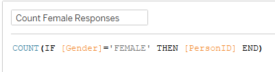
2. Create a Calculated Field that will act as one half of the chart; I am starting with the Female respondent side:
3. Next, right-click on your Age field, go to 'Create' and then 'Bins'; set 'Size of Bins' to 5. We are aiming to split the ages up into 5 year groups to avoid the bars of this chart all running together; if you want to include all individual ages, ignore this step.
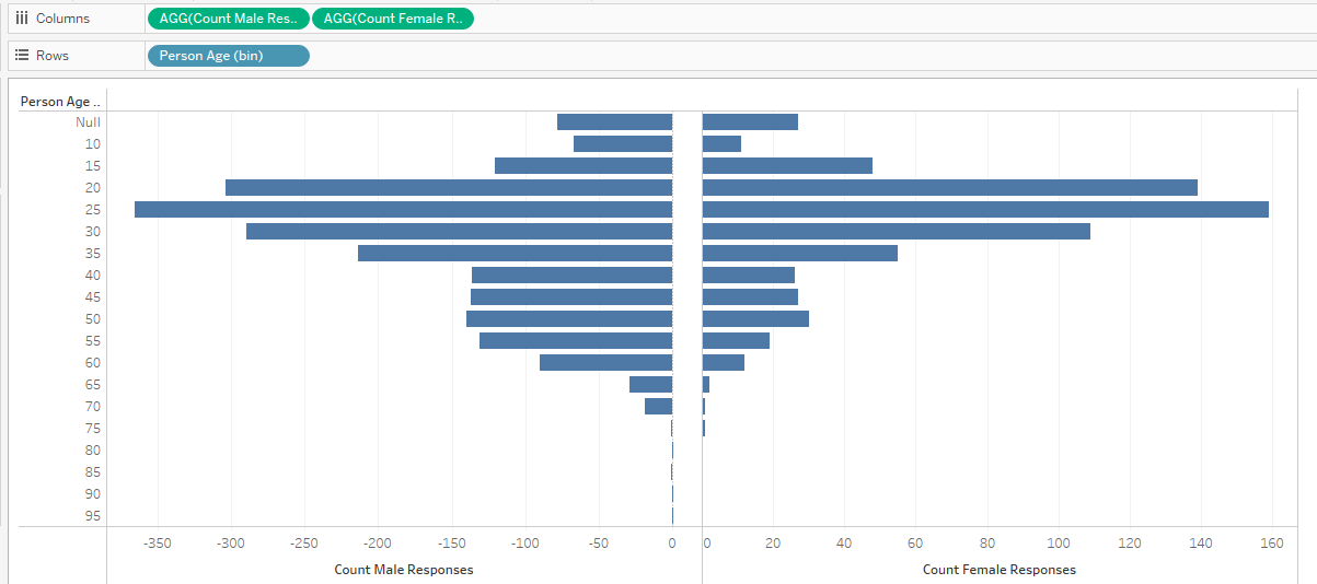
4. Bring the 'Count Female Responses' field onto Columns, and the Age Bins (or continuous age field) onto Rows:
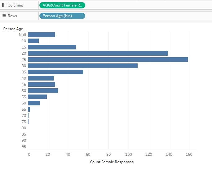
Nulls can be excluded at this point.
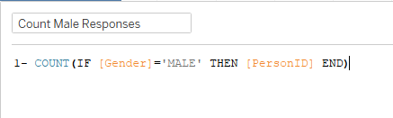
5. We can now repeat some of the previous steps to create another bar graph that will back onto this one; note the subtle difference in our Calculated Field for the Male survey responses:
6. Bring the 'Count Male Responses' field onto columns too:
7. We can now make these dual axis by right-clicking on either green Column pill and selecting 'Dual Axis', then right-clicking the x-axis and selecting 'Synchronise Axis':
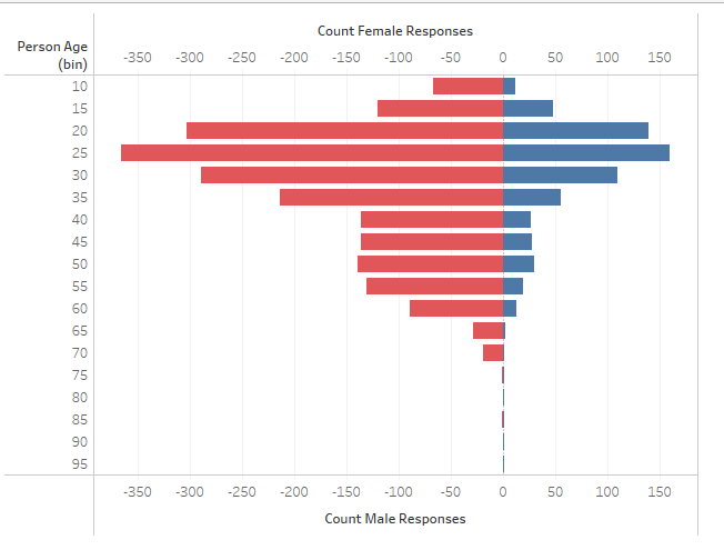
We now have a basic butterfly chart that helps us to see the distribution of gender and age in our respondents.
This chart can now be enhanced and formatted as appropriate, i.e. by hiding some headers, or setting the x-axis to be equally sized in both directions, removing grid lines, or adding reference lines and averages.
You can also add a central Age axis if preferred, instead of an axis to the side.
This requires you to create a new Calculated Field with the value zero; drag the calculated field onto the Columns shelf between the Male and Female response counts, breaking up the Dual Axis.
You can then add your Age bins onto the labels of this axis, and hide the other Age axis: