


For today's Dashboard Week brief, we were focusing on building a robust and well-designed KPI dashboard - the focus was on key performance indicators and summarising trends, instead of our usual focus on visualisation through charts.
I have always found level of detail calculations (LODs) especially tricky, and so knew that this would be a challenging brief for me...
The brief:
"We want to see an exceptionally designed KPI dashboard. The data set is about rent prices in San Francisco, which are stupidly expensive like London. The data is already cleaned, hence the requirement to build something very very good. You are expected to speak about your audience and how they will use your dashboard to make decisions. Include a citation."
In terms of designing with specific users in mind, this project was much more open-ended than we are used to: I inferred that we could choose our own use case and build a dashboard around that.
The user story:
The dataset was to do with property listings in the SF Bay Area, which had been scraped from historical Craigslist posts.
I decided that my hypothetical user would be someone aiming to sell property in this area, such as an estate agent or developer.
I wanted them to be able to answer the following questions:
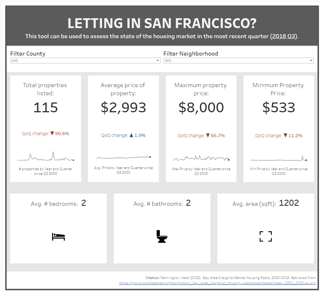
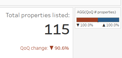
1. How many properties are coming onto the market right now, compared to previously?
2. How is the range of property prices changing over time?
3. What kind of properties are coming onto the market, in terms of size, shared/full property, and features?
4. How do the preceding factors vary by location?
If someone was looking to sell, they might have certain criteria in mind for the timing and type of properties they want to put onto the market: is it a busy and competitive time, with lots of variety for buyers, or are prices on the rise for sellers to benefit from?
My final priority was to make this a sleek and pared back dashboard in terms of design: the brief asked for 'exceptional' design, and for me the look and feel would definitely play a big part in this.
My final dashboard can be viewed here, or below:
Main features:
1. I was pleased overall with my dashboard layout and design! It is pretty simple, but my understanding of KPI dashboards is that they could work as a printed poster as well as an interactive tool, and I think this muted colour palette and clean layout make it easy to scan through and assess the key facts about properties listed this quarter.
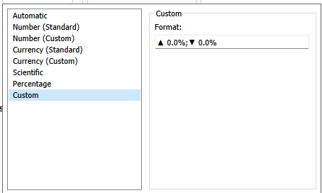
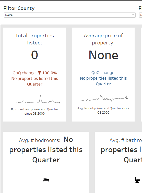
2. I managed to create QoQ change indicators that were dynamic in colour, with up/down indicators to make the direction of change even clearer. I used my QoQ calculated field on the Colour card in Tableau, and set the legend to a 2-step diverging colour palette; I could perhaps have used a continuous diverging palette, to show size of change, but I only wanted a binary good/bad colour scheme here.
I also changed the Number Format to add the up/down indicators, and set this as a percentage.
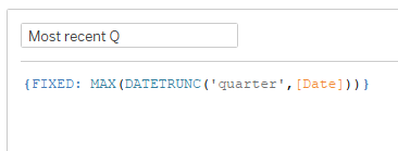
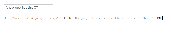
3. I made sure to use LODs for any current/previous quarter calculations so that could future-proof my work; I also included the result of this calculation as a dynamic title in the dashboard to spell out to the user what period they were exploring.
4. I also error-proofed the dashboard with a contingency plan, in case the user were to select a County or Neighborhood where no listings had been posted in the most recent quarter.
Feedback and updates:
- I went back and turned off any remaining messy tooltips, since these did not really add much.
- In my first version of this dashboard, I did not have any label or axis on my sparklines, and had them set to Year only. I ended up changing this as per my feedback, since it would be more consistent with the Quarterly view of the rest of the contents, and would spell out the date range for the user.
All in all, another interesting and challenging project ahead of our final day of training...