


For the second day of our Dashboard Week (and final week of training!), DS30 focused on accessibility. We were each challenged to rebuild an existing viz - used by The Information Lab itself - that would take some specific accessibility requirements into account; our hypothetical clients included users with dyscalculia, colour-blindness, visual impaired users who required Screen Readers, and mobility impaired users who did not use a mouse or tracker pad.
My task was to rebuild a Revenue Tracker dashboard for a keyboard-only user; I was allowed to use my own mouse for building out the dashboard, but had to test how easy it was to use and analyse with only shortcuts and my keyboard.
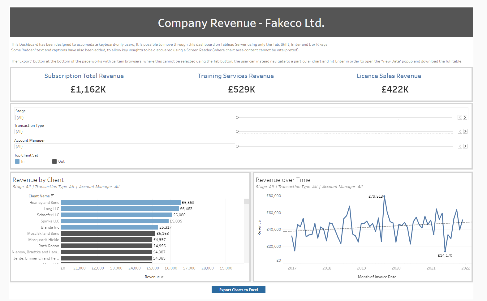
Since I was given an internal datasource to work from, I have recreated the dashboard using mock data from Mockaroo; it can be viewed on Tableau Public here or seen below:
There were 3 main features I wanted to focus on in terms of keyboard-only accessibility:
1. Showing key information without Tooltips
With no mouse, a user cannot hover over data points or KPIs and view more detail in Tooltips. Before today's session I had fallen back on Tooltips a lot for keeping my dashboards neat and tidy, hiding details in Tooltips for users to discover on their own.
To add some of this detail back into the dashboard, I included dynamic titles to help the user understand exactly what was being represented, and added mark labels back into the view so that users could see the exact figures next to the horizontal bar chart.
2. Clear Navigation
The next priority was to help users move through the dashboard and interact with any buttons and filters without requiring a mouse.
Tableau has a default order in which the Tab button can move around the page - it generally moves left-to-right, and top-to-bottom through the different sections of a dashboard. I made an attempt to edit the XML of my Tableau workbook and manually set the order of the dashboard 'zones'; however, this proved to be a time-consuming process, and our project was time-sensitive!
Instead, I focused on ordering the charts, filters and KPIs in a logical left-to-right and top-to-bottom order, tiling these in containers and regularly testing the dashboard on Server and Public to check that the Tab order was as expected.
I also checked the Tab action colour - in the case of my laptop, using Tab to navigate will highlight each section with a blue outline as I select them. I had to ensure that my colour pallete provided enough contrast for this blue selector to be clearly visible.
3. Providing Alternatives
Since the chart areas in Tableau can neither be read with a Screen Reader nor selected using keyboard controls, it might be that visual representations of our data is unsuitable for in-depth analysis.
I wanted to provide the option for the user to download a crosstab of the data in order to inspect it in Excel, as an alternative to the bar chart and time series.
My first solution was to find a Tableau extension to do this for me. I came across the Export All extension (made by other TIL members!) and attempted to add this into my workbook as a dashboard object. I configured it to appear as a blue button that, when selected, would download the data for both charts as an Excel file.
This worked well at first, but an unspecified error later meant that I could not actually select this using Tab when navigating without my mouse.
I then discovered that hitting Enter when selecting a chart on Server allowed me to open the 'View Data' pane, where I could also choose to download the data as an Excel file. This proved slightly less accessible, since without signposting only an experienced used might know how to use this feature. It also took me a while to work out how to exit the pane and return to the dashboard (Ctrl + F4).
All in all this was a really interesting session, and certainly challenged many of my perceptions about what makes a 'good' dashboard in Tableau
Many of the design features I always considered desirable (like minimalist, low-text design) are actually rife with accessibility issues - I will be doing my best to incorporate more universal design principles into my own work moving forward.