


On the third day of dashboard week our coaches gave to me... a data dump on the video game Path of Exile. Path of Exile is an online action RPG that has a sophisticated trading system that players track day by day (s0metimes multiple times a day), creating an internal economy within the video game.
The central currency in the game currently is in chaos orbs, so my analysis was conducted with chaos orbs being the point of reference for currency conversion. The data dump tracked the values of items (measured in chaos orbs) and currencies, and initially I wanted to create a KPI dashboard that tracked the highest performers. I firstly set up a "days back" parameter allowing you to look at prices with respect to the last n days, where n would range from 3 to 28 (so four weeks of analysis). My initial sketch looked like this:
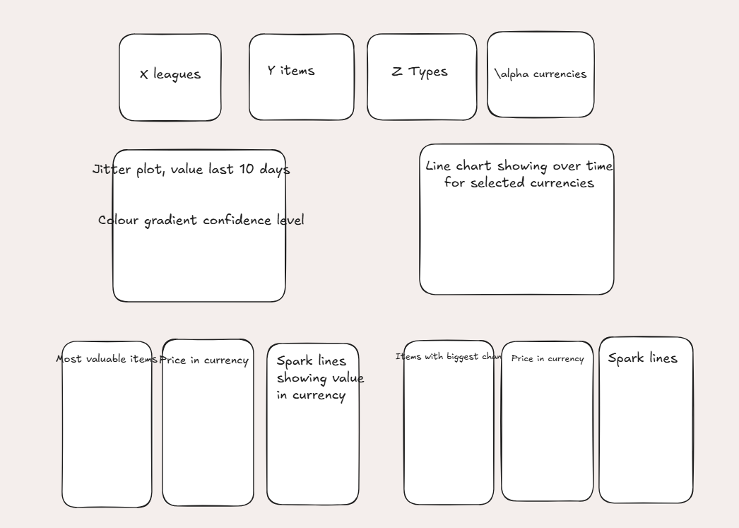
After consideration I added a bit of more context by allowing a user to select a type of item or currency and look at the distribution of the same type (using logarithmic scaling because some items have chonky prices squishing the jitter plots).
My final dashboard looked like this:
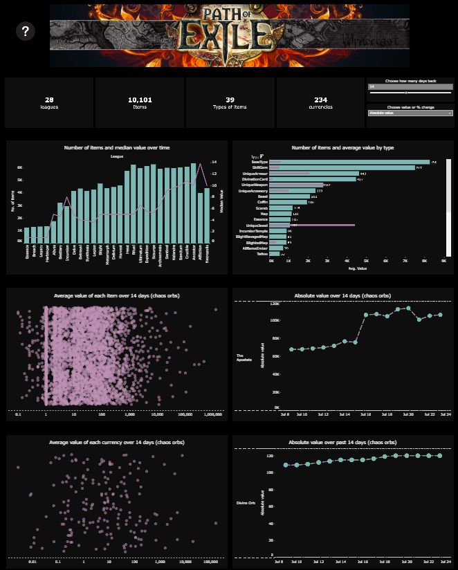
By selecting an item type on the bars in bars chart, it filters the first jitterplot to items of that type. By the line charts tracking the prices or percentage change day on day become populated with those items. Selecting points on either jitterplot populates the respecting line chary over the last n days with those selections.
Link to the dashboard to check it out: