


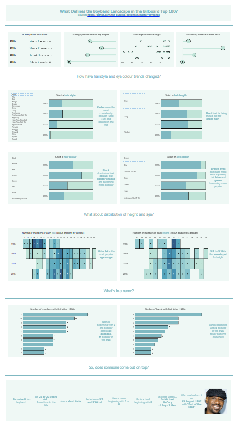
Today marked the final day of dashboard week for us and we were tasked with creating infographics from a dataset centered around boybands that have made it into the Billboard Top 100 charts.
I initially wanted to create an interactive chart that allowed to to pick characteristics to narrow down a list of members to focus in on one that meets all the criteria that one has set. This strayed to far into non-infographic territory, so I revised my scope and created something a bit more explanatory that still allowed some room for exploration. Based on the metrics I decided upon, I focused on how trends change through each decade, and then narrow my focus to decide on a particular artist that most closely matches the most popular iterations of each criterion.
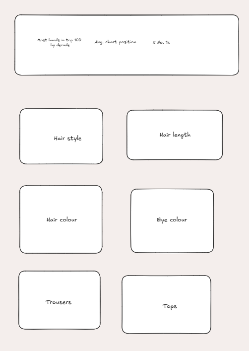
My plan, as seen below, got a bit too Dashboardy and reminiscent of Football Manager (with stacked bar chart after stacked bar chart), so I diversified my chart choices and mused on some novel metrics (like looking at whether the first letter of a member's or band's name is more popular).
The final viz, as seen below identifies one boyband member who stands above the rest, Michael McCary of Boyz 2 Men. He most closely fits some of the most popular trends of the most popular era for boybands, the 1990s.
Link to Tableau Public: https://public.tableau.com/views/BoybandsInfographicbackup/Boybandinfographic?:language=en-US&:sid=&:redirect=auth&:display_count=n&:origin=viz_share_link