It is with excitement and some apprehension that I submit my first blog post as I begin on my journey as part of the 46th cohort of the Data School. Today we discussed the role of a data consultant and explored some of the duties and responsibilities associated with the position. In doing so we learned about how to make use of user stories to help diagnose how to approach a task.
I was tasked with reimagining a data visualisation in my own personal way through creating a user story. The original visualisation can be found here:
https://public.tableau.com/app/profile/alexandervar/viz/Whentheicemelts/NHLStats

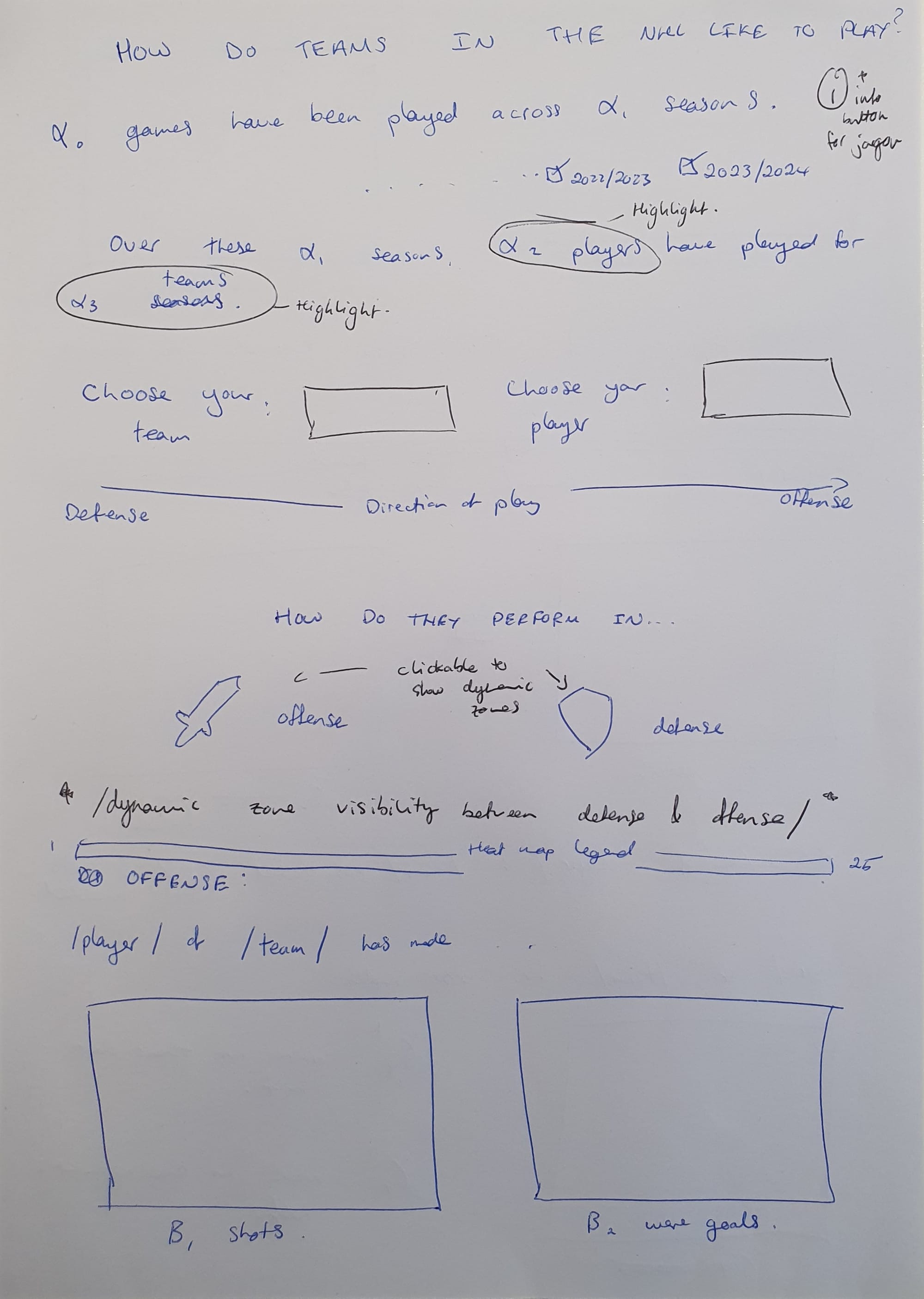
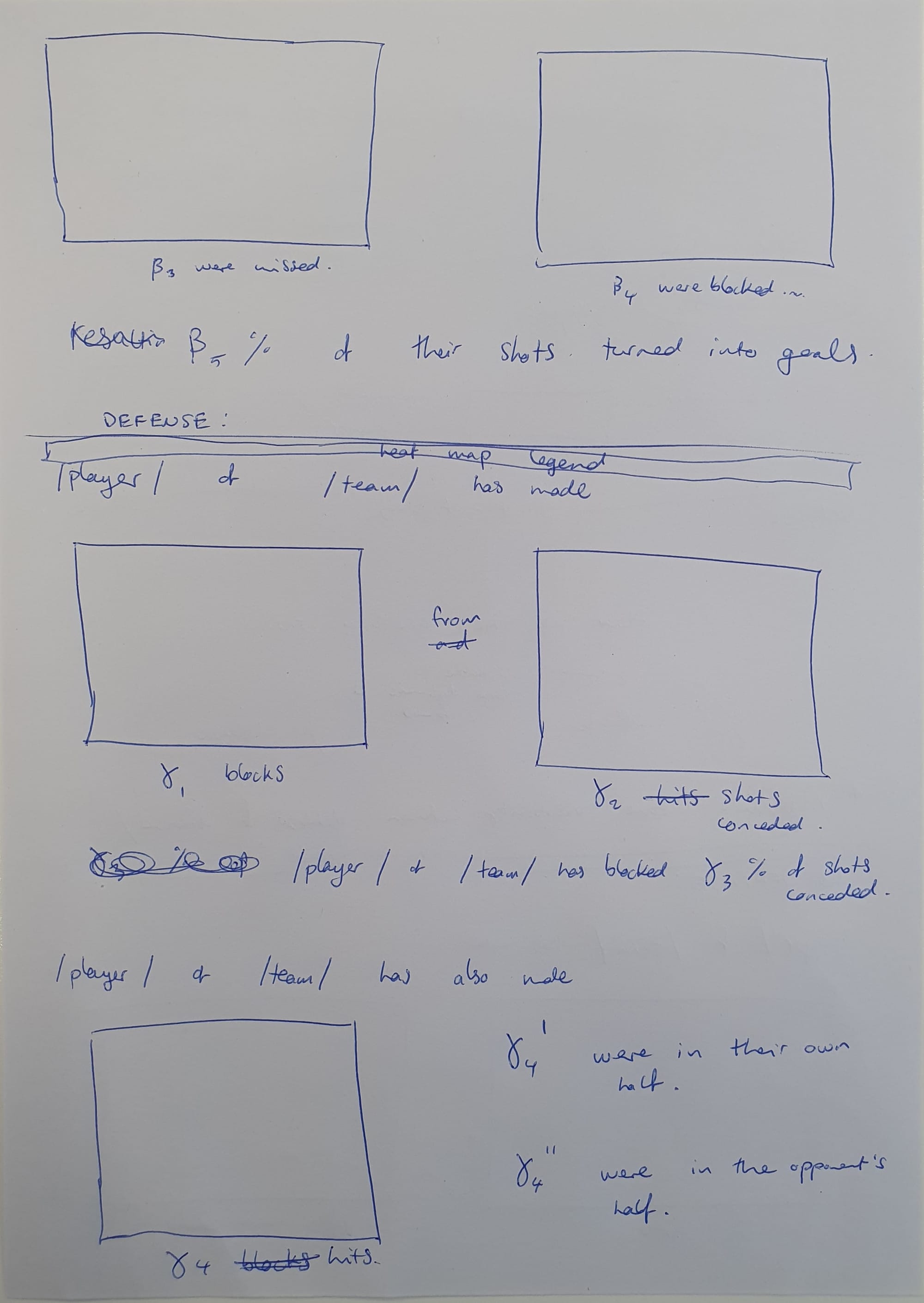
A few questions I wanted to attempt to answer came to mind when I explored this visualisation. Does each team in the NHL play in a particular way? Are some more aggressive in defense? Which positions should attackers find themselves in if they want to convert chances into goals? How have teams performed from season to season? Have any improved or declined?
In my reimagining of this visualisation I wanted to cohere this diffuse set of questions into a story that tells of a team's playstyle and performance to answer the hypothetical question: If I were to play against one of these teams at any particular point in time, how should I (have) set up my team? By identifying these key metrics, one could formulate tactics to effectively neutralise the opposing team's strengths and expose their weaknesses. As the user explores each of the filters, they can form an impression of a team's style of play and formulate a corresponding strategy!