Brief
Communicate the co-benefits of climate action using the dataset from the UK Co-Benefits Atlas. You will create a polished, compelling visual story showing the positive impacts of climate action — focused on convincing a specific audience. You may use Tableau OR Power BI, and data prep method of your choice.
Overview
- Explore the UK Co-Benefits Atlas dataset (climate action benefits to health, economy, environment, communities)
- Choose one or more co-benefit categories
- Select a specific audience to persuade (e.g. councils, businesses, a local community, climate skeptics)
- Tell a clear story using data
- Build a polished infographic-style dashboard (static or interactive)
- Publish your work and write a short blog
This challenge focuses on persuasion, clarity, and insight, not just charts.
Same rules apply as day 1.
Plan
Data
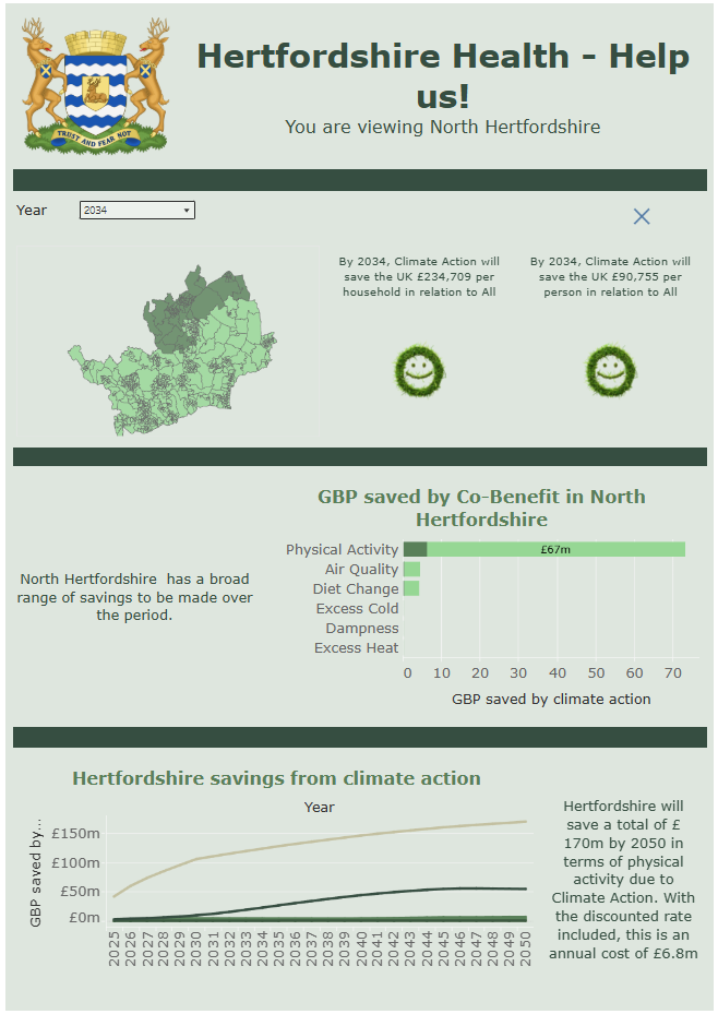
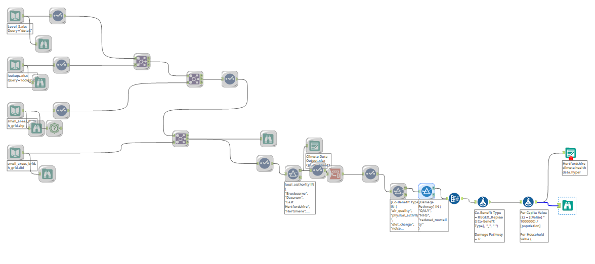
Created an Alteryx workflow that pulled the Level 3 data in alongside the lookups and small areas polygon map data, with all datasets joined on the small_areas field. The scope was then narrowed down to focus on Hertfordshire, and benefit types that revolved around nature and more specifically human health.
Sketching
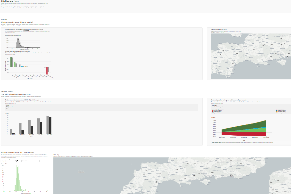
I browsed the UK Co-benefits site to find inspiration for the dashboard. I looked at dashboards that focused in on specific areas, taking this one focusing on Brighton as a way to layout charts and narrow focus region wise.
I then selected a colour palette, which I kept green to stick with the county colours and the green climate theme.
I tried to save time by making a reduced plan compared to my usual overplanning, as I had most of my ideas in my mind.
Building
I changed my approach and decided to rather build each chart and re-arrange on the dashboard. This meant I had more time to collate my items on the dashboard, which looked better but meant I had a lot of back and forth.
Challenges and Findings
Once again, designing and formatting was a struggle for me. I made more progress then I have in the previous days, but I still did not complete the dashboard as much as I would have liked.
Going forward I will try to continue to work at a faster pace and ensure that I leave more time for formatting. For the final dashboard, I will try to narrow the scope and ensure I have more clarity, faster.
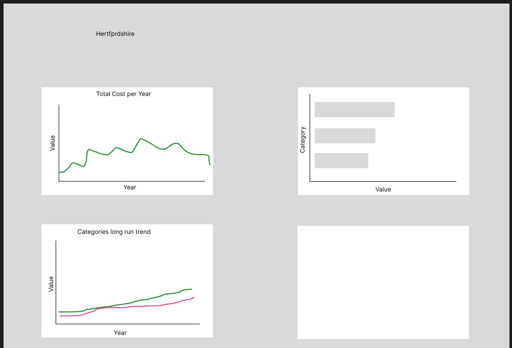
Below is my dashboard.