


Brief
The rules for dashboard week are pretty simple and apply to every day this week:
- They must work independently, unless otherwise specified.
- If data prep is required, they can use Alteryx, Tableau Prep, SQL or Power Query, unless otherwise specified.
- They must create a sketch of their plan for their dashboard and show this during their presentation.
- The dashboard they create must be uploaded to Tableau Public or Power BI Service (and embed it into their blog). If no visualisation tool is specified in the challenge, they can choose themselves.
- They must write a blog post detailing their work throughout the day.
- At 3:30 pm, they will present their data prep, sketch, viz, and anything else they would like to present.
Today’s challenge was set by the Fabric Data Days Dataviz Contest. Creating a visual CV / Resume in Power BI.
Task
- Create your own CV dataset
- Build a visual CV in Power BI
- Publish to Power BI Service
- Make sure to follow the rules as above
- Submit your entry in the contests gallery
- Presentations will be at 3:30pm
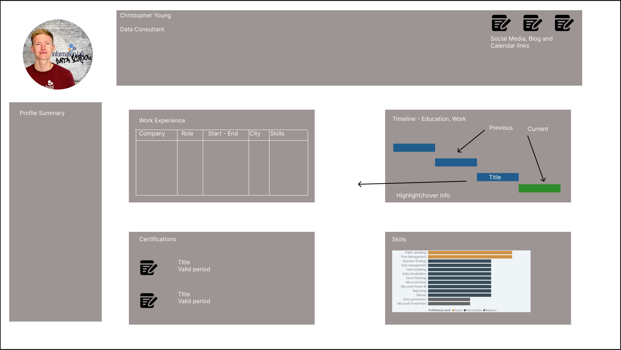
The Plan
During the first week my aim was to build an interactive dashboard that could work as a living version of my CV. I wanted it to look good as a static piece but also reward anyone who takes the time to explore it by showing extra detail and personality.
I began by downloading my CV from LinkedIn along with the version I had already submitted to the Data School. I also went through Sahir Maharaj’s blog post on what makes a strong application as well as the example submission which helped me understand what I needed to focus on.
The next step was to plan the data structure. Most of this was done by copying key information from my LinkedIn profile and previous CV and pasting it into separate tables for each section. I created a table for skills and then added my own skills while adjusting the categories so they suited my experience.
After that I moved on to the design phase. I looked at examples that inspired me. One dashboard used a Gantt style bar chart and a very clean layout where the social media icons were separated from the about me section. Another dashboard used coloured bars to show technical skill levels which I found helpful for thinking about how to communicate my own experience. I sketched out a rough layout based on elements I liked from both examples.
Challenges and Findings
There were a few surprises along the way. Dates caused far more trouble than expected. They appeared to be in a familiar format that looked like day month year, but Tableau Prep kept throwing errors when I entered them this way. After speaking with Robbin Vernooij we realised that the tool expected the dates in ISO format instead. Entering them as year month day solved the problem instantly.
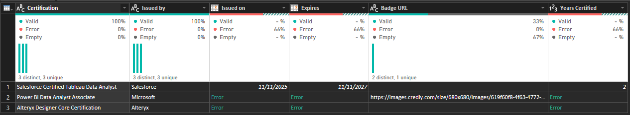
Another issue was that my date table stopped at the year 2025. This meant that the duration of some of my certifications could not be calculated properly. The fix was simple but not immediately obvious. I opened the date table in the length step and extended the calendar by adding extra days until it reached the end of 2030.
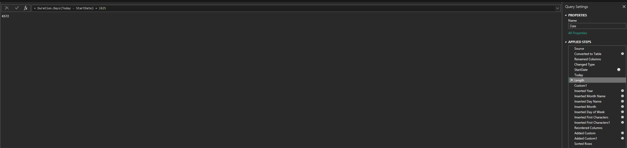
Both problems taught me to look a little deeper into how Tableau Prep handles dates and to check what it expects rather than what it displays at first glance.
Reflection
Looking back on the first day, I realised how challenging this project actually was. What I expected to be a simple start quickly became much harder once I began preparing the data and trying to shape the layout. Even small steps, like getting dates to behave properly, took more effort than I anticipated. Despite that, it was a useful introduction to the level of detail and problem solving needed for a dashboard like this. It also pushed me to think more carefully about how I present my experience and how much work goes into turning raw information into something clear and engaging.
Below is the dashboard I created. It does not fully flesh out the ideas I had in mind, but I looked forward to editing