


Brief
Brief 1: Consultant Needs Fast, Keyboard-Only Navigation
Scenario: Access London has hired an expert in accessible urban design to assess how inclusive the city's top attractions and transport links really are. They have a visual impairment and rely solely on keyboard navigation with screen magnification.
Data: The London Accessibility Dataset (Attractions + TfL Stations)
Output:
Upload to Tableau Public or Power BI Service. The dashboard must be fully keyboard-navigable, allowing them to:
- Tab through borough-level filters, accessibility feature checkboxes, and attraction lists
- View summaries with no mouse interaction
- Highlight keyboard focus areas for fast analysis
🎯 Key Requirement:
Efficient keyboard-only navigation across filters, tooltips, and pages — no mouse dependency.
Plan
My plan is to keep it simple, spend less time on planning too much for work I won't be able to complete.
- Ingest data and apply changes in PowerQuery.
- Browse accessible PowerBI dashboards for insight on navigation or design styles that will help users.
- Sketch out my ideas.
- Begin building.
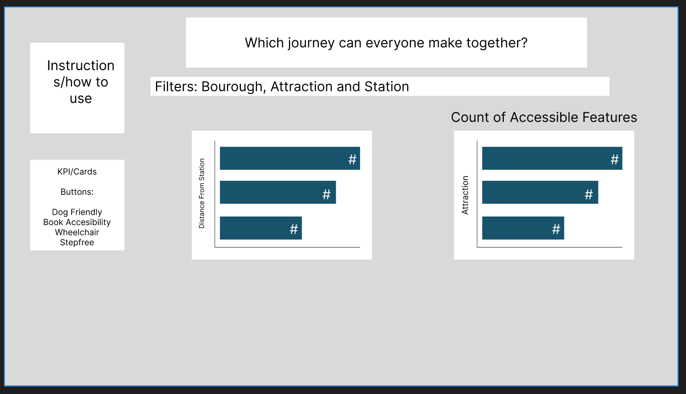
Initial Plan
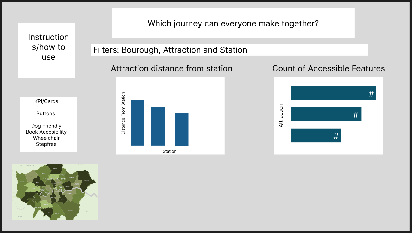
Updated Plan
Challenges and Findings
I ran into a few bumps with the DAX logic, especially around how certain columns were typed and how the measures behaved once slicers were applied. A couple of the calculations kept returning zeros, so I had to spend time digging into the data and reworking the formulas until they behaved properly. I also ended up spending longer than expected getting the hotkey navigation to work smoothly—some shortcuts didn’t register or conflicted with existing interactions, so there was a lot of trial, error, and re-testing to get everything feeling consistent.
Reflection
I once again did not manage to complete what I set out to do. Unfortunately I work a lot slower than required for the dashboards, which meant I did not finish as much as I would have liked to. I feel like I let myself down again, but I think I made slightly more progress towards finishing what I set out to do.