


This week we spent a day in each of Alteryx, Tableau, PowerBI and SQL revising and practicing topics that we individually or as a cohort felt we needing some brushing up on. It proved incredibly helpful as preparation for the looming Dashboard Week ahead of DS53, serving as valuable refresher but also down time from the fast paced weeks of client projects and new content coming from every direction. As most of this information I would have mentioned before, this week will contain some of the useful parts we revised during the week, or new techniques learnt during this period of time.
Alteryx
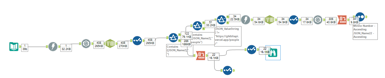
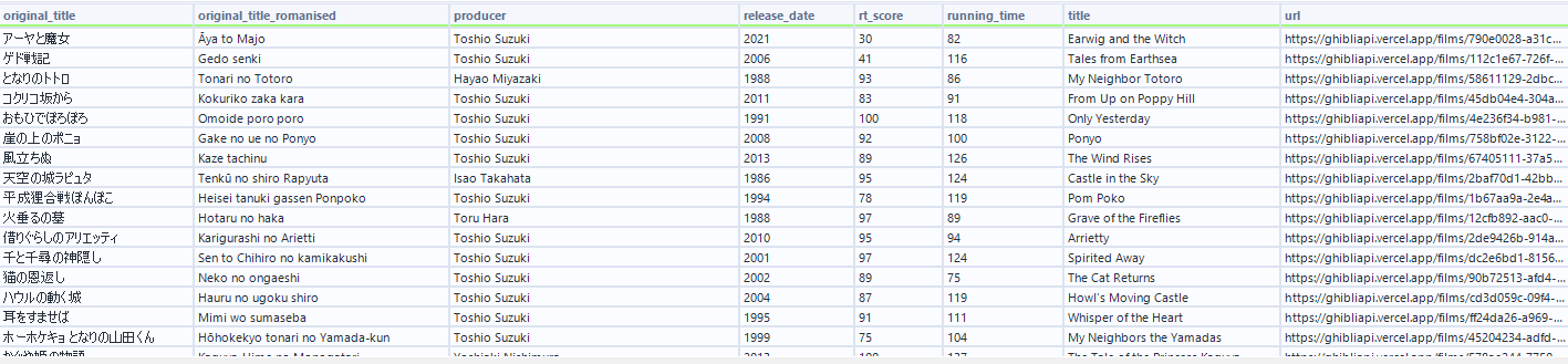
Nothing especially new was learnt during this session, but rather a useful recap of important concepts. We built a macro flow that aims to target a given number to a given number of decimal places, as well as a workflow to extract information from shows off of the Studio Ghibli API. As someone not interested in anime nor films, this still proved an interesting task. Learning about "My Neighbour Totoro", "Ponyo" and "Spirited Away" which are movies I had heard discussed by friends was a fun surprise to come across. Attached below is the workflow with the output.
Tableau
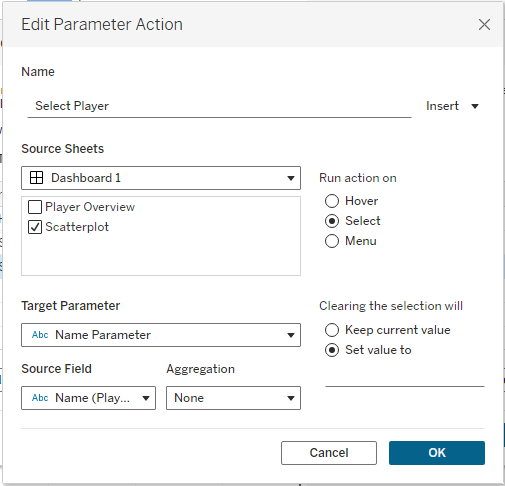
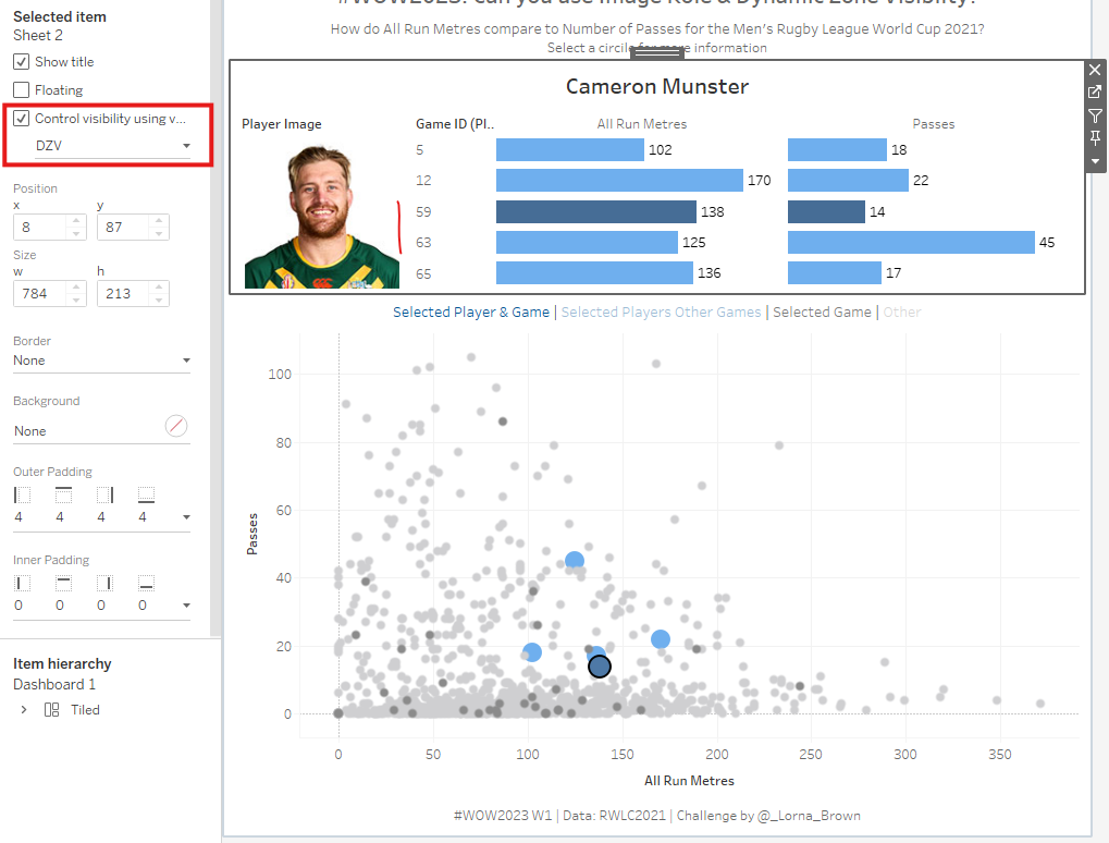
Using Dynamic Zone Visibility and Parameters to create a pop information section from a chart. By creating 2 parameter actions and using DZV, this Workout Wednesday shows a useful technique to have an information display appear upon a selection of a value, without having to take up key real estate on the dashboard.
The first parameter requires the higher level of detail (player name) to have a parameter action. The logic is that you want the player you select on the scatterplot to then filter the name parameter to that player. This will be sourced from the player name field.
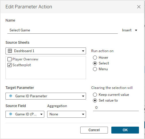
The second parameter is to then select only the relevant games that pertain to that same player. The click on the scatter plot targets the Game ID parameter.
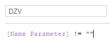
Next, create a calculated field that states that the name parameter is not equal to a blank space.
Finally, with both of the sheets places inside the same container in a dashboard, select the information overview sheet and set the visibility to be controlled by the DZV field.
Hopefully the attached GIF showcases how the scatterplot works.
PowerBI
We learnt how to create a cumulative chart that restarted each year the summation of values.
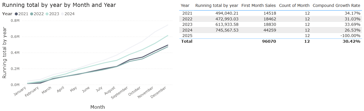
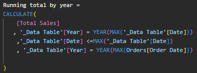
This chart uses a month field from a date table as well as a field that uses the CALCULATE function to break down a Total Sales field into each of the endpoints. The first line restricts the calculation to where the tables Year column is the same as the currently selected year. The second line ensures only dates up to and including the current row's date are included. The final line adds a filter stating the year in the Date Table must match the year of the max Order date in the Orders table. Whilst a tad fiddly to create, this provides a very useful chart that is used in various different sectors.
SQL
We didn't do any particularly new work, but we did learn about a website called Leetcode. This site has many useful questions on different coding languages, but we worked through the SQL Crack 50 interview questions which was a useful set of exercises which we could work through. Whilst I was only able to get to around halfway, I'll definitely be going back in my own time to complete the set.
Next week...
The finale awaits, which is hard to believe. I hope I can end training on a high.