


What is it?
Tableau Next is "a flexible, API-first analytics experience... Built on a composable architecture, with a unified data layer and trusted semantics, it delivers personalized, contextual, and actionable insights to every user", described on the Tableau website. Using AI powered features such as Tableau Semantics and integrations with Agentforce, it allows users to ask questions of their data in natural language. It is designed to work seamlessly with Data Cloud. The main abilities Next provides is:
- A unified data layer and semantic model
- Prebuilt analytics and visualisation templates
- Natural language–powered agents
- End-to-end governance and reuse
It tries to solve the complexity and mess that can arise from Business Analytics by introducing a common semantic foundation, where metrics and charts can be created once and then reused.
Building Visualisations
Chart building works differently in Next. You have to build the charts independently from the dashboard, but can then be used in multiple charts without the need for reconstruction.
Discrete Line Chart
- Drag a date field and a measure (Sales in this case) on to the columns and rows.
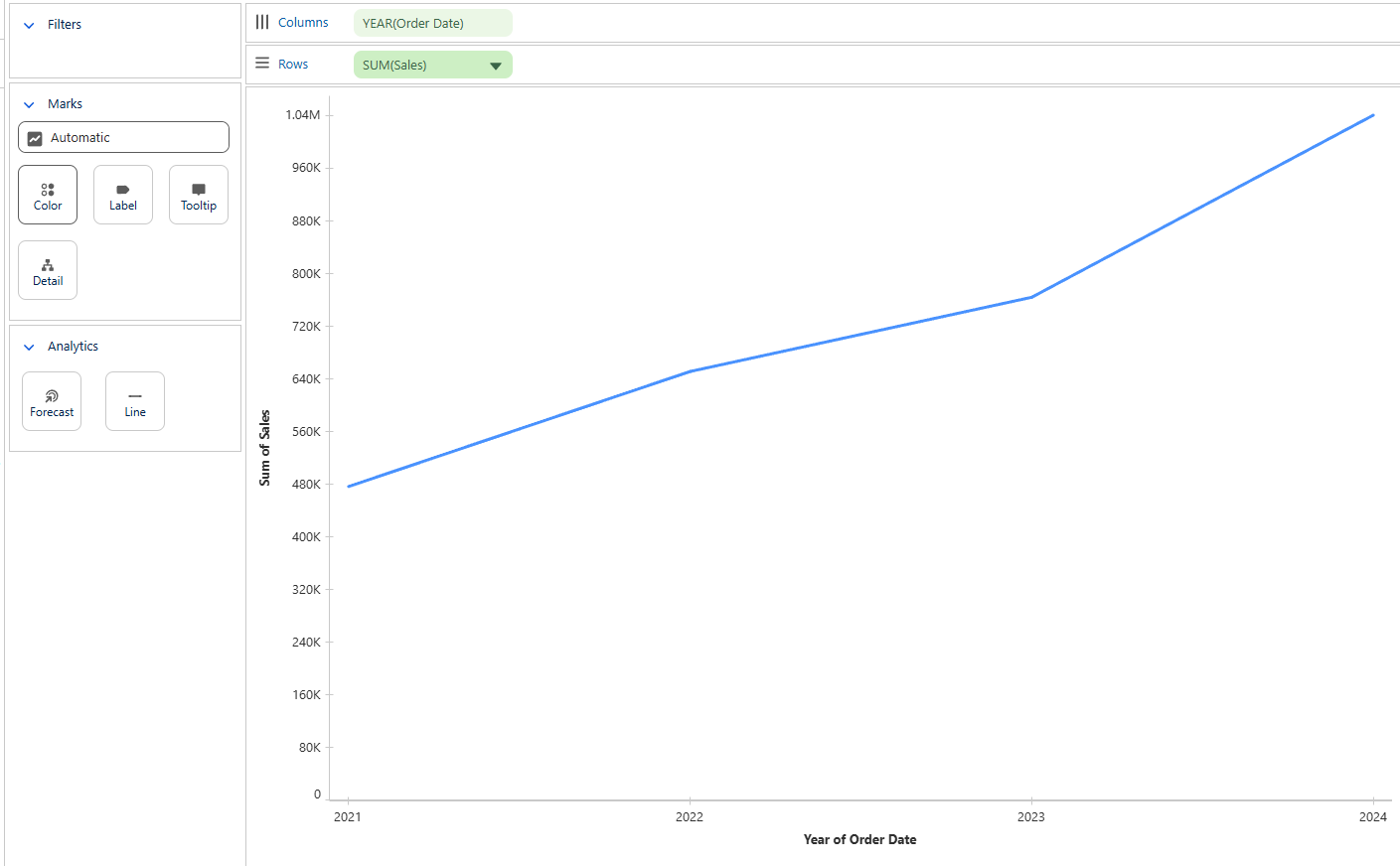
- To make this discrete, add another dimension on to the Colour section. For this instance, we can drag Category on to the Colour section.
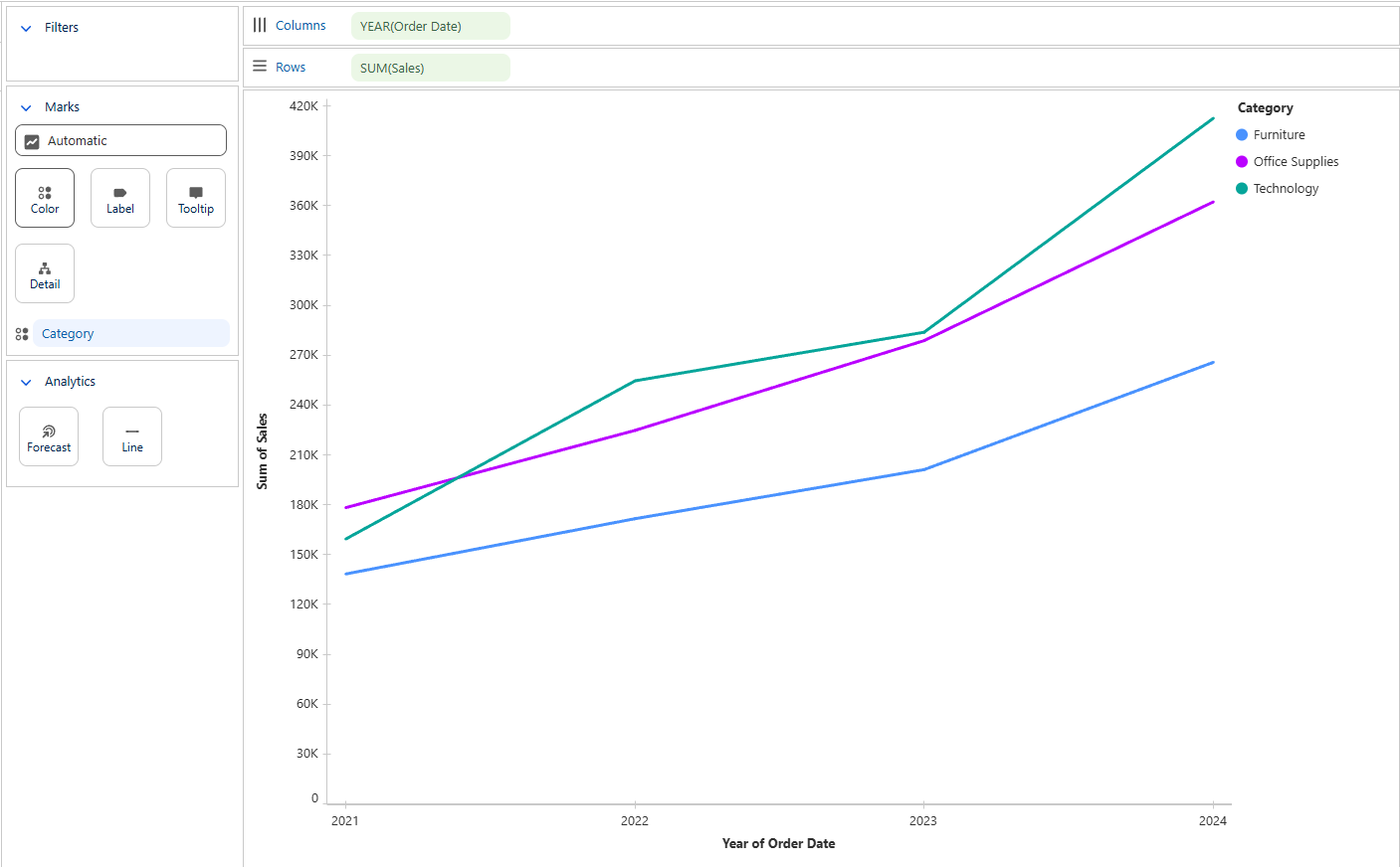
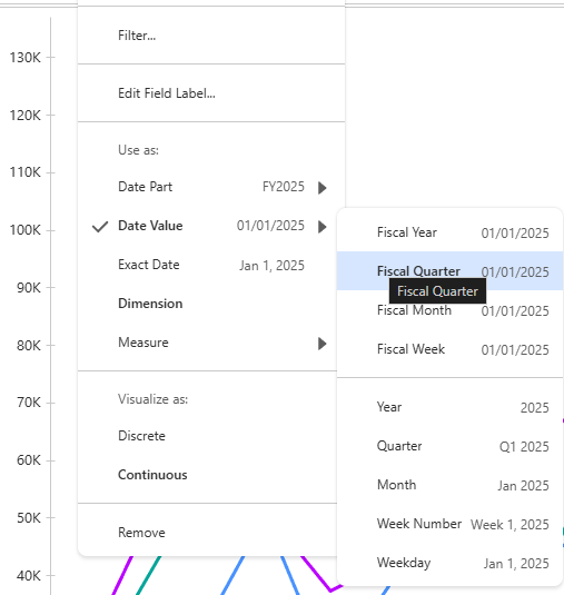
- To increase the granularity of the date, click on the drop down arrow on the Order Date and then select either Date Part or Date Value. In this case, I selected the Fiscal Quarter.
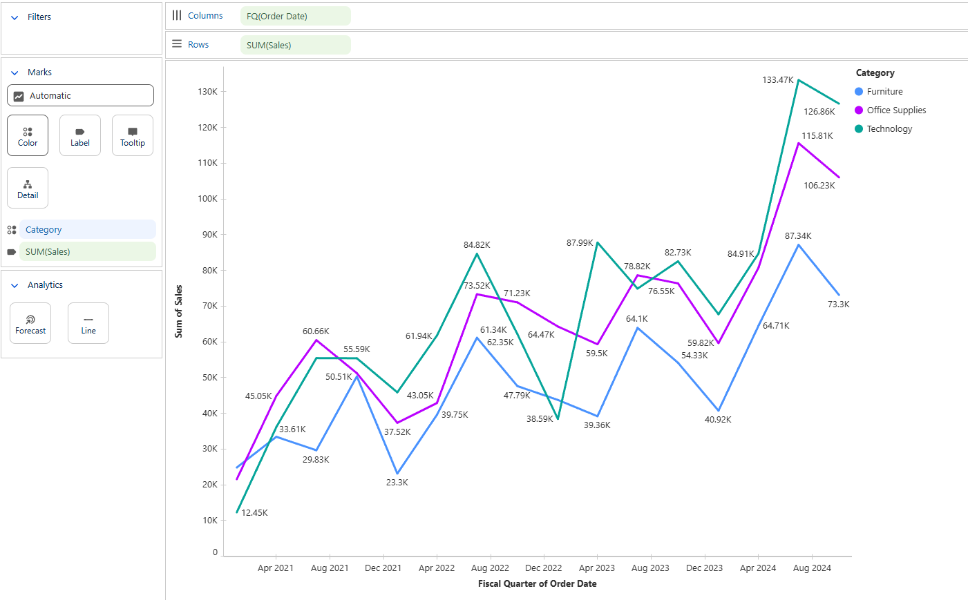
The visual now looks complete. You can drag fields on to the label or tooltip in the same way you are able to on the Desktop versions.
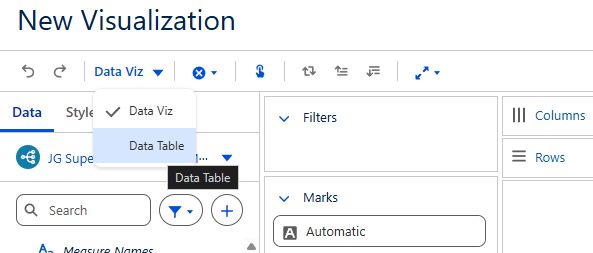
Data Table
One of the unique features of Next is to have a specific switch to create a Data Table, which I have found to be more convenient than building a table in Desktop.
- On the top section of tools, select the drop down menu and select the Data Table option.
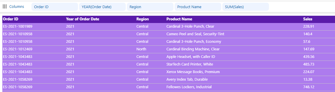
- The Rows tile will disappear and leave only the Column section, which is where you can drag fields in from the data pane to populate the table as shown below. The table can be easily formatted and is a useful, easy way to display information on a dashboard.
Quirks of Tableau Next
Whilst Tableau Next feels very familiar to any user of Tableau Desktop, there are still some key differences that can take some time to understand and adjust to.
- Environment
Being a browser based software, it immediately feels different. As we learnt due to some issues with the WiFi in the office, this can hamper the speed at which you can build dashboards once enough content is on the screen. The integration with Salesforce apps allows you to create and see analysis directly in Salesforce. The ease of having all the information and visualisations in one place is what can make Tableau Next so powerful, with some more work that still has to be done.
- Visualisation Layer
The selling point of this is that it offers a quicker setup for insights with less of a need for manually formatting charts. For example, the ability to rename field names in the visualisation without changing the underlying variable names, the ease of buildling Data Tables and Automatic filtering actions across visualisations. The speed at which visualisations can be created is an excellent time saver for gaining quick insights. Despite updates, it still pales in comparison to the level of customisablity that Tableau Desktop can offer.
- Formatting Limitations
Unfortunately with ease comes compromise, and part of this is the formatting inside Next. From being unable to hide axes, create dual axis charts, no custom text formatting, or even complete charts missing such as maps. Filtering can also feel a bit strange, having to use a date value and only being able to select pre-determined options such as Current or Previous Year.
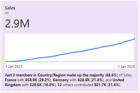
- Metrics
Part of the selling point is the AI driven insights that you can have from the metrics. These can create KPI's with an adaptive ability to inform depending on the setup and filtering on the dashboard. Shown in the example below, it can generate an insight summary that can give headline insight based on fields that you add to the setup in the Insight Dimension section.
Concluding Thoughts
Getting to grips with a new software that feels familiar felt simple and confusing at different points. The integration potential of Tableau Next is evident, especially with the time saving that can be made from only having to build charts and metrics once, but being able to place in different dashboards at any time. I hope this blog provided some insight in to the software, building visualisations and some differences to be cognisant of.