


This week proved to be a big week for myself and the DS53 cohort. Our first external client project and navigating that landscape proved an exciting yet challenging endeavor, alongside learning more Tableau Desktop and PowerBI Dax functions.
The kick off call was an excellent opportunity for us to learn about the client, the history of the company some of the outcomes they desired from the project. As the company had not previously used dedicated visualisation tools (beyond formatted Excel Sheets), but had a comprehensive dataset over a 10 year period, the initial size of the task did feel ominous once the call ended. The majority of the day was focused on deciding which of the various requests we would focus on (consider within scope), and which charts would prove useful for the dashboards.
Our mid week half day sessions on the product proved to be vital moving days for us. We adjusted the pairs placed on each dashboard, as decided by our Project Manager, and sat as a group to view the data. This proved to be a mini paradigm shift for us, as this provided an opportunity for everyone to scope the data, gauging what would be possible to build in the dashboards. On a personal note, being placed on Data Prep provided a good challenge. Currently this is not my strongest skillset, and having the chance to work on a real world dataset was a fantastic chance to apply the learning from training. As someone who takes documenting seriously, doing so for the Prep Flow helped reenforce the learning. On the Friday morning I compiled 2 videos for the client, walking through the Prep Flow rationale, including relating the tables within Tableau Desktop itself. Below is an image that shows an anonimised version of the Prep Flow.
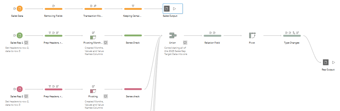
The Sales Rep tables were provided in a difficult format to load in Prep, and required multiple stages. Adjusting header positioning, pivoting to have values in columns and then back into rows in order for each of the sales reps to have monthly targets for the entire year assigned proved difficult due to the number of cleaning steps required. The main Sales Dataset included the entirety of the data collected by the company, required the discussion as a group to think of where to focus the scope. The rest of the process included making data fields to relate in Tableau, and standardising the Sales Rep name fields for the same reason. Documenting and explaining the process alongside recording the walkthroughs I found to be a fun process, which I hope to have the opportunity to do again. If you would like to read through Joseph Hughes' blog on his week, make sure to read it here.
Tableau training focused Set and Parameter Actions. Set actions allow for dynamic modifications of set's contents based on a specific action, for example clicking on a data point in a visualisation. This is done be creating a set, adding a set action, and then showcasing the effect on the visualisation. Parameter actions allow the value to be updated based on an interaction, where the parameter can control calculations, filters and more. However, they only store one value at a time.
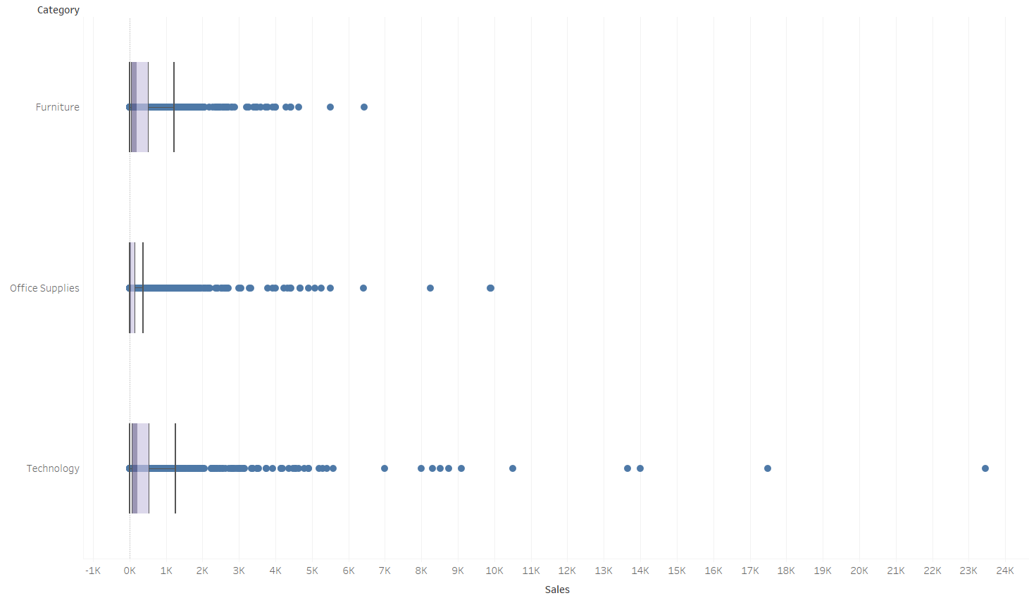
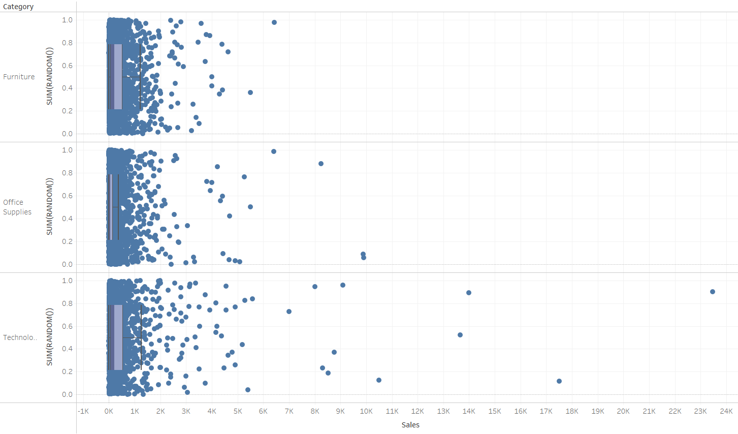
We began learning about the analytics pane, and some of the useful tools it can provide when trying to add context to graphs created in Tableau. We covered summary tools such as the average and constant lines, as well as the Distribution Band's, Clusters, Dynamic Bins, Box & Whisker Plots, and potentially the most visually satisfying one, the Jitter Plot. The image below showcases how it can help to show a user how densely packed data points are when they overlap. This is done by simply adding the calculated field SUM(RANDOM()) into the rows.
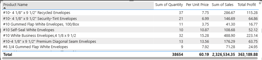
The short session on DAX in PowerBI focused on refreshing our existing Columns and Measures knowledge, whilst learning about iterator functions. These are the "X" functions, such as SUMX, which calculates a value for each row first and then adds up the results, while SUM would only add numbers in a single, pre-existing columns. There are more functions such as MAXX and AVERAGEX which perform an iterative calculation in a similar way. In the example below, the "Total Profit" calculation uses SUMX to calculate the profit per Product on a row by row basis, showing the profit for the product rather than as a total at the end of a pre-exisiting Profit Column.
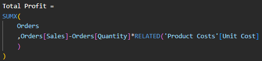
The table below indicates this. The Sum of Quantity x Unit Price gives the Total Cost, and when subtracted from Sales gives the Total Profit figure.
The next week will bring a welcome change of pace, as DS53 have no Client Project this week. The focus will be fully on Alteryx whilst spending time on creating the sessions for the Public Teaching Sessions being held beginning of October.