


Progress Bars are a useful visualisation that can be used in a variety of dashboards. With indicating how much of a task has been completed, it can assist in managing expectations and providing visual feedback that can satisfy the user. Whether this is for internal usage to measure completion rates, or add context, it can motivate users to work towards a set goal. This blog will provide an overview of how to create them in PowerBI.
The Process
- Setting up the chart requires using a clustered bar chart, and having 2 X-axis measures, one with the measure showcasing progress and then the target value. This target value (100% in this case) is done by creating a measure and setting it equal to 1 (Total = 1), and formatting it to a percentage. This is then dragged on with the field measuring the progress, and the categories onto the Y-axis.
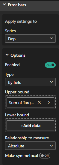
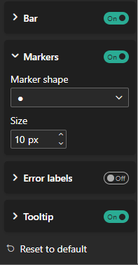
- Focus shifts to creating the curved ending to the bars. Select the graph, then under Visualisation Pane navigate to the Analytics tab. Scroll towards the Error Bars dropdown and enable them. For each field, you need to select the upper bound to match the targeted field or measure it refers to in the series. In the below example, Dep refers to the Department, and the upper bound is the Sum of Target Value. Under the Markers section, choosing the circle and sizing it to match the size of the graph in your dashboard. To show the numbers only on the progress bars, make sure to disable label values from the chart referring to the totals.
- Depending on how you want the carts to appear, you can format it with custom titles, axes labels, colours etc. (The left hand chart is created in the same way without the need for error marks. The Overall chart does not have the Department breakdown on the Y-axis.)
Voilà, you have your progress bar chart shown below. If you would like to try this Workout Wednesday for yourself, click here.