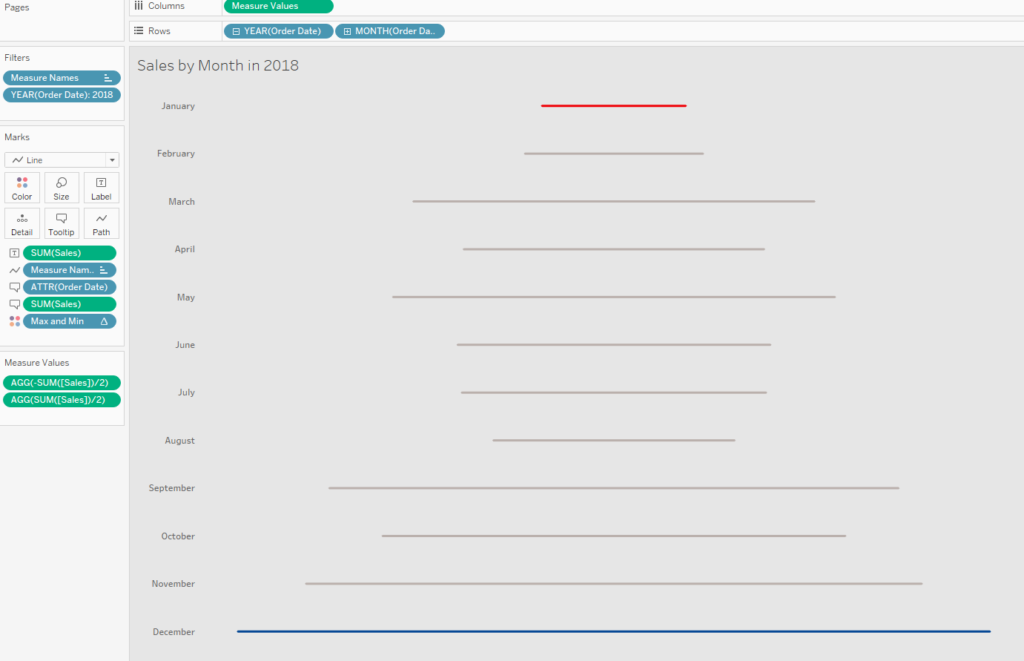
A seismogram timeline is a great way of showing change over time and is particularly effective when there are big variations in the dataset. With the help of a few calculations, the seismogram can be created easily and quickly in Tableau.
For the example below, I am using the Sample – Superstore dataset that comes with Tableau. Follow the steps below to create your own timeline.
1. Build
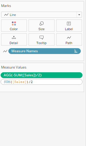
First, we need to build the foundations of the graph. To do this, place the date on the rows shelf (this needs to be discreet) and Measure Values on the column shelf.
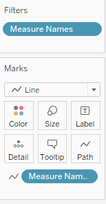
As illustrated below, bring Measure Names onto the Path icon in the marks card and make sure that the mark type selected from the drop down menu is ‘Line’.
2. Calculations
Now that we have built up the basic structure, we need to create some new calculations to produce the seismogram. To do this, write two separate calculations in the measure values card:
-SUM([Sales])/2
SUM([Sales])/2
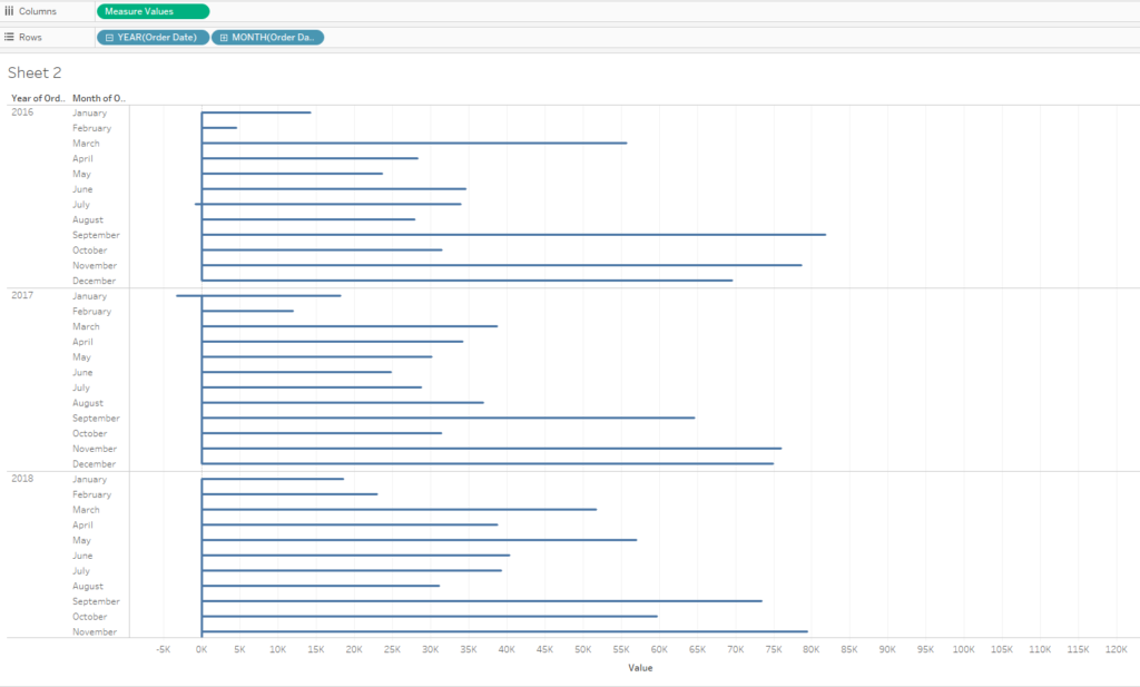
If you have any other values in the Measure Values card, delete these, so you are only left with your two new calculations. Once you’ve completed this step you should be able to see the structure of your seismogram.
3. Highlight
Another potential addition to this chart is a colour highlight which draws attention to the month with the highest sales and the month with the lowest sales. Creating this colour highlight can be achieved using window average calculations.
Create a new calculated field and use the calculation below:
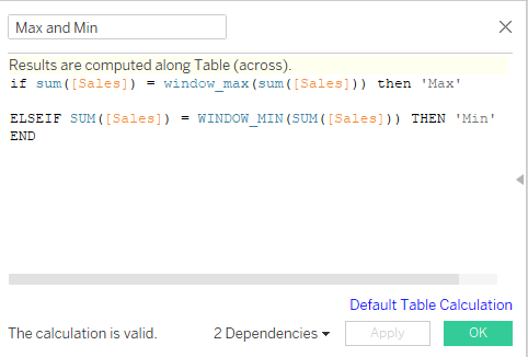
Drag this calculation onto the colour icon in the marks card. You can choose which colours represent the maximum and minimum value in your seismogram.
4. Format
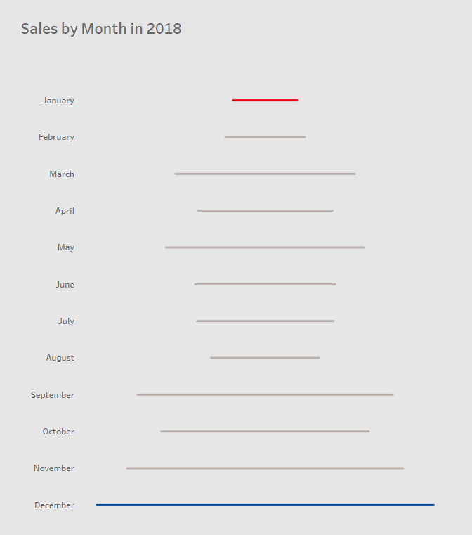
Now, all that’s left is the formatting. Start by removing the values header at the bottom of the sheet as well as the grid lines; you can also utilise the tool tip on the marks card to provide the user with specific data.
Once you’ve formatted to your heart’s content your seismogram is finished and ready for your dashboard!