What is a trend line?
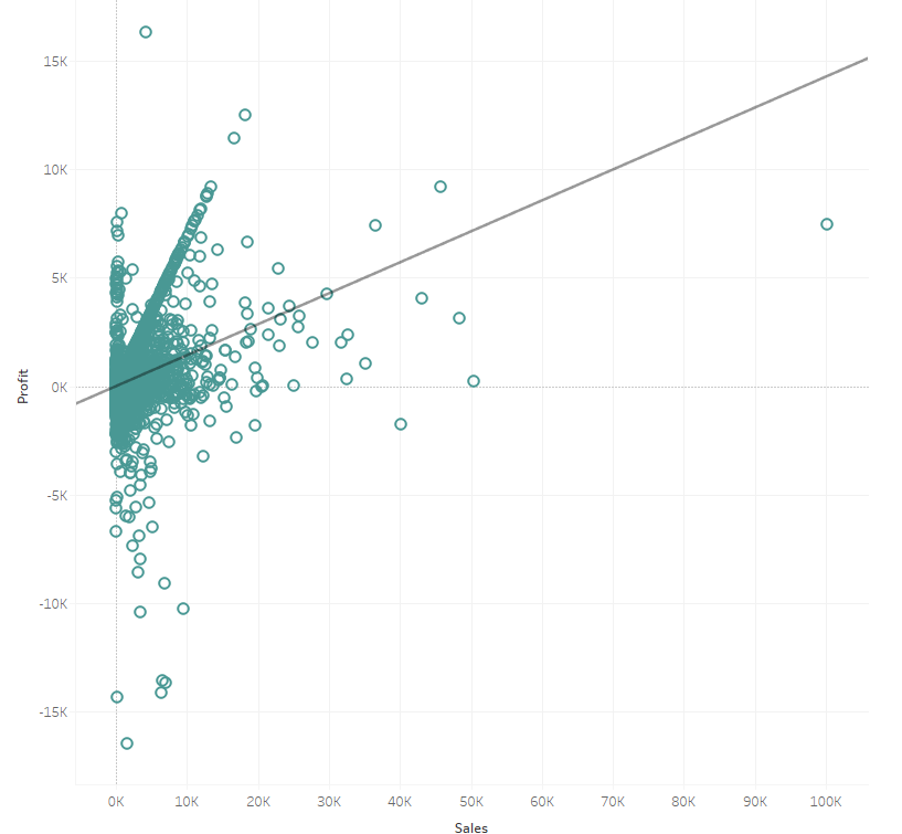
Trend lines or lines of best fit can be used to predict the continuation of a trend and help to identify the correlation between two variables by mapping the trend of both at the same time. With just a couple of clicks, Tableau allows us to easily add these to visualisations in order to highlight any correlation in our scatter plots or line graphs.

What are the types of trend line?
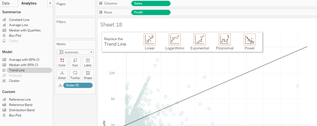
Although there are many models for trend lines, Tableau gives us the option to add trendlines based on five models:
- Linear
- Logarithmic
- Exponential
- Polynomial
- Power
These options tell Tableau to build a linear regression model based on this type of transformation on one or both variables.
For more information on the different models and the formulas for these, visit the Tableau’s help page here.
How can I add a trend line?
You can add a trend line in a couple of different ways.
Either right click on your graph or chart and go down to the ‘Trend Lines’ option on the drop-down menu, then click ‘Show Trendlines’. By default, this gives a linear model trend line.
You can also use the Drag and Drop options on the Analytics pane. Within the ‘Model’ options on this pane there is the ‘Trend Line’ option. If you click on this and drag across, you will be given the different options available for your type of graph. Now, simply drag your mouse to the type of trend line that you want to add.

Removing a trend line is just as simple, just click and drag it off the view.
And edit a trend line?
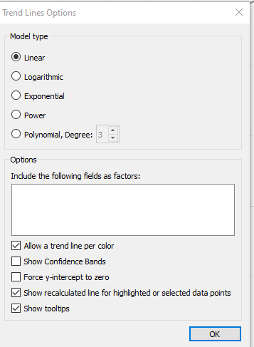
In order to edit a trend line, right click on the trend line and click ‘ Edit Trend Line..’. This will bring up a dialogue box with a variety of different options for our trend line (depending on graph and model type).
As well as changing the model type we can also:
- Allow a trend line per colour (this is the default option in Tableau)
- Show/hide confidence bands (this shows the 95% confidence interval for the model)
- Force y intercept through zero
- Show a recalculated line for highlighted/selected data points
- Show tool tips

Which trend line model should I use?
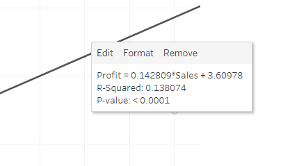
Assessing whether a trend line provides us with useful information is really important. If we hover over our trend line in Tableau, we can see a tool tip which includes an equation for the model, a value called the ‘R-squared’ and as well as the ‘P-value’.

The P-value and R-squared are vital when it comes to assessing whether the trend line model is useful or not and which model is best suited to your data.
P-value
The p-value is a measure of significance for the trend line. A p-value of 0.05 or less is often considered significant; the smaller the p-value the more significant the model is. A large p-value can indicate that the apparent trend in the data is due to chance, not the factors in the model.
R-squared
The R-squared is also an important measure when assessing if the model is suitable and tells us whether the model effectively fits our data. The R-squared is measured on a scale from 0-1; the closer to 1 the more effective the model.
