


Today begins DS17’s much-vaunted “Dashboard Week”. Each day this week, members of DS17 will receive a data set to prepare, analyse, and visualise it by the end of the day.
The Data Source
Today, we are using a vast database of water quality data from the United Nations Environment Programme. The database, called GEMStat, can be found here. It holds sampling information on many, many different measures of water quality from thousands of stations around the world going back to 1950. Unfortunately, as is often the case, data quantity does not equal data quality. Holes, false starts, sudden breaks and incorrect unit measurements plague the dataset. What’s a busy data schooler to do?
I focused on answering the immediate task at hand, which was to create a dashboard using only data from a single continent of data. I chose Asia. The UN’s data portal let me select stations that had only particular measurements I was searching for: transparency, pigment, temperature and dissolved solids. Having these limitations imposed by Coach Andy was a god-send and kept me from wading through all the different measurements on the site.
The Data Prep
I had to download the data in batches to make sure I had all the measurements, luckily it was easy to bring it all together in Alteryx. The data portal organises the data in a standardized, easy to union format. Here’s what my Alteryx flow looked like.
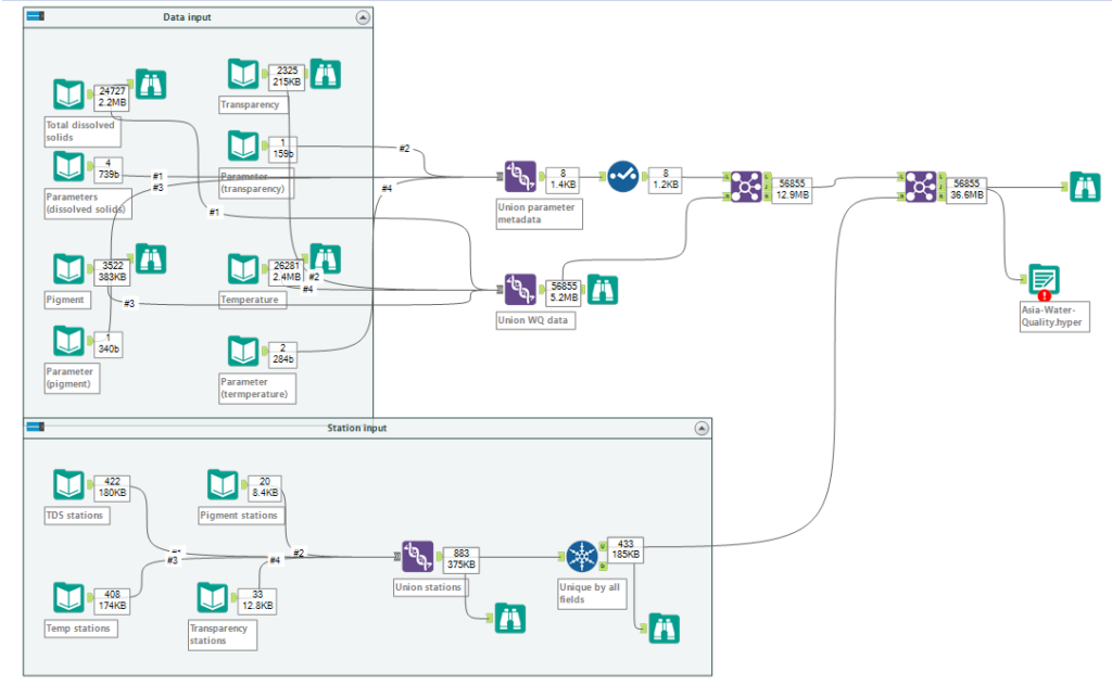
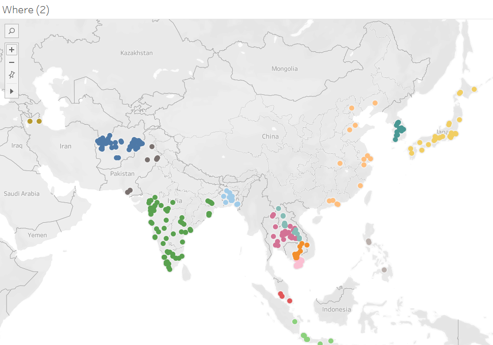
The metadata contained a wealth of information on sample sites, most of which went unused in my visualisation. However, the location coordinates were invaluable.
Considering the visualization
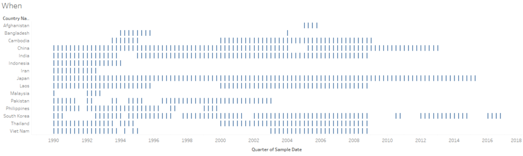
I brought the data into Tableau and started asking Andy’s suggested exploration questions: when, where, what, how and why. I have sheets in my tableau file named just that. Answering these questions told me a lot about the kind of dashboard I could eventually create. I discovered that the data, for the most part, was not very recent. Many countries had not provided information in almost a decade, others (like Iran) had no datapoints since the early 90s. Where the data did exist, it was often full of missing years.
After doing this preliminary assessment, I wrote down a sentence that described the kind of viz I wanted to create: “Create an exploratory dashboard that allows the user to see water quality data since 1990 for stations in Asia”. While I had originally had high hopes for pulling insights out of the dataset, the holes and spottiness of the data led me to believe such insights would probably be more disingenuous than valuable. To provide some interpretation, I opted to use a control chart, which helps users see outlying values. A map would help the user see where stations existed and be an interactive feature to select the data they wanted to see in the control chart.
Design
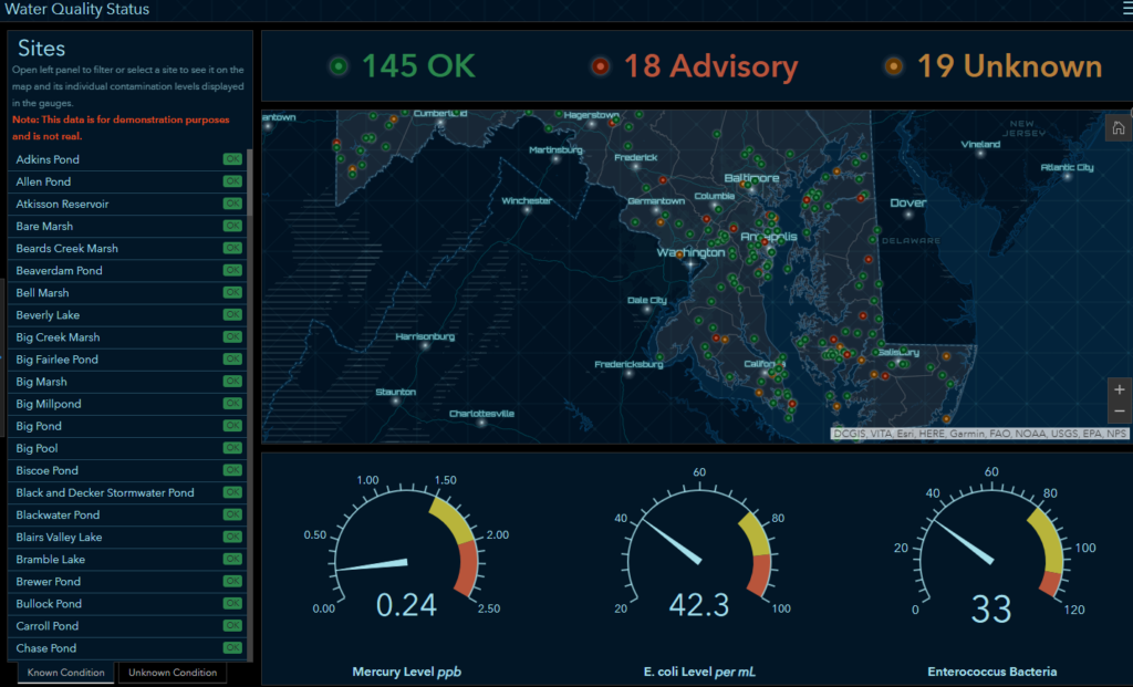
In considering my design, I googled various water quality dashboards to see what other folks had done. I really liked a dashboard that ESRI had created to showcase water quality data and I modelled my dashboard after it in its structure and color scheme.
Building the viz
With a model in hand, it was time to start building the visualization out. This always begins with a sketch with pen and paper. Mines not much to look at so I haven’t included it here.
I was able to build out a model for the dashboard with a fair amount of time to spare. I used a parameter to toggle between various water quality measurements and a filter action to use the map to control the control chart. The wireframe I wrote on paper gave me a great road map for the individual sheets I needed to create for my dashboard as well as a sense of the layout.
Exploratory dashboards have a lot of interactivity for the user and I tried to incorporate that principle in my viz. I allow the user to set the band width for the control chart, decide what kind of data to include, filter on date and country or even drill down to a single water quality station.Using Mapbox, I created a custom map using their ‘Monochrome’ base to match my map color to the overall color scheme of the viz.
The Final Viz
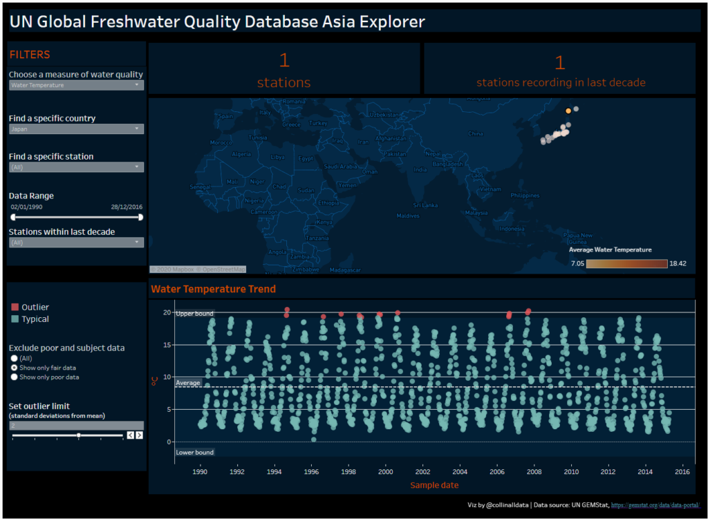
Here is the final viz I uploaded to Tableau Public. As I worked through the afternoon, I was stymied in the creation of a couple BANs, trying to figure out how to turn a window calc from the control chart into a BAN I could use at the top of the dashboard. I think I need to learn more about how to use LODs to mirror window calculations calculated elsewhere in a dashboard. I also realised that using set actions may have helped me streamline the interactive elements of my viz. However, for having a single day to complete this work, I feel reasonably well with the result. I’m looking forward to seeing what Andy throws at us tomorrow!