


It was another day of big data in dashboard week. Coach Andy asked us to create a visualisation based on data from the Survey of Income and Program Participation (SIPP) from the U.S. Census. I was excited to dig into some survey data, which can be notoriously difficult to work with but has a lot of opportunities for interesting visualisation. But first, I had to find the data.
Data Acquisition
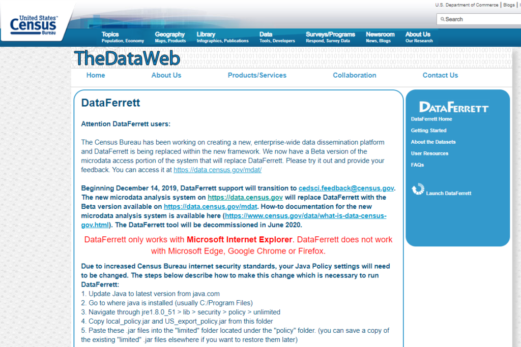
The U.S. Census data portal is antiquated at best, and almost deliberately unusable at worst. The data portal for the SIPP is a service called, I kid you not, “DataFerrett”. It can only be accessed through, here’s the real kicker, Internet Explorer. Even then, you wind up on a page that tells you the service has been deprecated in favour of a new beta service, which, while more streamlined, is similarly unusable.
However, there was another option, an old-school FTP page that contains the data for each ‘Wave’ of survey for each year it was conducted. These are massive (>10GB) files formatted as STATA, SAS, or DATs. It felt too soon to be having flashbacks to yesterday’s download woes but I hesitantly clicked the download for Wave 1. It took about 15 minutes. Upon dropping the file into Alteryx, I found that I had downloaded a DAT file, not easily readable by the program. So, I downloaded the same file as an SAS, which I did see in the list of readable file types. Cue another 15 minute download.Luckily, Alteryx could read this one. Unluckily, the file size, containing hundreds of fields and tens of thousands of rows made it unwieldy.
Data Preparation
With more than a little shame, I eventually made the decision to switch over to some pre-made tables from the Census Bureau regarding types of insurance coverage among different demographic groups. While far more aggregated, these were also presented in a table format that was hideous to untangle. It seemed the longer I looked at this table, the less I understood what it was actually trying to convey.
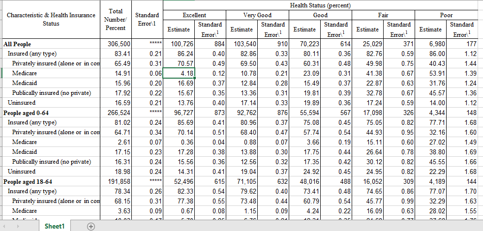
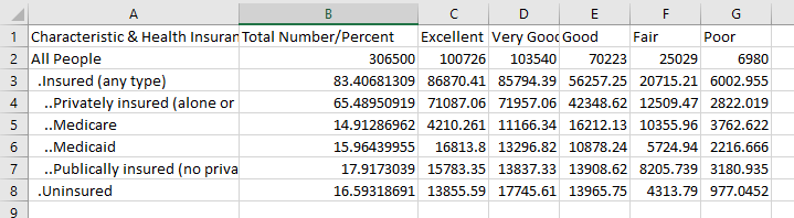
After about 45 minutes of unfruitful data manipulation in Alteryx, I finally capitulated and just futzed with the table in Excel until I got something manageable.
Data investigation and design
With my itty-bitty table in tow, I moved over to Tableau. My first visualisations were not promising. There didn’t seem to be much in terms of interesting trends in absolute or relative numbers. All I could see was that Medicare recipients tended to rate their own health worse than the rest of the population. This makes a lot of sense given that Medicare recipients are far older than the rest of the population.
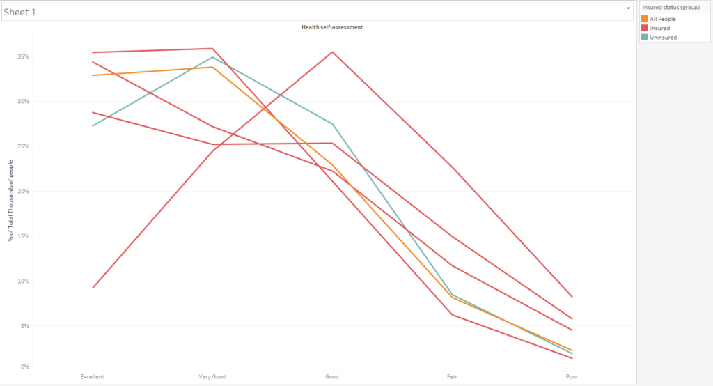
After some more underwhelming exploration, it finally dawned on me why I was excited to be dealing with survey data in the first place. I’d been wanting to adapt Steve Wexler’s designs from his Data Visualisation Society survey viz and this would be the perfect opportunity. I moved over to Tableau Public and found and exceptional model for a single-select question presentation.
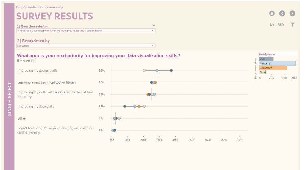
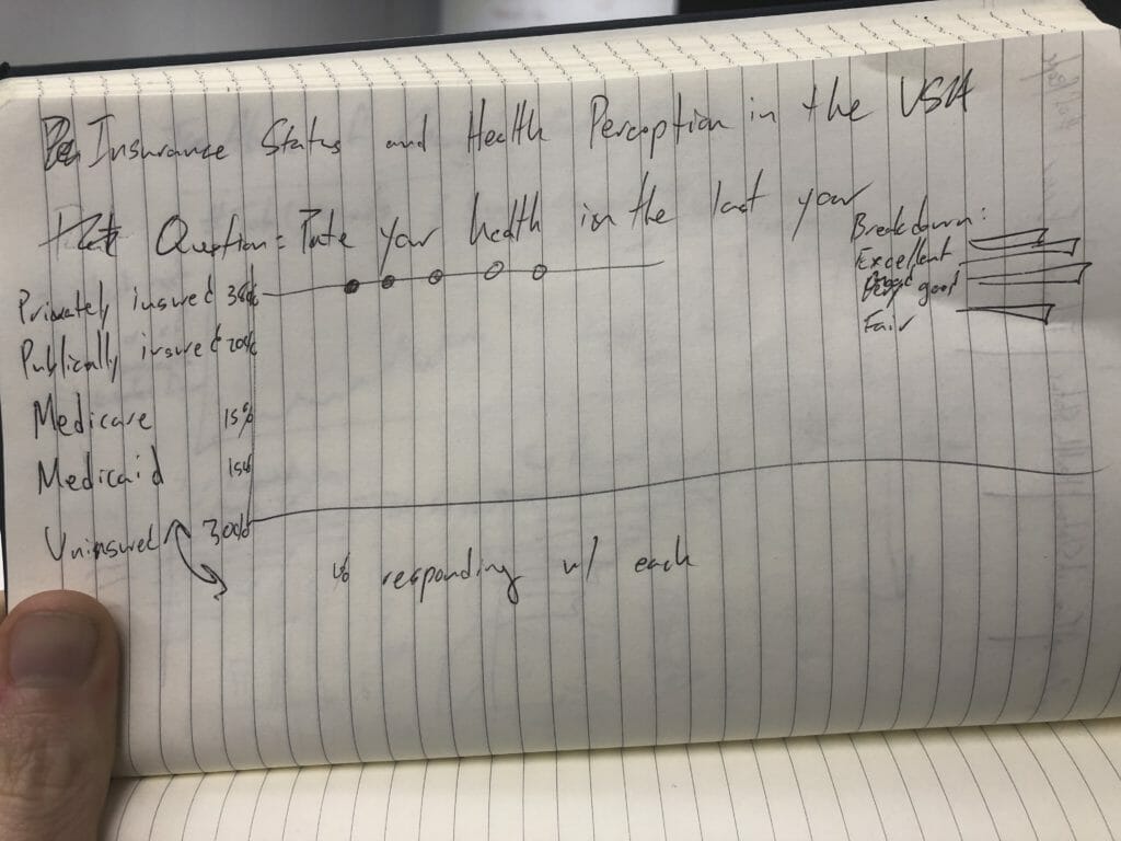
I had similar elements in my data, a group to breakdown by and a big question to present the answers to. I love how this visualisation lets you compare how each group responds to the question as well as giving the span of answers between groups. The bar chart that functions as both a legend and signifier of magnitude is pretty darn neat too. I made a sketch to signpost my own viz.
From that sketch, I built a wireframe dashboard in Tableau and then built out the two charts it would need.
It took a little jiggering to match the chart type to Steve’s, but luckily Tableau Public lets you download any viz posted there. A little snooping in the back end of the viz, and I was able to reproduce it tolerably with my own data. Here’s a link to see the viz.

I like how the highlight action helps you see the trend for each insurance group. The action also connects the legend and the span chart very nicely.
Data acquisition and preparation issues made this the hardest day of Dashboard Week yet. However, I enjoyed having an opportunity to do some interesting survey visualisation. I’m already thinking about how to apply these techniques to some of the volunteer work I’ve been doing with NGOs. Peace and data till tomorrow!