


Data Prep
Not the strongest of starts for me on this first day of dashboard week, just getting a file into Alteryx with the data was a struggle. Today’s data was on drones in the US and although you could download the data of three different departments drone usage all in one file the trick was to download each department separately then input them as a xml.
Once in Alteryx it was relatively simple to parse out the state and county from the description column. Looking at the data all I could think was how the hell am I going to find insights in this data with just the location and type of department. Purely counting the number of drones in each department wasn’t going to cut it and the thought of Andy being disappointed was almost too much to bear. I had a think about what is likely to be the biggest influence on how many drones each state is using. Now drone technology isn’t exactly new but implementing it into departments wouldn’t be a cheap project so maybe there is a relationship between state funding and drone usage. I managed to find a nice little wiki table on state funding that I could scrape into excel then format in Alteryx and joining the two data sets together I was ready to visualise the relationship in tableau.
Visualizing in Tableau
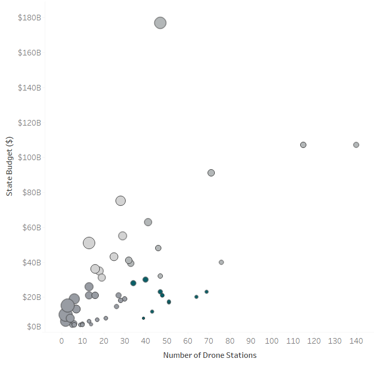
It was important to look at it on a state level and instantly a hex map similar to one of the Work Out Wednesdays came to mind. Now my viz can show if funding impacts the number of drones. But if this isn’t the case, I want to see which states are prioritising purchasing drones even if they don’t have a very large budget. After some messing around a scatter plot visualised this in the best way and I was able to do some basic quadrant analysis to find which states had used a lot of drones but had a small budget.

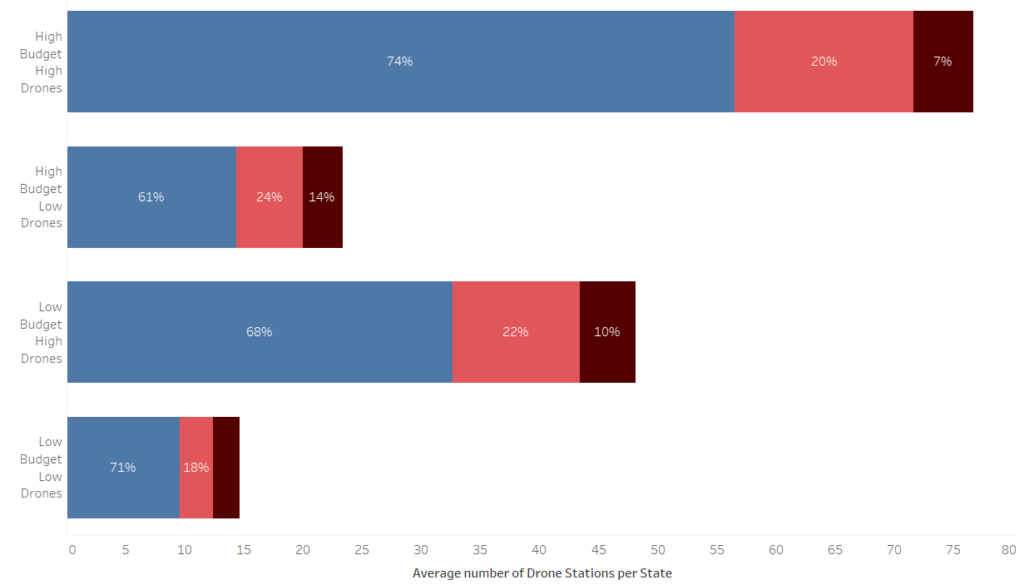
With that quadrant analysis complete I now want to look at if those specific quadrants typically focus on a specific department, are the states that prioritise drones needing them for a specific purpose? For this part I wanted to focus more on the percentage of drones per department rather than the number of drones overall. I used a table calc to look at the percentage difference in each quadrant.
Now with these three parts of the viz complete I need to format and design my dashboard and think about what context I want to add. Because there wasn’t a strong linear correlation between budget and the number of drone using agencies I went down the route of highlighting the states that didn’t have a massive budget but still used drones more than average.
Final Thoughts
With this project today I feel that I managed my time well and the fact that before I started in Tableau I tried to think of an insight rather than blindly making graphs until something looks interesting really helped me. Now that I have seen the data and have looked for insights if I had a second day of expanding these insights I would look into the states that have a low budget but high drone usage and look at how densely populated they are as I suspect that with lots of ground to cover using drones becomes more useful.
Link to the Viz on my Tableau Public: https://public.tableau.com/profile/craig.steven#!/vizhome/Dronestostatefundingwb/DroneStationsVsFunding