


If you’re early in your data career and looking to impress with your Tableau dashboards, here’s a secret: most stakeholders don’t care about fancy charts. What they actually need is a dashboard that is clear, easy to use, and functional. One that answers their questions without making them hunt for information.
These features aren’t about analytics. They’re about usability, governance, and professionalism. They’re also the kind of things that make hiring managers think, “Wow, they really understand how to build a dashboard for real users.”
Here’s how to take your dashboards from good to great.
Note: See a summarised view in this Tableau Workbook below:
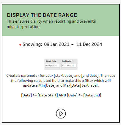
https://public.tableau.com/app/profile/vizgrowth/viz/TableauDashboardTips/TableauDashboardTips1. Display the Date Range
If your dashboard includes time-based data, show the date range clearly. Otherwise, people will assume it’s up to date, even if it isn’t.
💡 Why it makes you look good: It prevents people from misinterpreting outdated data and asking you for unnecessary updates.
🎯 How to explain it to a hiring manager: "I always display the date range prominently to ensure stakeholders trust the data they’re using for decisions. It’s a simple but crucial best practice in dashboard design."
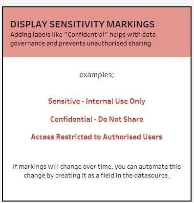
2. Display Sensitivity Markings
Not all data is meant for all eyes. If your dashboard contains confidential or restricted data, add clear labels like “Internal Use Only” or “Confidential”.
💡 Why it makes you look good: You’re thinking about data governance which is a big deal in real-world business environments.
🎯 How to explain it to a hiring manager: "Adding sensitivity markings is a simple way to reinforce data security. It helps prevent unauthorised sharing and ensures compliance with governance policies."
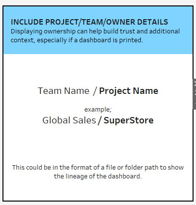
3. Include Project, Team, or Owner Details
If your dashboard is used across teams, include a ‘Project’ or ‘Team’ section to provide additional context.
💡 Why it makes you look good: It builds trust because people know where the data comes from, and if they have a question, they know who to ask or they know which project the dashboard is part of.
🎯 How to explain it to a hiring manager: "I include ownership details so that stakeholders can easily reach out with questions or feedback. This is especially useful if dashboards are printed or shared in meetings."
4. Use a Clean and Consistent Navigation Pane
A cluttered, messy dashboard is frustrating to use. Group filters and controls logically, align them properly, and use a clear visual hierarchy.
💡 Why it makes you look good: Your dashboard looks professional and polished. It also reduces cognitive load for users.
🎯 How to explain it to a hiring manager: "I focus on intuitive navigation because dashboards should be easy to use, not just visually appealing. Well-structured filters and controls help stakeholders find what they need quickly."
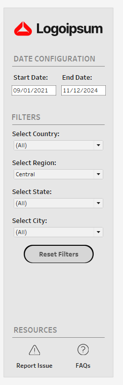
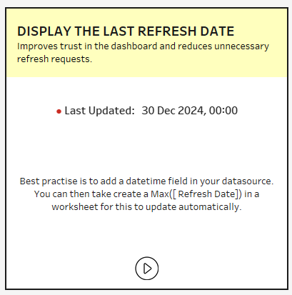
5. Display the Last Refresh Date
Stakeholders need to know when the data was last updated, otherwise, they might make bad decisions based on stale data.
💡 Why it makes you look good: It prevents unnecessary emails like “Hey, is this up to date?” and improves trust in your dashboards.
🎯 How to explain it to a hiring manager: "Adding a last refresh date increases transparency and ensures stakeholders know exactly how fresh the data is before making business decisions."
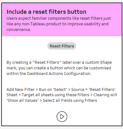
6. Include a Reset Filters Button
Every user-friendly application has a reset button, and Tableau dashboards should be no different. Make it easy for users to clear filters with one click instead of manually undoing selections.
💡 Why it makes you look good: You understand user experience and are making your dashboard as easy to use as possible.
🎯 How to explain it to a hiring manager: "A reset filters button improves usability by allowing users to quickly return to a default state without frustration. It’s a small addition that makes a big difference."
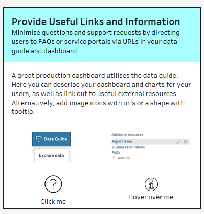
7. Provide Useful Links and Information
Add FAQ buttons, definitions, or service desk links directly in the dashboard. This minimizes confusion and reduces the number of times people need to email you with basic questions.
💡 Why it makes you look good: It shows you’re proactive and you anticipate questions and provide answers before people have to ask.
🎯 How to explain it to a hiring manager: "I add quick-access links to FAQs, definitions, and help resources to reduce support requests and empower users to find answers on their own."
Final Thoughts
A good dashboard presents data. A great dashboard makes data-driven decisions effortless. These small but impactful tweaks don’t just improve your work, they make you stand out as someone who understands what real-world stakeholders need.
If you're an aspiring data analyst, adding these elements to your dashboards will instantly make them more professional, user-friendly, and impressive both to stakeholders and hiring managers.
Want a template to download with these features? Click here.